(5 years and 3014 days ago)
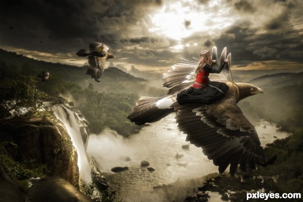
Sorry about the lack of sbs. I don't have time to make one right now.
Credits to faestock (5 years and 3043 days ago)
i love the idea n setup but the front bird really looks cut out. if you find the time to change that, cut out the wings better and blur the edges with a very soft brush so it blends in better with the background. Holding off my vote for now
Wonderful, love the fairytail look of it! 
Not a bad image, but the color makes it look flat. Changing the hues of the foreground and/or background would create a better sense of depth.
Congrats, very nice work 
wow amazing! congrats!
Congratz!! 
Congrats!!! Deserved!!! 
Howdie stranger!
If you want to rate this picture or participate in this contest, just:
LOGIN HERE or REGISTER FOR FREE
(5 years and 3054 days ago)

Howdie stranger!
If you want to rate this picture or participate in this contest, just:
LOGIN HERE or REGISTER FOR FREE
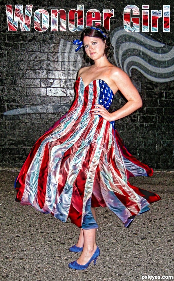
TV SHOW LYRICS FOR WONDER WOMAN by Norman Gimbel and Charles Fox
(damn, I wanted to be her so bad)
Wonder Woman, Wonder Woman.
All the world's waiting for you,
and the power you possess.
In your satin tights,
Fighting for your rights
And the old Red, White and Blue.
Wonder Woman, Wonder Woman.
Now the world is ready for you,
and the wonders you can do.
Make a hawk a dove,
Stop a war with love,
Make a liar tell the truth.
Wonder Woman,
Get us out from under, Wonder Woman.
All our hopes are pinned on you.
And the magic that you do.
Stop a bullet cold,
Make the Axis fall,
Change their minds, and change the world.
Wonder Woman, Wonder Woman.
You're a wonder, Wonder Woman. (5 years and 3058 days ago)
Very well thought out and imaginative. Excellent work
Nice idea and costume, good job author.
Really nice author!!! Creative!
Good luck!
Cute idea! Love the dress. Wonder if they have my size? Lol
Great job! looks good!!!
Good Luck
congratulations  here we go back with the time
Congrats Slushie!!
Congrats !!!
Howdie stranger!
If you want to rate this picture or participate in this contest, just:
LOGIN HERE or REGISTER FOR FREE
(5 years and 3060 days ago)
clever and very well done  good luck author
That is sooooo cool.
Thanks!
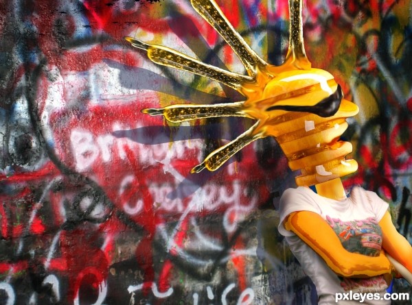
This is so .... punk!
Good idea, author, good job too.
But looking at hi-res, It could take better care of the edges... IMO.
However, your job is pretty cool.
Good luck
Fun job, author! This is really cool. I agree with DanielaOwergoor...she has a good eye!
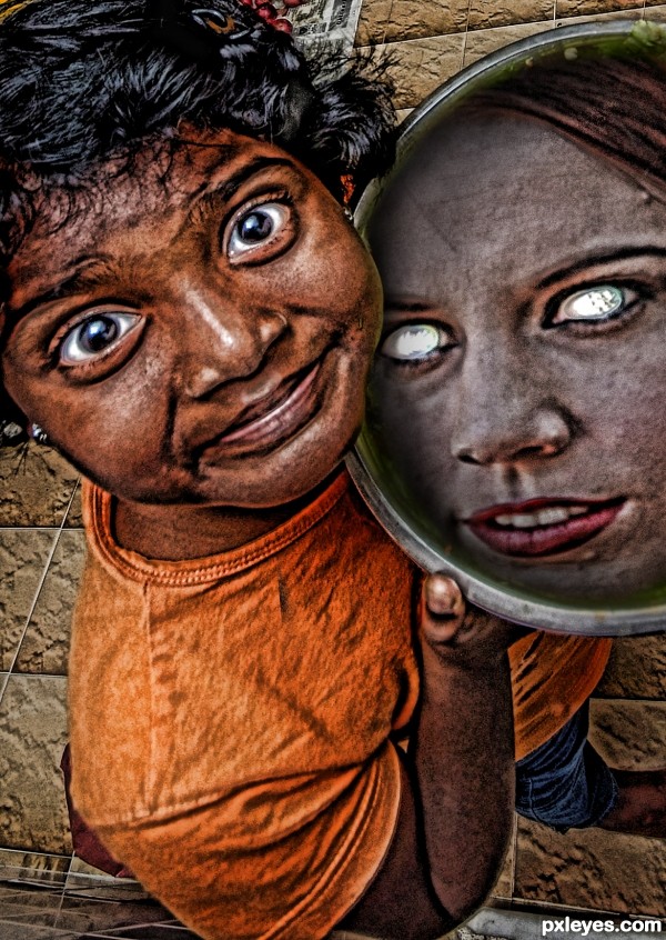
Another case of a really good composition and idea, needing a few tweaks to take it to a whole other couple of levels: arm is a bit too "cartoony" compared to the rest of the image (needs something like the specular hilites that are present in the face), the blurry top edge of the sunglasses don't match the sharp bottom edge, the character's mohawk kind of ends abruptly in a squared off angle at the very top of his head ... I'll shut up now.
Thanks for the comments. I agree with the edges. Any suggestions to take care of them? What tool would you use?
Author, the CLONE tool works great on finishing edges if the image has been flattened, if not, an erase tool set at 80% in a sharp edge setting can do the trick.. ,you can also use the BLUR tool if the edges are super tiny but have a lot of sharp edges, blur will soften and blend..
to hunt down Outer debris I usually use the STROKE setting and erase the bad stuff and then shut off the Stroke tool after I've cleaned..
Lots of other suggestions may follow I hope.. (I really have never understood photoshop that much, it's all quite Greek to me, but I got the basics).. Good Luck 
Thanks! I'll try these. The clone tool for sure.
Howdie stranger!
If you want to rate this picture or participate in this contest, just:
LOGIN HERE or REGISTER FOR FREE
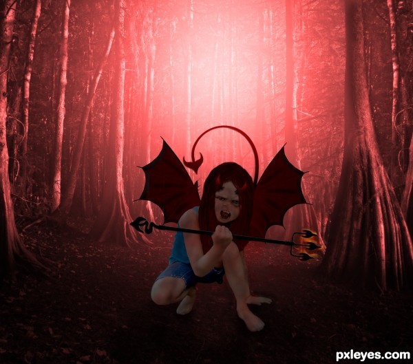
the hair looks really bad in high ress, the hand thats holding the fork is partly erased the fork goes straight thru her thumb and pinky lol, her cutout seems a bit shaky, the colors are okay, I would have added fire behind her though. I think you had a really great idea, the execution just needs to be a little better. holding off my vote for now.
thx for ur comment eladine, ur were right bout the hand lol, missed that, changed that and the hair also, i think the fire bhind here is a personal thing but thx for the suggestion
yes great improvement author except the thumb the fork now goes behind her thumb instead of her holding it. the pinky is right done now, just use a hard brush to erase some of the thumb and use burn to create a small darker edge where the fork comes out through the bend of her thumb. (hope that made sense) and yes the fire behind her is a personal thing and does not change the quality of your work, just a matter of different taste i think perhaps if u have the time you could let a tail come from behind her a little bit.
Howdie stranger!
If you want to rate this picture or participate in this contest, just:
LOGIN HERE or REGISTER FOR FREE