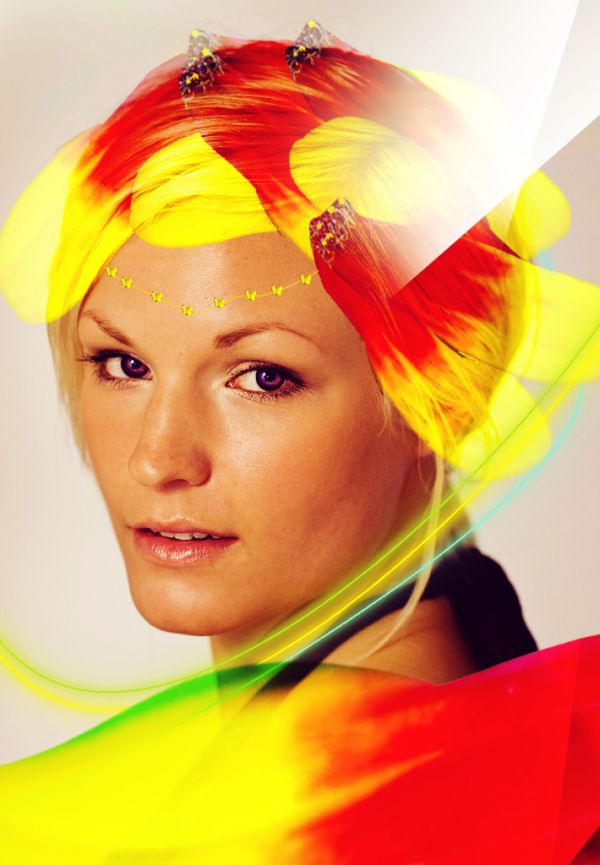
Cloned the hair, then messed around with filters and blending styles to get this effect. (5 years and 3609 days ago)
(5 years and 3625 days ago)
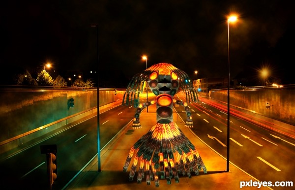
Look at the lighting in your background pic. The figure needs highlights & shadows.
I think you worked alot at it 
Nice effort; but I have to agree with CMYK 'bout highlights and shadows... 
nice work on the robot 

Best of Luck to you on this very original entry!!!
nice
Congrats for your third place, Lamantine!
Congratulations for 3rd
Congrats!
Thanks everyone for your votes and comments ! 
congratulations!! for 3rd place...
Congrats on 3rd!!!!!!!!
Congrats!!!! 
Congrats on 3rd palce 
Congrats!!
Howdie stranger!
If you want to rate this picture or participate in this contest, just:
LOGIN HERE or REGISTER FOR FREE
(5 years and 3659 days ago)
What are the white things in the upper right corner?
idea is nice but seems like blending is incomlete... and the white area is totally needless, better you remove that lines ... author.. GL
Howdie stranger!
If you want to rate this picture or participate in this contest, just:
LOGIN HERE or REGISTER FOR FREE
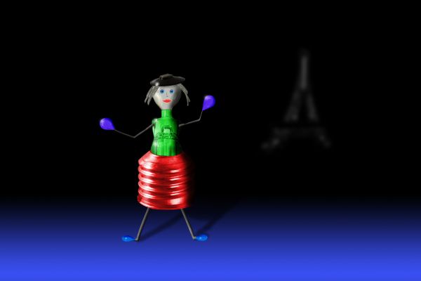
Used only the source image and Photoshop tools. Her hands and feet and scaled-down bulbs, her skirt is the bulb base, her body is the bulb innards (the part that holds the filament), her head is a small bulb, her hair and eyebrows are the filament (using smart objects and warp to shape them), and her hat is the bulb base tip. Her arms and legs are the part of the bulb that holds the filament. Her face I painted on with brushes, etc. The Eiffel tower in the BG was created with shapes and brushes, then warped and blurred. Added shadows and highlights with dodge and burn. (5 years and 3690 days ago)
Good use of source elements
very creative work
very creative 
Agree with the comments ! Very creative  gl author
Not a great composition, should focus more on the character you created...
Great creativity....good use of the elements....
Howdie stranger!
If you want to rate this picture or participate in this contest, just:
LOGIN HERE or REGISTER FOR FREE

1- I smoothed the skin .
2- then I colored the hair
3- then I retouched the face, eyes & brows .
4- then I edited the face shape ,eyes shape & the mouth .
5-finally I made some sparkle on the jewelries . (5 years and 3695 days ago)
I don't see any face slimming...
Howdie stranger!
If you want to rate this picture or participate in this contest, just:
LOGIN HERE or REGISTER FOR FREE
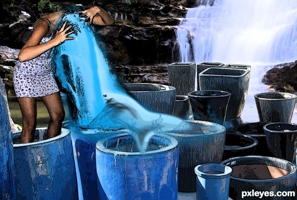
kinda superficial that water... otherwise the ideea it's good GL
GL
good luck
nice idea but i agree, water is looks very weird, good luck
I've never done water before and I kinda wanted the whole thing to look very abstract but judging by the comments I kinda failed on the water idea.
Thank you to Elisafox for the image of the woman and jpaulocv for the waterfall image
gl
nice attempt ......... gl.........
Howdie stranger!
If you want to rate this picture or participate in this contest, just:
LOGIN HERE or REGISTER FOR FREE