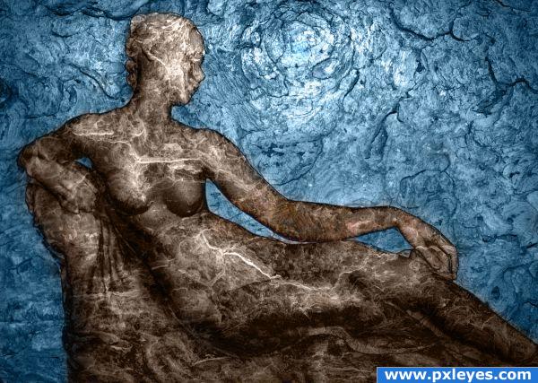
(5 years and 3814 days ago)
- 1: woman
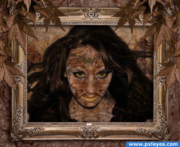
Bina Sveda,Roger Kirby,G & A Scholiers and Andrew C
Thank u guy's for great images.... (5 years and 3815 days ago)
Awesome. Good job!
nice job
Amazing!
Howdie stranger!
If you want to rate this picture or participate in this contest, just:
LOGIN HERE or REGISTER FOR FREE
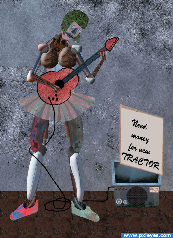
Only from the source image :)
Enjoy ;) (5 years and 3826 days ago)
cool
good use of source image.... good luck.....!
I like your unique use of source. The irony here is great! Perhaps soften your edges...
I agree with pixelkid. Soften your edges withliquify/push tool and maybe add some burn and dodge to give it more definition.
tips provided by other posters would improve.. Love the sign.. GREAT use of source.
Howdie stranger!
If you want to rate this picture or participate in this contest, just:
LOGIN HERE or REGISTER FOR FREE
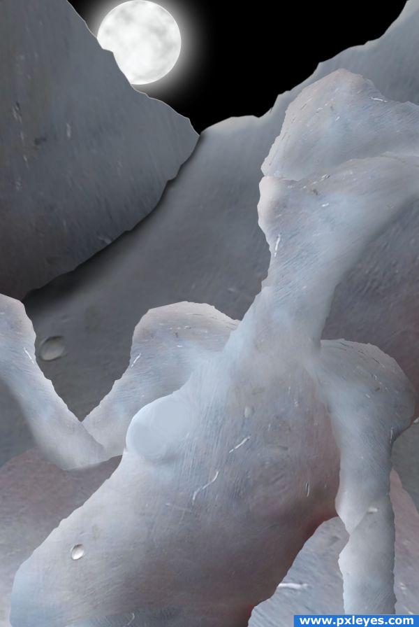
First entry here, and pretty new to photoshop, so all advice/criticism welcome...Don't know how to do screen-by-screen--Everything here is source image. Used pieces of the helmet stretched and distorted for the body and the landscape (other than sky (black fill layer). Made moon with the ellipse tool, render clouds, inner/outer glow and contrast. Details of body and mountains done with burn/dodge, smudge, erase, and some liquify bloating.
Again, comments/questions welcome! Thanks (5 years and 3834 days ago)
it doesent look to abmominable...only looks like a frozen woman
welcome to pxleyes
Hi, welcome...go to guidelines to read on the SBS...it's pretty easy...GL
Welcome! The trick to the "SBS" is to save your work in intervals, so that you can show how you created your image. Good Luck.
to make a quick SBS, go to FILE - SCRIPTS - LAYER COMPS TO FILES....and just make sure you export them as jpegs....don't forget to specify a folder for them to extract to.....and your layers will all be saved seperately for upload as SBS.
oh yes, and WELCOME!!!
Howdie stranger!
If you want to rate this picture or participate in this contest, just:
LOGIN HERE or REGISTER FOR FREE
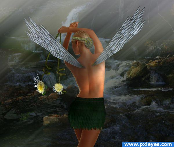
(5 years and 3836 days ago)
Looks like she's standing in front of the light, not in it...
Nice composition  I like the wings and the flowers she's holding in her hand. But maybe you could work a bit on the skirt. It looks very square. Maybe a bit liquify and dodge and burn can help to make it look like her butt is actually under that skirt
  Good luck!
I agree with cmyk, try lightening up her right side, while removing all the light streaks that any part of her touches from the left. I also suggest a gradient mask on the light itself, for added realism as the light dissipates. Also try what Lelaina suggested. Good luck 
oh author.. go a head and show the BUM... you put a lot of work into this, and it's not pornographic... and she has a great tush!! (red flag this and ask if it's okay to show her behind.. it would make this piece really pop!!!  great job
good change, much more dramatic.. (i agree with GolemAura! xD)
nce idea
Pretty good! But the wings look like they're floating behind the lady. Try blending the ends of them instead of just burning that part of the body. Good Luck 
Howdie stranger!
If you want to rate this picture or participate in this contest, just:
LOGIN HERE or REGISTER FOR FREE
One image already have the same name...
LOVELY )
)
nice
Awesome!
Howdie stranger!
If you want to rate this picture or participate in this contest, just:
LOGIN HERE or REGISTER FOR FREE