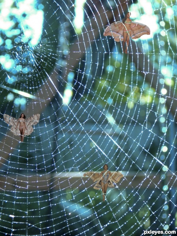
I have given up on those bars and pick up lines ...this works (5 years and 3075 days ago)
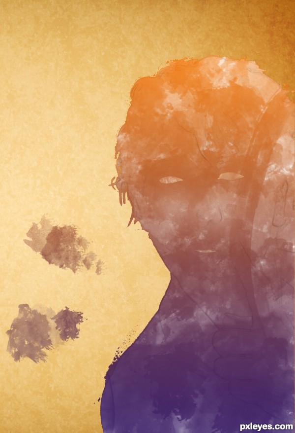
The woman, painted on yellow paper. it is my first entry, got tips anybody?
brush preset from:
brushking.eu (watermark) (5 years and 3096 days ago)
Nicely done author! I love your selection of colors! 
I dont know what exactly you where trying to reach so its hard for me to tell how to improve it.. if you want the woman on the background shine through your colors more you could try play with the blend modes .. like put it on over lay or soft light. now its hard to tell who it is and if its even a man or a woman.. if that was your goal then you did well  I like the colors u used...
Yeah.Play with some blend modes man, it will be really cool.. 
Howdie stranger!
If you want to rate this picture or participate in this contest, just:
LOGIN HERE or REGISTER FOR FREE
(5 years and 3103 days ago)
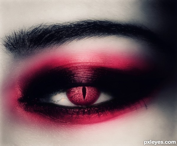
Too dark, color should extend above eyelid.
It was meant to be that dark,"gothic style"..
im gonna try to fix the color part.
The flesh of the eyeball itself looks black...Interesting concept, but the execution looks rushed, without attention to detail with the color just slapped on.
I dont think this was rushed?..thats a bit diferent,..I can call it simple edit, playing with effects..
about the slapped color..there's not a lot of room to play and extend the color..
I tried what I saw was right for my eyes..if mess with color too much,
then it would look like a clown..maybe u are right in the eyeball part..
Thanks for commenting!!.
I love it! ♥, I think I will go with this make up from now on 
JoeCacia lol,I think u will look pretty on pink..
Thank you so much author! 
I love it! I think the color is great!
I would shade a little more the pupil to give the imagine a bigger dynamic. Very nice idea.
Thanks for all comments!
and thank u Akassa im gonna work on all suggestions.
Fixed the color above eyelid,some dodge tool to give brightness to the eye,.. and shaded a tiny bit the pupil..thanks all for the suggestions.
innovative...
Too blurry..But good peace of thinking. 
Howdie stranger!
If you want to rate this picture or participate in this contest, just:
LOGIN HERE or REGISTER FOR FREE
(5 years and 3126 days ago)
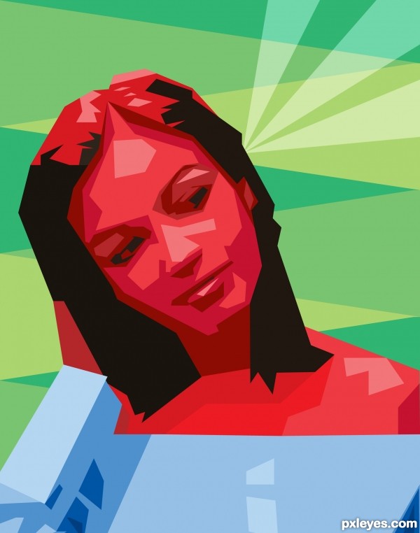
really like this one, would only take away a bit more from the sweater.
Great style 
Thanks wysiwyg! 
Nice one, yes. I agree with WYSIWYG about the sweater. Blue is a bit too dominant imo, while it has no important role. If you can crop the image on the lower part (i.e. remove a 3rd from the sweater) the balance in the image would increase. Good luck!
Removed some of the sweater.
Thanks wazowski!
very nice author
looks cool
Thank you for your comment and your fav Kush!!
Howdie stranger!
If you want to rate this picture or participate in this contest, just:
LOGIN HERE or REGISTER FOR FREE
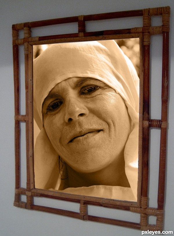
Changed the picture of the woman to sepia and superimosed on the other picture (5 years and 3157 days ago)
Howdie stranger!
If you want to rate this picture or participate in this contest, just:
LOGIN HERE or REGISTER FOR FREE
doesn't look like she is restrained in the web. Just looks like she is floating around it.
some shadowing may help with the restraint aspect.. creative thoughts author
Howdie stranger!
If you want to rate this picture or participate in this contest, just:
LOGIN HERE or REGISTER FOR FREE