(5 years and 3309 days ago)
thanks to
no1cristi
alifarid
zeafonso (5 years and 3414 days ago)
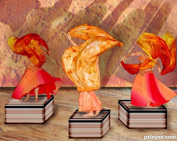
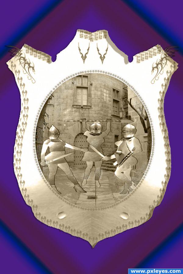
It's a nice compo, author, but a different color of the background would be good, because dancers become mixed up with it, and it takes a minute to recognize the image. 
Sorry, this is just too minimal use of source...
Lol I agree with both ! 
GL
I was thinking the same thing
nice
Congrats!
Congratulations! 
Congrats.......... 
Congrats!!
Howdie stranger!
If you want to rate this picture or participate in this contest, just:
LOGIN HERE or REGISTER FOR FREE
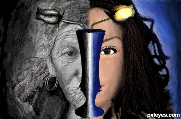
Two images were clubed part by part.Both of them were a bit posterized.Image on the right side was photo filtered with a variety of orange colour.Mainly brush tool was used to paint.Pen tool was used to select the vase.A little blur effect was given.
Sorry guyz nothing from source 2 was used. (5 years and 3442 days ago)
the idea is quite nice...
good work...
Please post your valuable comments. 
I think the blending of the two images needs attention where they meet in the middle. Lovely idea thought!
It's a nice idea, but I suppose source 2 is not valid (from blogs).
Source 2 is from blog. Please read http://www.pxleyes.com/blog/2009/06/how-and-where-to-find-legal-source-images/
I think you need to pay more attention to the size of the faces, it would be more effective if they line up well and look like the same person aged and un-aged.
thanq for ol da comments...
@raytedwell:-I thot tht when one gets old their face shrinks 
Howdie stranger!
If you want to rate this picture or participate in this contest, just:
LOGIN HERE or REGISTER FOR FREE
(5 years and 3572 days ago)
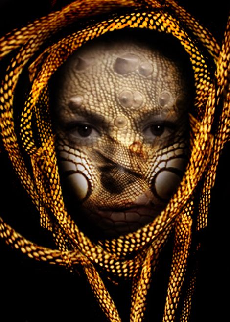
cool, I particularly like the bit 'stretched over the nose
this is great! thanks!
Howdie stranger!
If you want to rate this picture or participate in this contest, just:
LOGIN HERE or REGISTER FOR FREE
(5 years and 3728 days ago)
Howdie stranger!
If you want to rate this picture or participate in this contest, just:
LOGIN HERE or REGISTER FOR FREE
Needs a high res image.
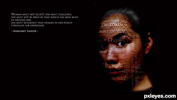
Great concept, but the face is a too red compared to the neck, and the text should fill the image more, especially the cheek and neck area.
Nice idea, even nicer though it would be to make the face only by text. Create a compact wall text and clip the asian face to it.
Before that use some warp and displacement map on the text wall so that it follows the shape of her head. GL.
Excellent concept, but the face looks too red.
nice work author...gl
Howdie stranger!
If you want to rate this picture or participate in this contest, just:
LOGIN HERE or REGISTER FOR FREE