(5 years and 3172 days ago)

(5 years and 3174 days ago)
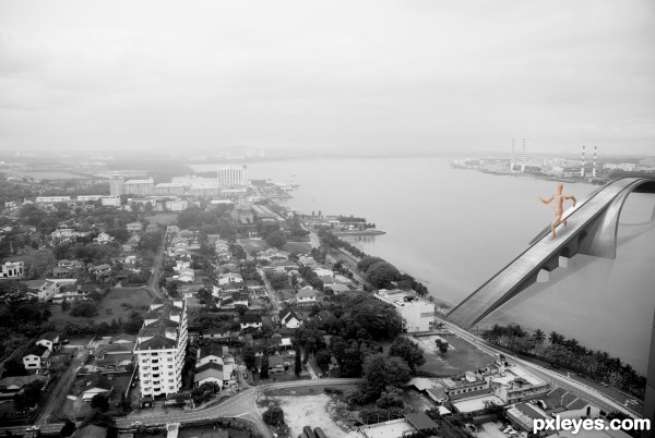
instead of the "guy" crossing the bridge, suggest substitute with ships/boats below it.
take care of the blending of the bridge and background image, so that they look as one.
perspectively speaking, the right side of the bridge should be smaller, since it is the furthest part.
it looks like an old postcard.... nice 
The wooden mannequin ruins the illusion of this piece. He just looks out of place, proportionally and color-wise. I agree, either ships beneath, or a bunch of tiny cars would fit better.
Try to manipulate the point where the bridge touch the land so the vehicles who pass can continue their journey in the road :p. There needs a path becuase it seems that you have not access to the city.
I agree for the wooden mannequin, looks like e giant who has swallowed the colors of the city, and because of him you are loosing the idea of an old postcard.
Good luck.
yep, the wooden figure doesn't fit, try to blend the bridge in to the picture and you should cork a bit on the reflections. in high resolution you can see the reflection details that it doesn't fit.
All the best 
Larger than life concept there.
Howdie stranger!
If you want to rate this picture or participate in this contest, just:
LOGIN HERE or REGISTER FOR FREE

Thanks to mqtrf for the nice stock images (5 years and 3389 days ago)
It's a good blend & mood here.
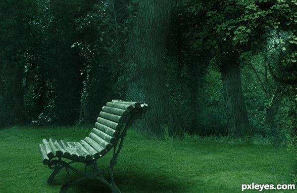
There's a mask prob. left side of the background and imo if there are leaves on the bench there should be on the grass too- it's easier to remove the ones on the bench.
thanks greymval , workign on them now 
This would be pretty convincing, but i would suggest a bit of shadow coming off of the front right leg where there is none now. GL!
Pretty, but too green overall. The tree trunks, particularly.
Totally my favorite in this contest...very nice mood and great execution...i will be surprised if this entry don't win...best of luck author...
Congrats
Congrats!
Congratulations, Sophia!
Congrats Sophia...
thanks to you all 
Congrats!!
Howdie stranger!
If you want to rate this picture or participate in this contest, just:
LOGIN HERE or REGISTER FOR FREE

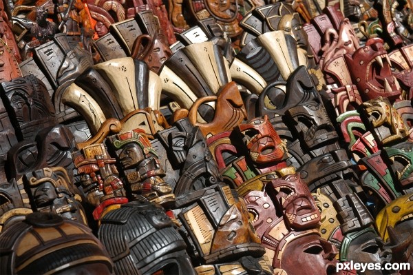
Items to look for:
Female Bust
Barrel
Pencil
Comb
Clothes Pin
Wooden Clog
Wooden Man (5 years and 3403 days ago)
YOU GAVE US A CHEAT SHEET!!!... LOL.. you are so fired!!!
Great job darling.. hehehe.. AWESOME IMAGE!!!
I thought we were supposed to provide a cheat sheet  LOL....Thanks for the compliment
And you can fire me anytime  LOL
LOL
Where's the female bust !? I'm ussually good at this.. oh, found it.
Found all; the wooden man was the hardest for me but I didn't look at the cheat sheet! Very good work!
Finding the pencil made me laugh, very well hidden = )
It's been fun to read the comments of what people find or couldn't find...definitely a cool contest idea thanks Emik for suggesting it  I had a lot of fun with it
great construction author....gl
Congrats for your second place, Christy!
Congrats ... I really had fun with this one. Everything was so well hidden it was sooooo hard not to cheat!
Howdie stranger!
If you want to rate this picture or participate in this contest, just:
LOGIN HERE or REGISTER FOR FREE

May not be safe near fire :)
Only source and texture used.
Try to see the high-resolution image, the texture and the details of the armor look great in it. (5 years and 3406 days ago)
Try warping the wood grain to conform to the contours of the armor. Also, reducing the highlights would help it appear wooden.
looks bronze to me maybe even gold idk haha
Nice work author...gl
Howdie stranger!
If you want to rate this picture or participate in this contest, just:
LOGIN HERE or REGISTER FOR FREE
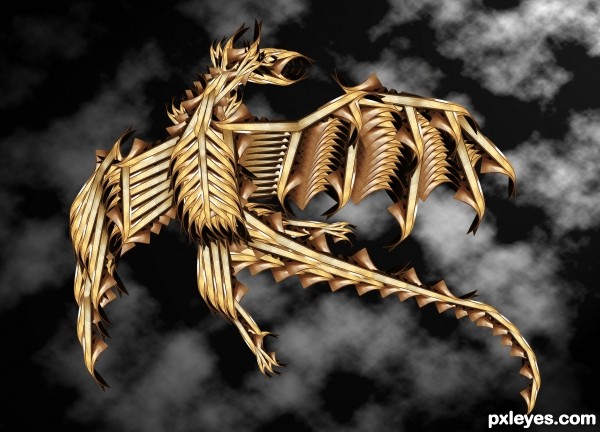
I love the contruction of the dragon, and I think you have done a terrific job there, however, I feel the background doesn't do your dragon justice. The high contrast in the background is distracting and pulls your eye from the detail of the dragon, perhaps you could blur the background. Although what I think would look really nice, is a photo with mountains in the bottom third and sky above, but again I'd blur it a lot to create a good depth of field, so that the eye is drawn towards the dragon. Good luck
thanks for your kind comment!
Love the dragon! The background really is distracting, though.
Sweet Dragon.
congrats
Congrats!
thanks guys for voted & liked!
Howdie stranger!
If you want to rate this picture or participate in this contest, just:
LOGIN HERE or REGISTER FOR FREE