
Only supplied image used.
(5 years and 3555 days ago)
(5 years and 3644 days ago)
nice idea.....
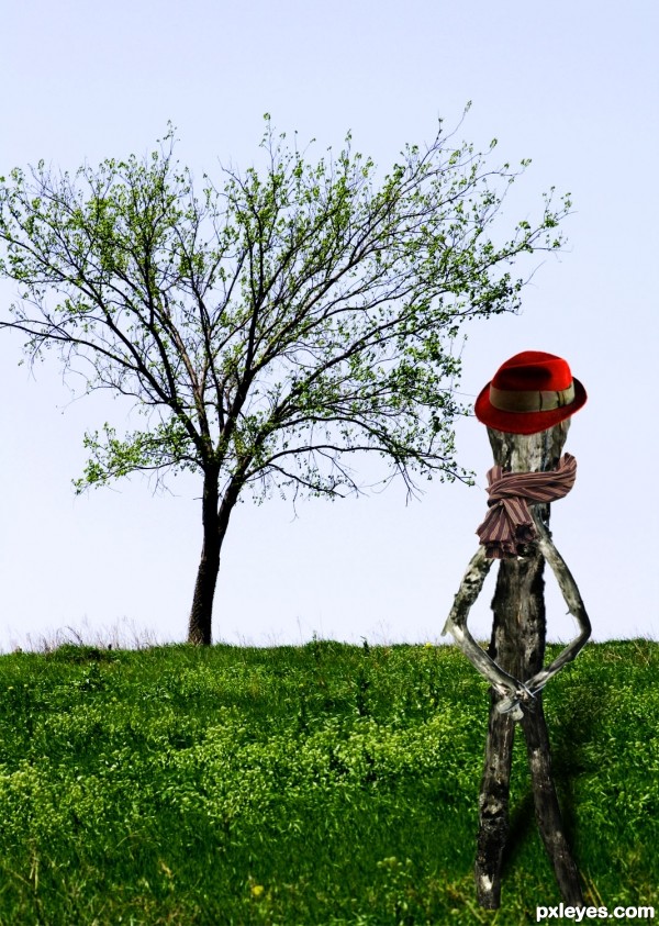
Now it looks like some of the mask on his head is hiding some of the tree, like there's almost a square shaped clean space around his head. Fix that and it's awesome. Very good work otherwise.
Congrats for your third place!
Congratulations! 
Congratulations,
congrats
Howdie stranger!
If you want to rate this picture or participate in this contest, just:
LOGIN HERE or REGISTER FOR FREE
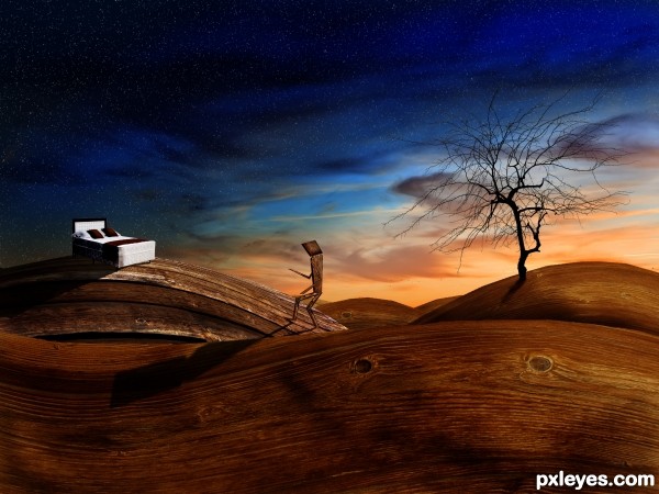
Up the wooden hill -
When you go up the wooden hill, you go up the stairs to bed.
Thanks to michelsick for the bed.
Thanks to Chemtec for the sky.
Thanks to dlritter for the tree.
Thanks to somadjinn for the wood 1.
Thanks to kovic for the wood 2. (5 years and 3686 days ago)
Very surrealistic approach and a lovely representation of the idiom... great job!
i agree!! great job!!... somethin bout the bottom of that tree looks a little off to me... could just be me though.. Great Work!!
I don't often mark things as my favourites unless they keep me coming back to see it.. and every 30 minutes or so i find myself staring at this again and again... Wow.
Thank you very much! I touched up the base of the tree westfall.
much better!.. and i agree... this one draws me back as well
I'm unfamiliar with the idiom, so I appreciated the explanation. The wooden landscape is lovely, but I don't get why the figure is also made of wood.
It just seemed to be fitting in the world of wood that I created. The figures being made of wood has no significance towards the idiom, only to the piece. 
Funny image  the sky looks very nice. I would suggest to change the shadows. The shadow of the man is way to big and comes to far to the front, while the shadow of the tree isn't getting any close to that and it's even higher. Removing the shadow on the front hill and sharpening the edge of the tree shadow (also stretch the shadow more downwards without fading it out) would finish the job
  Good luck!
it is very nice work ,good luck
I am glad so many people like this entry 
Ressiv, I know the shadows are off a bit, I retweaked them but I am going to let this entry ride like it is. Once the contest is over I will upload my adjusted to my profile.
I think I kind of like how the shadows don't totally match the logic of the lighting.
good luck
Congrats 
Congrats for your first place, Phubar!
Holy crap I actually won a contest! Awessome, thanks for the votes everyone!
Congratulations for 1st, really nice pic.
congrats!!
Congrats, a lovely piece of work 
Congrats for the 1st place . . . . 
Congrats sweetie!
Congrats! for 1st place
Great work! CONGRATS!!!
congrats! 
congrats on 1st place....
Congrats phubar! Well deserved win 
Howdie stranger!
If you want to rate this picture or participate in this contest, just:
LOGIN HERE or REGISTER FOR FREE
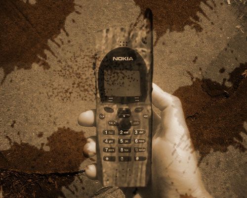
Thanks to horia varlan for the picture of the wood.
Thanks to thelastminute for the picture of the phone. (5 years and 3739 days ago)
High res would have been nice -- blending of the phone and the wood is hard to see with the grunge background and the single color. Try masking the wood over the phone then try various blending modes (a layer in overlay mode with a copy above in multiply is usually a good spot to start) Then play with the fill or opacity levels
PS . Look for a better wood source the one you have now is too blurry and will not blend as well as a sharper image -- good luck
Is it also a wooden hand ?
Nice effort.....
I think the splash layer has to be under the hand layer... 
GL
agrees with Alan
Howdie stranger!
If you want to rate this picture or participate in this contest, just:
LOGIN HERE or REGISTER FOR FREE
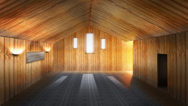
A fairly plain room, but i have tried to add some interest by using lights and shaddows. (5 years and 3862 days ago)
I like this one! A couple of goofy things though from what I'm seeing: the sunlight would stop seeping into the room at the top of where the ceiling meets the farthest wall. Presently it is above that line a little bit? Also, it may be correct, but the top of the dark door on the right looks tilted and doesn't seem to match the ceiling line above it. Still, great job on this!
Great job on this
very appealing!
This is good but silver surfer was right about the door. Other than that, it's very well done.
Thanks for your very keen eyes SilverSurfer and jawshoewhah. I have now corrected this if you haven't already voted.
Perfect work, the lighting effects look so realistic 
Much better!
this is a very skilled image. love the lighting from the windows and side lights.
Very nice use of source.. i love the light.
Congrats for your second place, Fezjez!
Congrats! You earned it 
Congrats!
thanks for all who commented and voted.
congrats!
Congrats!!
congrats 
Howdie stranger!
If you want to rate this picture or participate in this contest, just:
LOGIN HERE or REGISTER FOR FREE
lot of sharp edging... I LIKE IT.. good luck!!!
Lovely graphic quality.
It's a little on the CBR'd side. But that's just IMO....
Howdie stranger!
If you want to rate this picture or participate in this contest, just:
LOGIN HERE or REGISTER FOR FREE