ONLY SOURCE (5 years and 4031 days ago)

only source (5 years and 4033 days ago)
well done. nice image 
yep very nice!  gl
gl
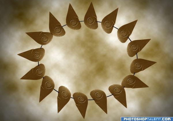
Nice image overall..just wondering if it could use a little UMPH.. maybe a little more intersting back ground or brightening of the subject.. just a thought.. over all very solid image.. with nothing to contrast against.. it's a very free to go image.. GOOD JOB
simple, but good
Try blurring the background with Gaussian blur at about 30 pixels. It'll get rid of that obvious 'rendered clouds filter' look. Great job! 
Howdie stranger!
If you want to rate this picture or participate in this contest, just:
LOGIN HERE or REGISTER FOR FREE

this is my first trial.
all images used was posted, all others were create (5 years and 4036 days ago)
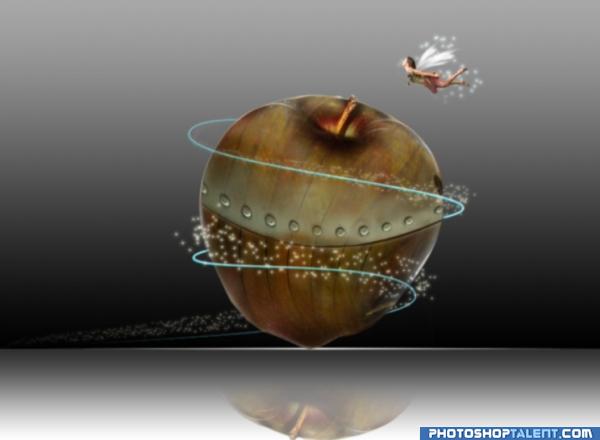
would have loved to have been present at the photo shoot of your fairy source.. BWHAAA HAA HAA.. I wonder how many times she let out a yelp of annoyance.. beautiful image by the way.. some sources just crack me up because I know what peeps went through to make them LOL
in time, an SBS would be nice for your pieces.. peeps like to know how you made the entry so they can rate you higher
Is that a hole on the side?? [EDIT: helps if I look at the source!! ] Like a house for the fairy? Your spacing on the rivets needs some work too.. Not sure whats happened to the reflection? Have you flipped it yet?
Great idea. Good luck!
very nice done! good luck 
Ok author - you have flipped the reflection, now you need to drop it down more and fade it out.. GL
good idea, need to improve
very nice idea
nice
very interesting, congratulations
Howdie stranger!
If you want to rate this picture or participate in this contest, just:
LOGIN HERE or REGISTER FOR FREE

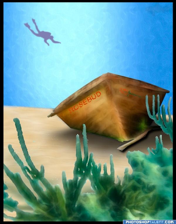
I played with Photoshop's painting and drawing tools. I created a brush for the water, adjusted the transparency and saturation, blurred the diver, seaweed, and shark, adjusting the saturation levels to help create depth. I used the transform tools to play with the text and rosebud and then eroded them to add aging and the results of being under water. I used a drop shadow and played with feathering and transparency for the dinghy on the sand. I applied texture to the sand, adjusting the transparency until I achieved the subtle look I wanted. I used a seaweed photo and a clipart diver for references from my Microsoft clip organizer. (5 years and 4037 days ago)
Yeahh, the other day Citizen Kane was on tv, but fell asleep  . Looks quite ok, but you have to show how you made your entry, author. Also, better remove the sign right under since all entries have to remain anonymous. Good luck!
need to improve
I really like the colors. Small suggestion...Give some shadings and variation to the water and scuba diver. Right now, the diver looks a bit flat. perhaps shade the sides a bit darker and the middle (belly) a bit lighter. This will give it some shape. Just a thought...nice work!!
Howdie stranger!
If you want to rate this picture or participate in this contest, just:
LOGIN HERE or REGISTER FOR FREE
cool

looks nice
nice work of art, good colors
Nice work, good to see this.
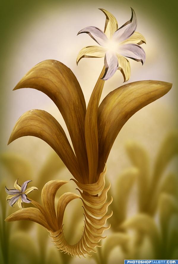
love the wiggly stem.. and the fact the wholething is floating is a lot of fun.. good luck
Very Artistic Flower......... Good work Author.........Good Luck.
very nice
Nicely done. I like the blur you've applied to the background. Good luck!
Good job author i like the movement in the flower
Excellent job! Great color choice.
Congratulations for 3rd
congrats
congrats
Howdie stranger!
If you want to rate this picture or participate in this contest, just:
LOGIN HERE or REGISTER FOR FREE