(5 years and 3159 days ago)

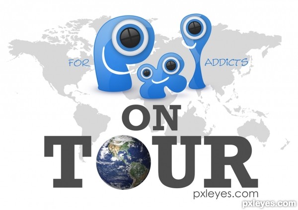
the back could be the other side of the earth and people could mark their approx. location (5 years and 3160 days ago)
Really nice concept. Good manipulation!
Really great concept but you are missing a part of the description 'PXL ON TOUR' should be mentioned in the design 
I like your idea of adding a print on the back. 

Cool!
I am so inpressed with so many wonderful entries here and this is definitely one of the best!
Very good potential for a white T-shirt. I do feel more contrast (shadows?) between "PXL ON TOUR" and the background would be more striking when printed on the T-shirt.
The logos on the compass points seem repetitious and boring. Would it be too trite to dress them in parkas, sombreros, grass skirts, kimonos, etc. to add some variety? Or perhaps they could be deleted altogether for a simple, less-is-more approach.
lovely entry.. good context and usage of images for the shirt.
I like This, nice work !
I like your idea, but if you just make the words, "ON TOUR" a little bigger and separated from eachother, in this way they will be more readable. You have enough space between the edges of the world to make the change. This is just my opinion, the design is yours. Good luck.
I always received some great ideas and comments thank you all. The quandary I have is when to apply them? In this case I agree the letter could be larger and since this is a focus of the T shirt I have revised it.
..
ty you all for the kind and informative comments
great work...
lovely
One of the best..
Good work! congrats
Nice Congrats
Congrats..
Howdie stranger!
If you want to rate this picture or participate in this contest, just:
LOGIN HERE or REGISTER FOR FREE

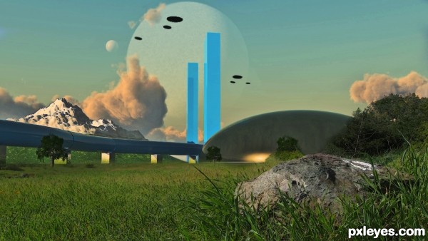
This is a compilation of work done with CS5, 3DS Max 2010 and VUE 9.5 XStream. (5 years and 3168 days ago)
The pink cloud next to the blue towers looks odd with the vertical shaping, and competes with the towers and the moons for visual dominance.
The snowy mountain is a bit too high contrast compared to the rest of the image, while the black space ships are too dark, looking like painted spots with no depth.
The blue towers show odd blue shapes (reflections of each other?) that are inconsistent with their placement, and distracting, particularly the one on the front of the rightmost tower.
The light reflection at the bottom of the dark dome shape is misplaced, since the large clouds show a light source much higher in the sky.
And what is the white mark on the right of the rock in front? It looks out of place.
It's a really good composition, and has good visual flow, you just need to adjust your lighting, reflections, and that big cloud.
 MossyB, I am so glad you like it. As for the reflections and refraction's on those towers...I suppose you are a bigger expert on how the software handles light than the folks that created the software. There is only one light source and it was set by the program a single sun. I am very happy you noticed the clouds I wanted them to be stark looking and a dominant force in my scene. The white spot on the rock...well I suppose some wildlife on the alien world has visited.
Software is not invincible, and often does not take into account the difference between a spotlight aimed at a subject, and a sun, millions of miles away, providing "global" illumination on a planet with an atmosphere...
I wonder if there's an alien version of Pepto Bismol for those embarassing travel moments?
Why that spot of nature adds a good deal of realism to my picture, thanks for spotting that I had not even noticed until you pointed it out. Funny what draws certain peeps eyes, no wonder you said my picture has good composition and visual flow.
Thanks!
Nice 3D work, author, this has a 50s-60s scifi look, which I love! Cool texture on the foreground elements, too. 
Howdie stranger!
If you want to rate this picture or participate in this contest, just:
LOGIN HERE or REGISTER FOR FREE

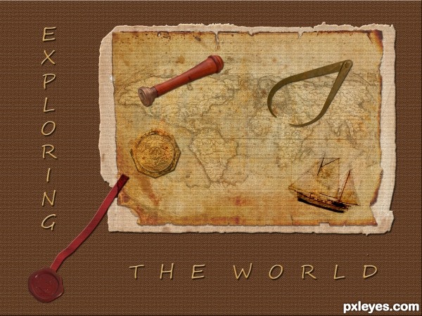
OLD PAPER thanks to SHLOMASTER
ANTIQUE WORLD MAP thanks to THESWEDISH
COMPASS thanks to GERBERA
SUNDIAL thanks to NASTYSENSTY
VINTAGE SEAL 1 thanks to HISKS
WAVY RIBBON 1 thanks to WEMEDGE
CLASSIFIED thanks to PLUSVERDE
(5 years and 3188 days ago)

Howdie stranger!
If you want to rate this picture or participate in this contest, just:
LOGIN HERE or REGISTER FOR FREE

Thanks to NightFateStock (5 years and 3201 days ago)
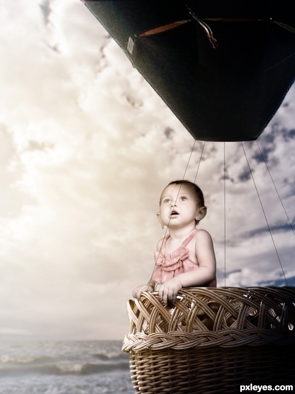
Ballon & basket are out of proportion. Too many white edges on child & balloon.
The white edges were done using the Glowing Edges filter set to screen, they were intentional. As for the proportion i'm very aware of it but it would've made for a boring image if they were.
Might have been easier to make a SBS explaining that, then...??
The lighting is too inconsistent and wonky, from the intentional glow edges, which just look like a bad extraction, to the totally black balloon, showing no light refraction/reflection from the strong light source of the sun.
The "shadows" from the totally black balloon lines also look very unrealistic, and not in a good fantasy way.
While an SBS would help the view recognize which poor chopping effects are deliberate, this is still an image that needs work, either to look more realistic, or more fantasy. At present, it just looks very novice, especially for a photoshop competition, IMHO.
Glowing edges overlay removed, black lines made thinner, more light added to the balloon and scaled down the child slightly. Thank you.
Maybe it's just me but the balloon feels a little low compared to the water... I can foresee an imminent and dramatic crash on the horizon...
Oh and on the subject of the balloon and basket being 'out of proportion' I think it probably looks better this way than if they were not scaled down to the baby. Now do feel free to ignore this if it becomes pretentious but a full size basket would give the idea that it was being seen by an adult and that the baby was out of place or intruding for comic effect. Whereas a smaller basket kind of gives the impression that it is being seen by the child, in its own world, and that the basket is specifically for it, not adults. I warned you it would become pretentious...
balloon color to change to match overall color scheme
strings not strong enough to hold balloon, change to ropes?
nice idea 
Howdie stranger!
If you want to rate this picture or participate in this contest, just:
LOGIN HERE or REGISTER FOR FREE
Great idea. Perfect displaying and message.
Can you make it a bit bigger within the space you have? we have an A4 space to print and there's a lot of wasted space this way, the logo can be bigger on the shirt
Maybe you can add "www." in front of the URL?
thanks for including Tasmania in your world map many don't
Love this concept for a T shirt.
It seems to me that the PXL logo should be clearly the biggest element and the "for addicts" is restrictive and possibly derogatory to those who regularly participate on this site. The background map seems redundant given the globe and distracting overall—I would delete it.
I love the way all of this is put together. I don't think it is derogatory and I don't think the map is redundant. I think this is the best one so far and would look great on a t-shirt. I like how you also put the web address so people can go to the site to see what the shirt is all about!
Thanks k5683..it's nice to see that u got my point of view on this contest.
The site's tagline is "For Pixel Addicts" why not use it in the design....Dan??? Good concept for this author , nice looking design.
Howdie stranger!
If you want to rate this picture or participate in this contest, just:
LOGIN HERE or REGISTER FOR FREE