(5 years and 3203 days ago)
(5 years and 3230 days ago)
keep it simple 
Too simple, IMO, but the underlying concept is creative. If I didn't know the theme of this contest, I'm not sure I would have noticed the owl faces. I would delete the little owl (just distracting) and make the big owl's gray portions a different color. The tag line on the bottom right doesn't add anything IMO and its font is totally at odds with the rest of the image.
great!
Smart!
Howdie stranger!
If you want to rate this picture or participate in this contest, just:
LOGIN HERE or REGISTER FOR FREE
thanks to:
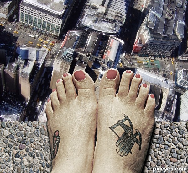
nevinstyre: concrete
hbrinkman: new york (5 years and 3235 days ago)
Very cool!
Oh... Don't jump! Nice.... GL
believable!
Congrats!!
congrats, good work
Thank you all
Congrats!
Howdie stranger!
If you want to rate this picture or participate in this contest, just:
LOGIN HERE or REGISTER FOR FREE
(5 years and 3237 days ago)
Howdie stranger!
If you want to rate this picture or participate in this contest, just:
LOGIN HERE or REGISTER FOR FREE
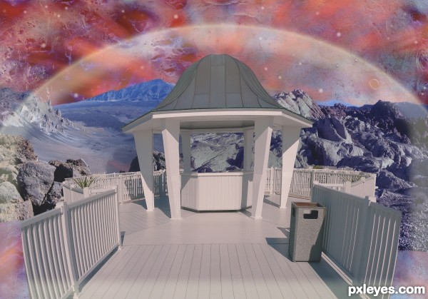
I used source at 4 different place and in 4 new way (5 years and 3237 days ago)
Howdie stranger!
If you want to rate this picture or participate in this contest, just:
LOGIN HERE or REGISTER FOR FREE
Yep.
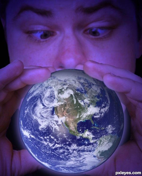
soften the edges around the globe, alittle 'cut-out' feel now

can intensify the glow, add some 'light glow' at the finger-tips
The skin tones are too purple, and the dark outline around the planet belies the lighter glow of the atmosphere.
Interesting concept, but the technical needs some adjustment.
Howdie stranger!
If you want to rate this picture or participate in this contest, just:
LOGIN HERE or REGISTER FOR FREE