
(5 years and 3748 days ago)
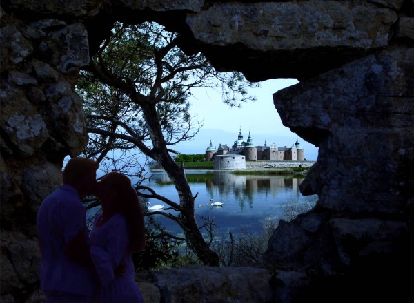
A Kiss in the Shadows has the contrast of the castle in a serene lake to a young couple having a few stolen moments in a shadowed grotto. Thanks to rikorocki at morguefile.com for the stone wall and tree, and to mikrash at morguefile.com for the wedding day photo. (5 years and 3752 days ago)
Light on castle is from right, light on tree is from left...
Nice composition. It would have been improved if you used a layer mask for the castle (around the tree area). The soft eraser has just made it fade to oblivion.
very nice 
So romantic! 
wow nice idea. the first kiss
Howdie stranger!
If you want to rate this picture or participate in this contest, just:
LOGIN HERE or REGISTER FOR FREE
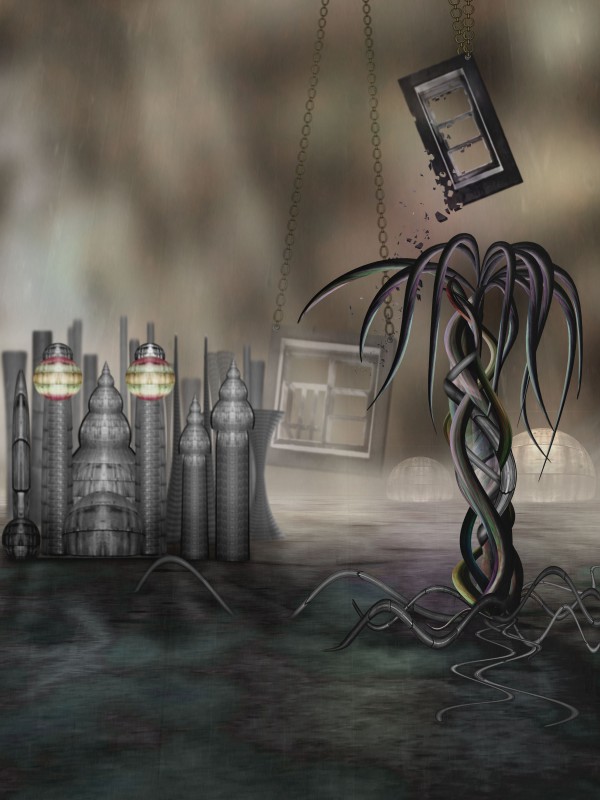
Only the source image is used (5 years and 3758 days ago)
Very nice image, i would suggest darkening the bottom of the buildings a bit, but the rest looks good.. wonderful mood.
Kind of surrealistic feeling... nicely done.. good luck author.
great work
Good creation.
Congratulations for 3rd place....
Congrats,
Congratulations! Beautiful surreal work 
Congrats! for 3rd. Creative use of source 
Congratulations for third place!
congrats Cornelia
Congrats for your third place and a Happy New Year, Cornelia!
congrats 
Howdie stranger!
If you want to rate this picture or participate in this contest, just:
LOGIN HERE or REGISTER FOR FREE
(5 years and 3764 days ago)
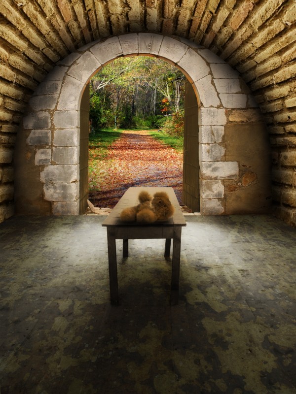
Maybe the wood & stone shouldn't be the same color, but good job over all...

Thank you CMYK  Everything colourized or texturized now...
Wow...really a LOT better now! 
i dont know, but the perspective seems a bit wrong from my site of view.. i really don't know .. :p
Well put maXed. There are two things that make for this impression: the table, which is askew, and the path outside. The table bends to the right and the path to the left. I didn't change the original table and the floor under the texture 
Its the door that looks askew. I see you were trying to follow the trail but I think it would look better if it was just equally balanced with the same width on both sides. Just my opinion.
Right, I turned round the wall where the door is about -1º. It's the same degree I turned the source image round as to get its horizontal lines straight (It's easy to see the source image is askew when you turn the grides on). I turned the landscape round too, a bit to the right. Thank you 
the teddy bear looks out of place i don't know if you can do this lol (but probably just add a new layer) add noise to the room on the inside and leave the forest bright so it catches your eye
Thanks for your suggestion kayaklovergirl, but the idea is not make the forest catch the eye but integrate the whole. As for the teddy bear, I think that an abandonned toy in a place always makes emptiness and loneliness greater. Well, one may assume that there was a child in the room and now he is playing in the forest out there 
This image, looks real good. Illumination coming from the outside is good. Probably darkening the wall (front) by the door, a little, and the doors look kind of dark. If light is coming from the outside and the door is open, it would be a "little" more highlight over it. A kind of clear, brownish color will do it, just like you did at the bottom left, by the door stop, (stone). The teddy bear is ok as it is, and it brings a special feeling to your work. Good luck! 
Thank you George! Changed...
looks better....
Nice work author. Looks nice
Howdie stranger!
If you want to rate this picture or participate in this contest, just:
LOGIN HERE or REGISTER FOR FREE
(5 years and 3770 days ago)
Nice idea and beautiful image
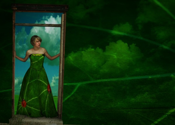
I've seen this girl before  .. either ways it looks good. love the skies in the leaf.
this is a beautiful image. well done author.
Nicely done, like the colors. Maybe a bit lighter air (just behind the girl), so you see the girl even better, but that's maybe also a personal thing. Good luck!
loving it!
thanks a lott for comments,and sorry i decided to change a bit this image, more dark and some lights.thanks
Very nice use of source... i'm not a great fan of the lens flare, however. Still - good luck!
Good use of source, But PLEASE remove the lens flare.
 lodd, i dt understand why so many people here dt like lens flare,some times can give a nice effect.but you u here right here, better without,merry Christmas

Very nice image! Really like the separation of the doorway and the rest. 
Good use of source, very creative. Author, this entry will work well for the amazing dresses contest too.
Very very nice work,great overall mood,and the touch of clouds on the wall is fabulous...good luck author
fantastic...
It's a nice chop, but probably a little soon to reuse the same image. It kind of reveals yoru idenity.
EDIT: OK your not the same artist. What are the odds of finding the same stock? 
congrats 
Congrats! for 3rd 
Congrats,
Congrats!
Congratulations!
ooh thats pretty
ooh thats pretty
Howdie stranger!
If you want to rate this picture or participate in this contest, just:
LOGIN HERE or REGISTER FOR FREE
Might be better with some sort of background...
I feel like there's too much going on in the globe. If I didn't know what the source image was I'd be very confused.
I like it!
nice
Howdie stranger!
If you want to rate this picture or participate in this contest, just:
LOGIN HERE or REGISTER FOR FREE