
No external resources or references used. Completely done just using shapes I created using pen tool. Do take a look in high resolution and let me know. Thanks :) (5 years and 3235 days ago)
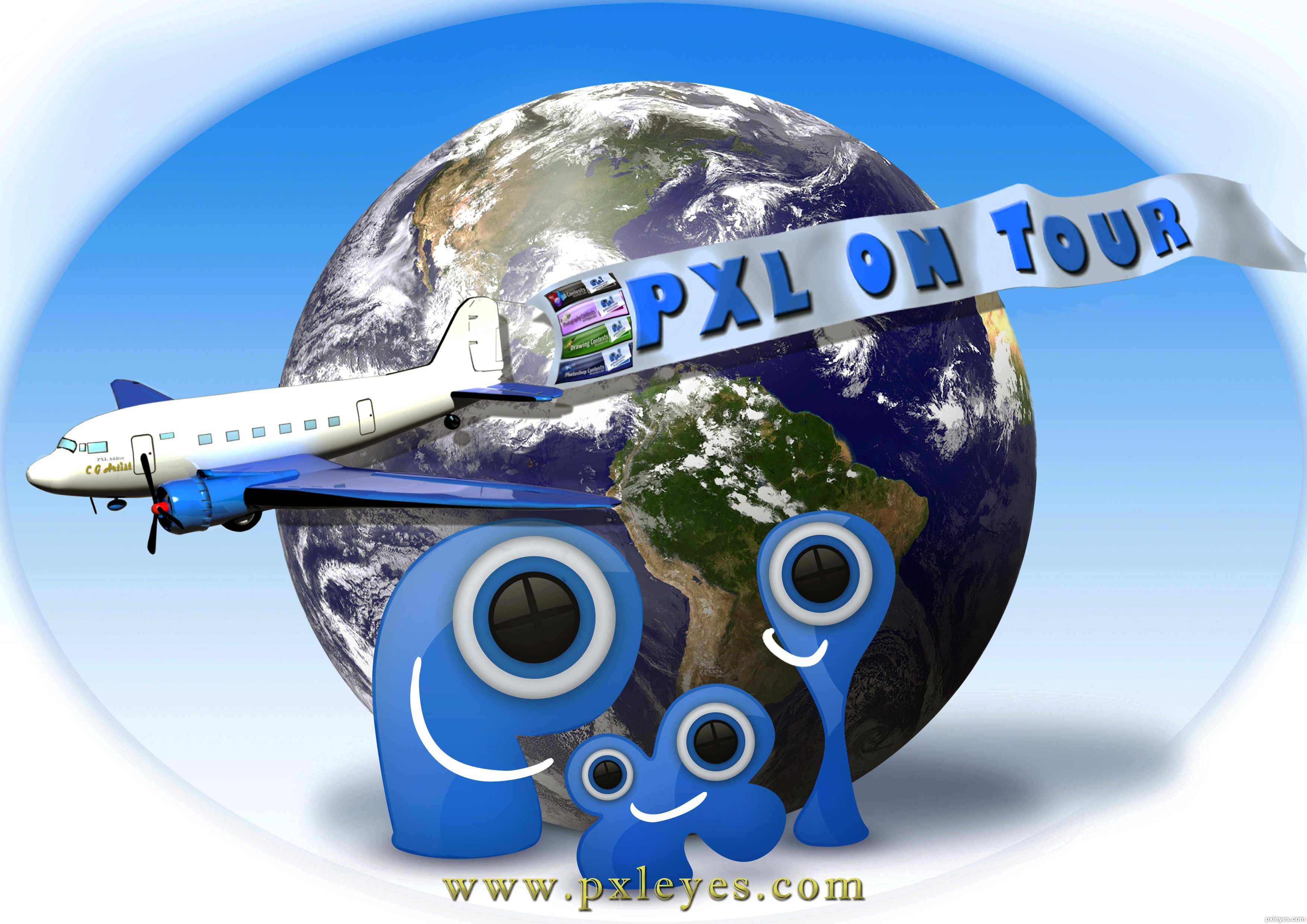
The source for mother Earth is compliments of "NOAA-NASA GOES Project" The images at this site are in the public domain.
The particular image is the GEOS EAST latest full disk image 19:40 UTC Sept. 1 2011. I used this particular days picture for this work it was found@ http://goes.gsfc.nasa.gov/goescolor/goeseast/overview2/color_lrg/latestfull.jpg
The WEBSITE where I got this particular picture is linked below...find the NASA link named "full disk image" these will vary as so does the weather. (5 years and 3235 days ago)
This entry has been edited and republished. Due to an oversight on my part regarding PXL policy on the use of pre-made illustrations or "tubes." The former airplane illustration has been replaced by a 3D render created by me using 3D Studio Max. Thanks
The sources used were masked and positioned.The flying banner is a rectangle filled with color, text rasterized and merged down. Shadow of Earth is brush work. Gradient fill as background.
Stunning!!!!! This is amazing!
The drop shadow off the plane wing and banner are falling onto the planet behind it, while the Pxl shadows are dropping down and are more diffuse...

very happy image  good luck author
MossyB I am fully aware of the way my shadows are, and did it intentionally. Thank you very much.
I thought you might have been deliberately inconsistent, so as to reflect all levels of talent here on the site, since inconsistent lighting and shadows are some of the biggest and most common mistakes people make, but thought I'd mention it just in case you were striving for a higher quality entry. Glad to know my initial feeling was the right one. 
Appealing concept.
In hi-res, the four mini banners on the left side of the big banner are sharper than the rest of that banner. But it's hard to imagine that those mini banners would be legible printed on a T-shirt, let alone why they're flying in a different breeze than the big banner when I would assume those mini banners are actually printed on the big banner. Bottom line: I would delete the mini banners and sharpen the remaining part of the big banner.
The earth is realistic, the logo is drawn but clearly a logo, while the plane with banner is in-between. I think the plane and banner should be an obvious illustration on top of everything else so it stands out as the true foreground element that expresses the primary message of the image. Making the plane and banner bigger so there is greater overlap with the PXL logo would emphasize that point.
Looks amazing, very good job!
Good design, maybe you can change the background a bit? The final shirt will be white, meaning this print on a shirt will look like a block on it. If the background is more flowing into a gradient to white towards the outside it will look nicer on a shirt.
Can you add "www." in front of the URL?
Thanks for the compliments everyone. robvdn I made edits hopefully this will blend better to a white shirt.
i would put pxl air on the airplane or something instead that artist and i see some "stuff" in front of the right engine and around wings that should be erased.....small banners are not that good....but good idea...will vote later to see how it goes...gl
Deki, wow thanks for holding your Vote... The point out about my masking is appreciated and the problem has been edited, rookie error. lol. As far the name of or the text on my Gooney Bird and the small banners ( I presume you mean the PXL contest ad banners) your opinion is noted. Thanks
Very nice work, author - I love how ALL of the elements are 3D, or have that look. Work on the plane is very good, especially the detail of the engine and reflections of the fuselage and tail in the wings! I used to do artwork and print t-shirts, and this would look great on white.
Blue on blue, heartache on heartache...
the plane in the eyes doesn't look god. maybe you should put the P in the foreground
amazing work author
Howdie stranger!
If you want to rate this picture or participate in this contest, just:
LOGIN HERE or REGISTER FOR FREE
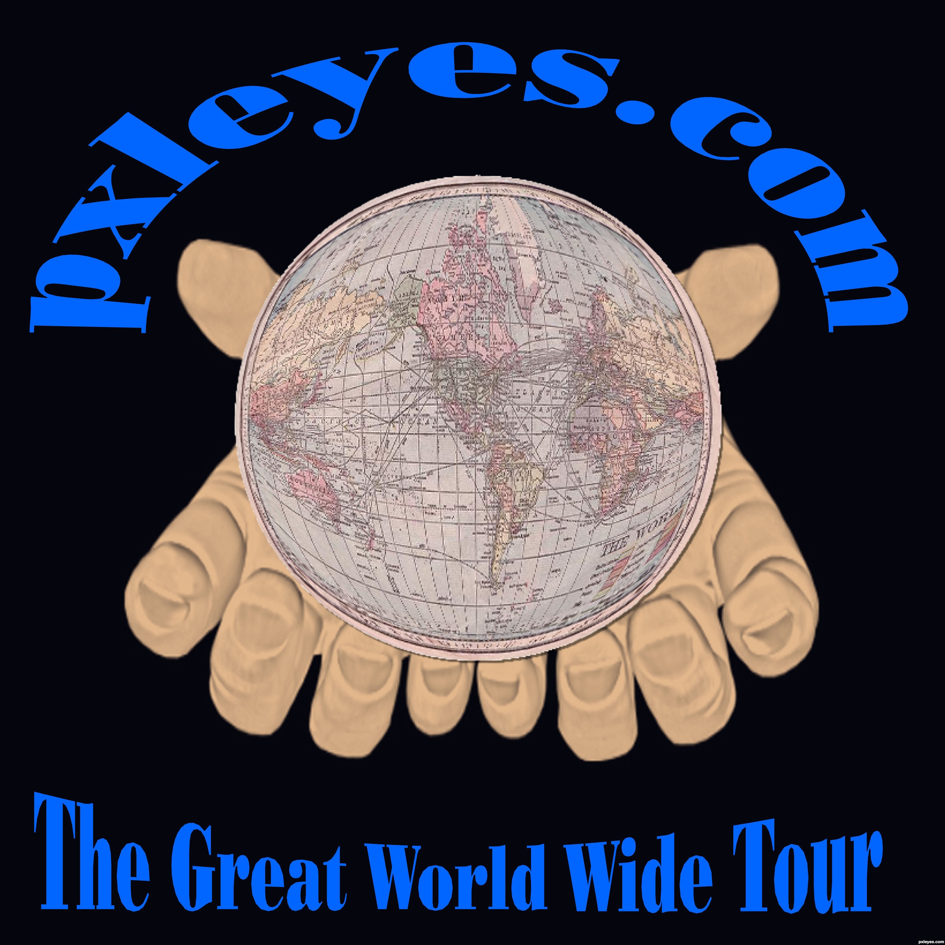
Spec Thanks to perpetualplum for use of his world map picture found on Flickr photo sharing.com (5 years and 3236 days ago)
The double space between 'World' and 'Wide' is distractring, made more so when they should really be a hyphenated adjective. The double PXL logos on the sides come across as secondary when a single big logo in the center could be compelling.
The fingernails are shaded funny, they look almost dirty.
DanLundberg Thanks for the comment I too care of it.
MossyB Thank you also The hands were done with a mask ok I redid by ding a solid hand and pasting over it but you lose the detale in hands and nail swhat I mean in # 10 in sbs. I put the redo #9 up. Yea maybe I could have had someone take picture of my hands But only one home with me is my dog..lol But thanks
really looks like a Tshirt logo.. good luck author
good work author good luck
Thanks guys.
Howdie stranger!
If you want to rate this picture or participate in this contest, just:
LOGIN HERE or REGISTER FOR FREE
A simple but attractive design.
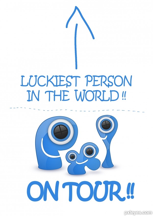
And don't forget .. it is going to be on a T-shirt !! (5 years and 3236 days ago)
I like how this recognizes that it's a T-shirt, but "Photoshop Me!!" might be a more appropriate message. I don't get the dotted line. The PXLEyes URL would be a useful addition.
supercool...
The dotted line is to separate the 2 texts cuz i'm 100% sure that people will read em toghether and to make it look more doodle-ie ;d .And about the url .. I made a version with it sideways to the whole image but it just didn't look righ with the doodle effect of the shirt
maybe if you take off that sentence - luckiest ......... - and put the website URL instead
----------------
brilliant idea man superb
love it
high vote and fav for you
perfect
good luck
Howdie stranger!
If you want to rate this picture or participate in this contest, just:
LOGIN HERE or REGISTER FOR FREE
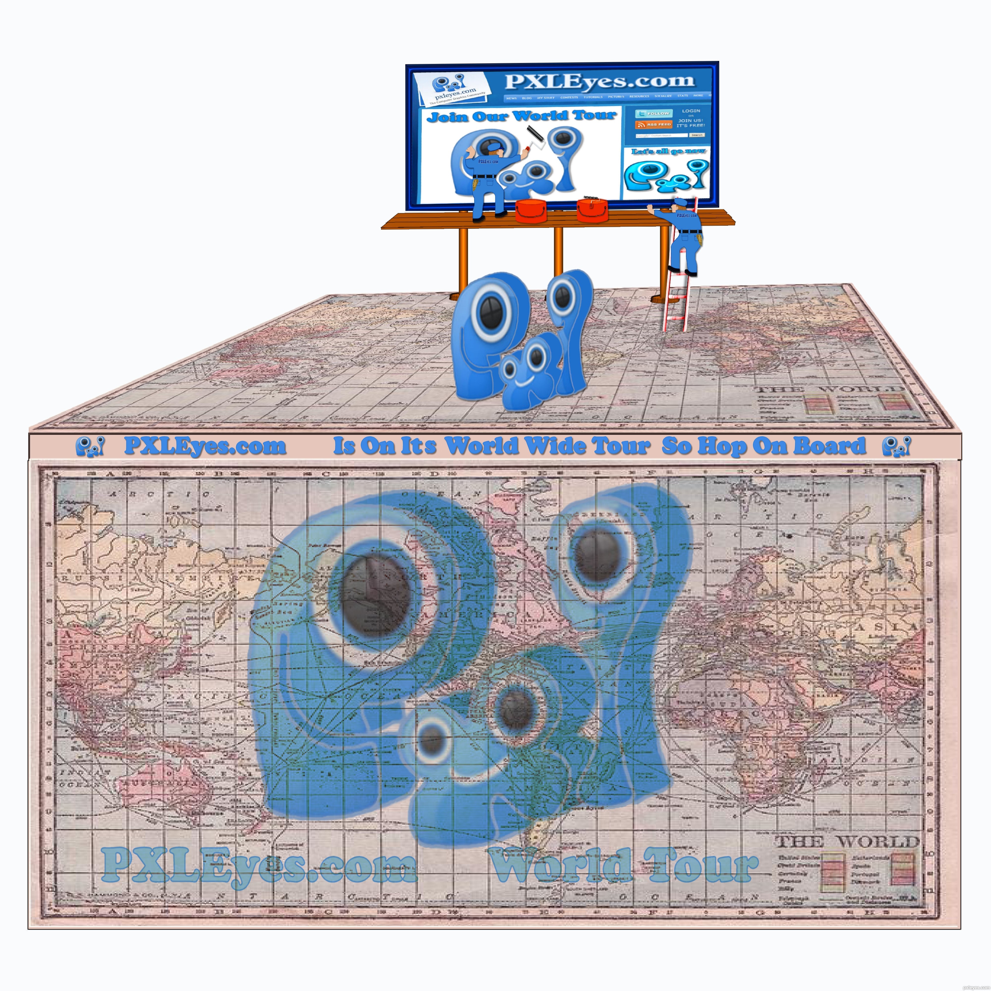
Spec Thanks to Perpetualplum for use of this picture found on Flickr photo sharing.com (5 years and 3238 days ago)
In my honest opinion, if it's any worth, this would work better with a white background. Not that the source is bad or something like that, but having "cartoony style" elements backed with a photograph... well, just doesn't do. Don't be affraid to try a second time and enhance your work!
I think there is some great ideas here.. think outside the square author.. REMEMBER this is a t shirt image not a scene construction.
some ideas: ditch the background but keep the billboard.
The billboard is a great idea that will work on a shirt.
love that you have used the website page .
GOOD Luck . i look forward to see if you get time to rework this entry .
Fun concept but I don't get this as a T-shirt. It's mixture of cartoon and photo with blurry PXLEyes-Web-site screen shot (which should be the real focus) just doesn't work IMO.
I'm sorry I didn't get it was for a t-shiert I looked at it quick first time around I had jus redone But I will go back in again and get red of backround Thanks all
I think this would look cool if the map was your background
Ok all I did a redo I didn't see that it was for a t-shirt i hope I'm on the right path now. Thanks everyone for comments.Oh someone said a wh backround Now I understand why.
Oops, you made the same spelling mistake I made in my earlier comment (please slap some sense into me!): no apostrophe in possessive pronouns [his, hers, its, yours, ours, theirs].
This seems too detailed for a T-shirt plus I think more than one PXL logo is too many. The map is cool but the right edge needs cropping to match the other three sides. A simple billboard (no workmen) atop a much more tilted map could be compelling. "Less is more."
DanLundberg Thanks for pointing that out to me...lol I took care of the spelling mistake
Oh Yes I took care of the border...Thanks
Howdie stranger!
If you want to rate this picture or participate in this contest, just:
LOGIN HERE or REGISTER FOR FREE
Photography and photoshop contests
We are a community of people with
a passion for photography, graphics and art in general.
Every day new photoshop
and photography contests are posted to compete in. We also have one weekly drawing contest
and one weekly 3D contest!
Participation is 100% free!
Just
register and get
started!
Good luck!
© 2015 Pxleyes.com. All rights reserved.


Great idea, and very clean...good luck, author!
One of the best here! Good luck
Very nice work matching the drawing style to the logo's. I like the simplicity of this version.
woo a Hoo Hoo Hoo.. such a wonderful visual

it's a beautiful visual
Very fun and a great T-shirt! The side arm on her sunglasses is much too low on the front frame, however, IMO, and its angle should probably match that of the hat more.
Really good idea and drawing.But the one thing I dislike about it is that the girl's sunglasses are a little transperant.
You deserve 1st palce ;]
i think that's my favourite that's a really good idea
Thanks everybody.. I'm delighted..
@Steelclaw: thanks a lot, I deliberately made the sunglasses as translucent shade.
@Dan: there are goggles with low side arms in the market.. so I thought it to put it like that.. I'll see..
Good Idea & nice presentation...
Wow, so cute! This one is one of my faves =)
great work...
This is clever!..like it a lot
great author
woh woh woh awesome superb wonderful man.this is great author good luck
high vote and fav for you
love it
thanks a lot everybody..
I really like this, it says "travel!" The sunglasses on the 'x' are a great touch!
CONGRATS!! great job
Nice job! congrats.
Congrats on a well deserved win!
Congrats, this is cool
Thanks everybody.. you guys made my day
Just perfect for the tour!!!! Congratulations!!!
Nice Job Congrats on your Win
Congrats...
Thanks once again..
Howdie stranger!
If you want to rate this picture or participate in this contest, just:
LOGIN HERE or REGISTER FOR FREE