Photoshop Pictures: Www (page 5)


results 21 - 25 of 57

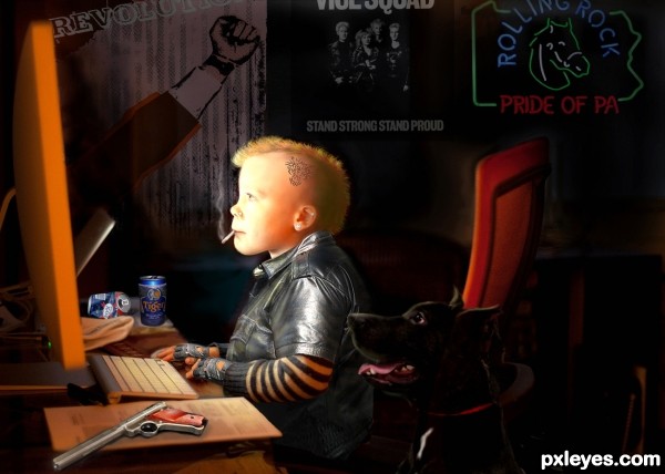
Young cyber punk - created by Glockman


Young cyber punk
Favs: 10SBS: 5Hi-resRank: 1/11Score: 69% (39)25033 views

I realize this is probably not what was expected, but it is what came to mind for me.

TWO MISSED SOURCES
1 http://www.flickr.com/photos/brizzlebornandbred/5025015593/


2 http://www.flickr.com/photos/44458147@N00/2631764931/ (5 years and 3111 days ago)

10 Sources:

avatar lchappell
lchappell says:

Fits the "Cyberpunk" nomenclature perfectly to me, nice work!

avatar robvdn
robvdn says:

NIce entry!
Maybe some attention-points? The dog looks a bit transparent, the orange chair is shining through and the back of the head (of the boy) is a bit to bright IMHO. For the rest: great entry, good thinking... in short:

avatar Drivenslush

Very Cute

author says:

Thanks Robvdn, I fixed the problems.

avatar robvdn
robvdn says:

Looks better IMHO

avatar CMYK46
CMYK46 says:

Great concept, good execution, and you did it without using pre-posed, pre-lit, and pre-costumed pics from DA, so major kudos to you, author!

avatar woodztockr

I will have to bow down here and totally agree with (CMYK46) about the DA stuff. This is in the true spirit of what photoshop is all about, not to mention the skill and artistic touch in bringing it all together. I really love this image, can I say love, sounds weird, but this is Totally Awesome, there that is better!

author says:

You guys are making me feel a bit weird-- in a good way . thanks.

no avatar
olga says:

Great concept and realisation! Good luck!

avatar itsdesign
itsdesign says:

nice work

avatar pixelkid
pixelkid says:

Love the aluminum cans in the background...nice thinking outside the box on this one!

avatar CrystleClear

this is simply amazing author! i love how interested in the computer the dog is lol,great lighing too

avatar wazowski
wazowski says:

This kiddo could be just another weird character from the Tankgirl comics. Well done for sure! Good luck!

avatar layerstack

Fantastic work here, very well done and GL

avatar erathion
erathion says:

Perfect work author...Very cleaver thinking and great mix of elements...This entry fits perfectly in the Cyberpunk spirit...well done

avatar CorneliaMladenova

Stunning! This is the future, I'm afraid...

avatar solkee
solkee says:

Very good integration of the sources. I love the beer cans that were also included.

avatar pearlie
pearlie says:

Great job with this!

avatar Lelaina
Lelaina says:

Congrats for your first place, Glockman!

avatar Nysoe
Nysoe says:

Congratulations

avatar RichieMB
RichieMB says:

Congratulations for 1st, cool pic

avatar madamemonty

Congrats Glockman very clever

author says:

thanks all

avatar spaceranger

Congrats!!

avatar nanaris
nanaris says:

congrats!

avatar vertigo
vertigo says:

congrats!

avatar solkee
solkee says:

Well deserved win.

Howdie stranger!
If you want to rate this picture or participate in this contest, just:

LOGIN HERE or REGISTER FOR FREE


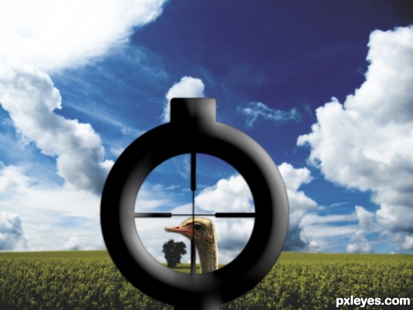
sniper - created by apocalips


sniper
Favs: 0SBS: n/aHi-resRank: 11/11Score: 51.6% (0)14509 views

(5 years and 3176 days ago)

1 Source:

No comments yet... Be the first!sniper, http, www, flickr, com

Howdie stranger!
If you want to rate this picture or participate in this contest, just:

LOGIN HERE or REGISTER FOR FREE


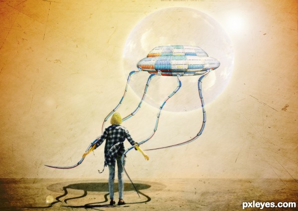
where is my sky - created by nanaris


where is my sky
Favs: 3SBS: n/aHi-resRank: 2/11Score: 60.1% (47)20761 views

I know the shadow is not ok, so any help is welcome. (5 years and 3239 days ago)

3 Sources:

avatar itsdesign
itsdesign says:

great use of source

avatar layerstack

cool idea GL

avatar dekwid
dekwid says:

I just wonder about the model,....dont you think that she should be bit smaller or that flying thing in a higher position or ......aarggh.....maybe it is just my eyes that are wrong to see the compo,.......but one thing for sure it is great work,.....

author says:

I didnt think of that, the model, but yes I will try to make different adjustments this week on this, thanks dek !

avatar Drivenslush

looks A LOT like a book illustration!!! Kudos!!! author.. good luck

avatar CMYK46
CMYK46 says:

Good image. The tentacle behind the figure makes it very hard to judge the shadows but for sure the dark comma shaped shadow to the right of the figure on the ground needs to go. You're on your own for the rest.

avatar greymval
greymval says:

Hey author, great work, my gf loves it.
Tentacles' shadow should be united with the main shadow which should be a perfect elipse. Because of the angle of the light you won't see the projection of the upper side.
Imo, it would add a great effect to make a shadow of the bubble as well, use this as reference:
http://farm3.static.flickr.com/2530/3676289691_7fd9418923_o.jpg

author says:

thanks guys,and greymval thanks for the advice!

avatar Androla
Androla says:

interesting!

avatar greymval
greymval says:

It definitely looks better, good job!
I don't wanna be pushy, but you should know that the shadow for a suspended object equals the length of an object when light source is above.
So the dark elipse should be same length as the ufo, and the light elipse same length as the diameter of the bubble ( which is an energy shield, right? ).

author says:

ooo,,,
you are right againnn I spend a lot just for these shadow

avatar ponti55
ponti55 says:

I love it. I love the concept, i love the execution and i love the title. Really well done author

avatar jawshoewhah
jawshoewhah [banned] says:

Wild! GL!

avatar erikuri
erikuri says:

Very cool surrealistic image!

avatar CMYK46
CMYK46 says:

Author, here's a good link on casting shadows.
http://www.photoshop-pack.com/details/Casting_Realistic_Shadows/11041
I know there are others, but I can't find 'em right now. Good luck!

avatar DanLundberg

Love the illustration look. I personally don't get the title.

Shadows continue to be a problem. The figure's shadow seems to be cast in a different direction than the UFO's. A line drawn from the center of the UFO's shadow through the center of the UFO itself doesn't continue on through the center of the light source. The tentacle shadows don't blend that smoothly into the UFO body's shadow.

With the strong back-light source, the front lighting of the UFO (and especially its underside and the tentacle connections) and the side/slightly-front lighting of the figure seem unnatural.

author says:

cmyk: thank you for the link , it was usefull !
dan: the title cames from buble , if you look at source 3, the sky is in the buble but I blend it at hard light mode and I losee the shape of the clouds, I think I will change this too
for the shadow you are right, but I know now what the problem was
the proble is the shadow of the girl in originaly source , I manipulate the photo ....but I didnt manipulate the shadow og the girl!
I think that if I wash out a little the shadow of the girl and with the right perspective for the other shadows that will be much better!I will try.
Thank you again all, I learn a lot from this entry and this is good!

avatar erathion
erathion says:

Very very nice work author...i did not saw previous edition,but this one look very good...best of luck

avatar derdevil
derdevil says:

Congrats on second !!

avatar erathion
erathion says:

Congrats...so cool work...

avatar RichieMB
RichieMB says:

Congrats for 2nd, nice

author says:

thank you!

avatar erikuri
erikuri says:

Congrats!

Howdie stranger!
If you want to rate this picture or participate in this contest, just:

LOGIN HERE or REGISTER FOR FREE


The Book Of ... - created by Arryko


The Book Of ...
Favs: 3SBS: n/aHi-resRank: 8/11Score: 55.8% (0)14055 views

(5 years and 3270 days ago)

1 Source:

avatar nanaris
nanaris says:

wonderful!

author says:

Thanks

avatar ponti55
ponti55 says:

Moody and evocative. This is simplistic art at its best!

avatar nilknarfsoive

i like this one...

avatar erathion
erathion says:

Fabulous job author...Mood is perfect...well done

avatar CrystleClear

this is very lovely! i love the medieval look to it!

avatar swordfish
swordfish says:

nice idea and lovely work ......all the best to u..........

avatar JPDesigns
JPDesigns says:

Its so simple but I love it!

Howdie stranger!
If you want to rate this picture or participate in this contest, just:

LOGIN HERE or REGISTER FOR FREE


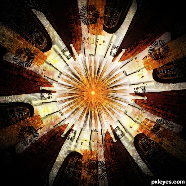
Jam Session - created by VitalExpressions


Jam Session
Favs: 0SBS: 3Hi-resRank: 10/11Score: 54.6% (0)12075 views

See if you can spot the different instruments. : ) (5 years and 3298 days ago)

5 Sources:

avatar pearlie
pearlie says:

Love this, author, it's so creative! Great image for the background, and then the use of instrument parts with the fireworks is fantastic - I can almost hear the music and feel the beat. Cool circular piano keys. It reminds me of an abstract piece of fabric for curtains. Well done.

author says:

Thank you!

Howdie stranger!
If you want to rate this picture or participate in this contest, just:

LOGIN HERE or REGISTER FOR FREE