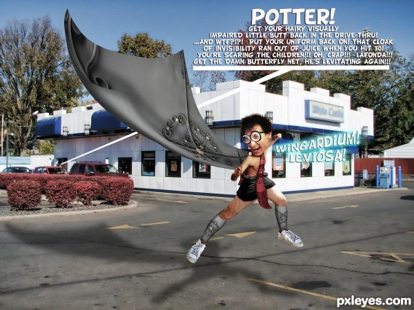
AV PAGE CURL for leg warmers (and source) scarf has source as well (5 years and 3245 days ago)
- 1: castle
- 2: Glasses
- 3: base model for harry
- 4: legs source

AV PAGE CURL for leg warmers (and source) scarf has source as well (5 years and 3245 days ago)
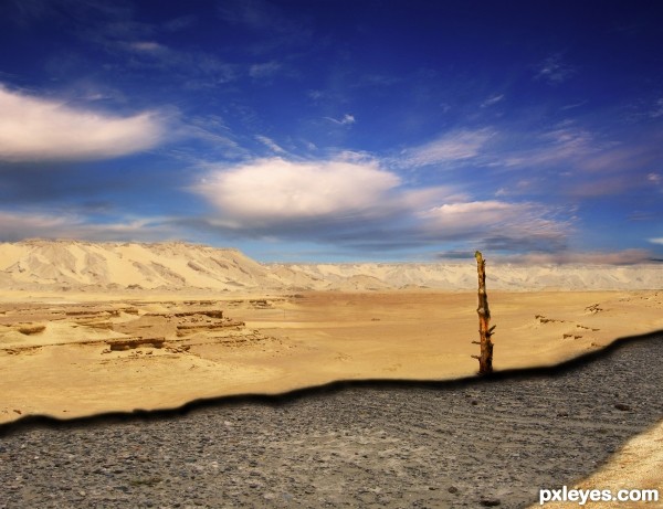
(5 years and 3246 days ago)
The riverbed needs some depth. (See source pic.) Otherwise it's a good job! 
You're right... see what i can do
Howdie stranger!
If you want to rate this picture or participate in this contest, just:
LOGIN HERE or REGISTER FOR FREE
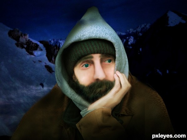
(5 years and 3494 days ago)
excellent work author...well done
Howdie stranger!
If you want to rate this picture or participate in this contest, just:
LOGIN HERE or REGISTER FOR FREE
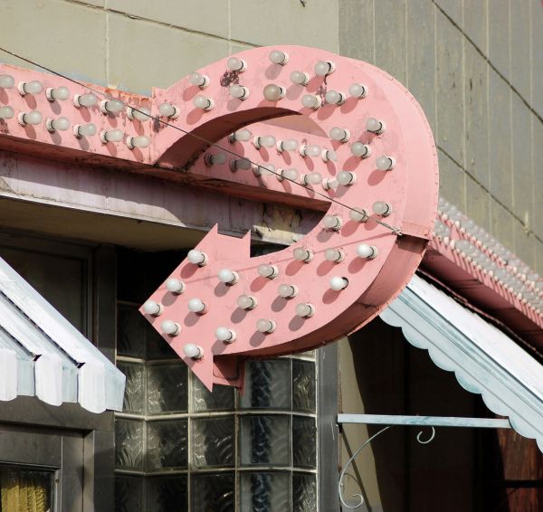
Just source (5 years and 3669 days ago)
Good upgrade of the original! Now...if you're going back in time, the colors would probably not be as faded, and there might be a bit more contrast, if ya take my hint... I'll wait to vote as usual.-)
Up the sauration of the colour -- paint not so faded now -- much thanks for the suggestion CMYK
nice restauration work...good luck
some shadows are pinkish and some are dark...
 now...
You should restore the wall too. And I think you missed just a spot or two on the back of the arrow.
great work! never could have guessed this was photoshoped if i've seen this elsewhere
nice work...good luck
Nice restoration  Good luck today Author
Howdie stranger!
If you want to rate this picture or participate in this contest, just:
LOGIN HERE or REGISTER FOR FREE
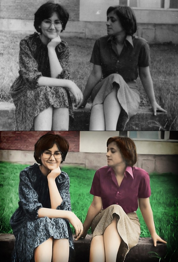
This is a photo of my mum and her best friend taken 33 years ago while they were still in high school. The photo is really small, I'd say as an average business card, so it was really hard getting it to look sharp. I used a special technique for making the edges look normal (since sharpening filters know to make that strange blurry glow on some places), check out the SBS. I also used some other images from flickr for facial parts and parts that were to small to be sharpened with filters (eyebrows, glasses, nose....), it's all listed in the sources.
Hope you like it. =) My mum sure did, she even made me some cookies :D
(5 years and 3739 days ago)
Well done. My favorite part is the look on the face of the girl on the left. She looking at the other girl as if to say, "Don't move. There's a huge bee on your shoulder" while girl 1 is blissfully unaware of the impending stingage. Great job. I'm looking forward to the SBS cause the edges are fantastic. The left eye of the girl with glasses looks like it's half closed. Not sure but it's the one point I see that looks a little unnatural.
Very nice work! In my opinion however, the skin and especially the grass looks very unnatural, i'm really no good at this type of thing so i wouldn;t know what to suggest, perhaps some different shades of green around the grass.
Thanks for the comments guys! Glad you like it =) The SBS will come during the day, I planned to finish it about now, but something came up, I really really have to go now.... Doesn't matter anyway if I lose a bit of reputation, just hope they don't expell it. =)
Oh, and about the grass and the skin.... Yeah, the skin really looks kinda... 'painted' in some parts, probably due to sharpening filters... I'll make sure I fix it.... =) However, I do like that the grass is blurred, kinda looks out of focus, and I really like the effect =) About the eye, hmmmm, it kinda does look half-closed.... Tho I didn't mess with her eyes, couldn't match any I found only with my mum's (the one without glasses)
the grass is surreal, its cool
Thanks all, I added the SBS. =)
An update.... I fixed the skin, and I did some touch-ups to the hair. =) Hope everyhting is OK now =)
You missed a lot of scratches that could have easily been fixed.
Wuuuuuuuuuut?! Where?! O.O I can't see what you mean.... I just can't see what you're aiming at? Have you looked at the SBS?
imo, there are still a number of areas that could be a lot better. the heads and hair on both ladies could be much better, in hi res you can see this...your mother, the one with glasses, her face needs some more work, her nose is not finished well........her arms also look like prosthetics, especially the left one, they lack definition.....imo
Hmmm, some parts could be better, but only if I used external sources for those parts, since they are to blurry. You must understand that the photo is not bigger than an average business card. I tried to do my best here, edges are much sharper, you must admit, but some things just can't be sharper.  Besides, TBH, I think this is maybe the only entry which has cleaner outcome than the original. Most of others are just colouring and scratch-removing and simple usage of filters.... Some are even blurrier than the original.Considering the original, the outcome is great IMHO.
Ummmm....nice work on your entry, but your last comment wasnt true .....Other entries did come out cleaner and sharper.... besides that, you shouldnt be putting down other entries to try and make yours look better.
TBH, I see only 3-4 entries in this contests which are cleaner sharper than the original. Others are just colouring and scratch-removing. I'm sorry for maybe putting down the other entries, I was just pissed off by the fact that I spent hours manually making the edges sharp and clean and even using outside sources to bring up the detail on faces etc and then somebody says that it's scratchy and blurry etc. I mean, maybe it is, but compared to the starting photo it's much better.  peace
peace
great 
Well i thought this should of made top 4 at least.....i have to say that the results are very dissapointing and just dont seem right.
Howdie stranger!
If you want to rate this picture or participate in this contest, just:
LOGIN HERE or REGISTER FOR FREE
Love the humor here author... GL!
GL!
The scarf is too large in the image.
trim49, you forgot that his chest is too small, his legs are way too thick, his glasses make no sense and his cape is too heavy, his hair is too fluffy, his head is too big (I enlarged it) his shoes don't match, and the underline is too thick (all done on purpose by the way).. (you forgot the sign on the restaurant is too blurry)
Just a suggestion trim49, try to use a crowbar on your imagination, your comment lacks any kind of inspiration or helpfulness... basically it's negative and mean (terse comments are useless and hurtful) now if you would have followed up with a solution to the issue that would have been a great help... it would show some sort of thought behind your comment
I modeled the tie after DOCTOR WHO, so in this case THE SCARF IS TOO SMALL IN THE IMAGE.. but that's your right to comment, just as it is MY RIGHT to comment right back
(Lighten up and just enjoy the concept, loosening the stick would help too) if everything was perfect and the way you want it, the world would be a very boring place indeed
so funny!
Androloa, thank you so very much
very nice, good luck!
Haha love the expression
I want his socks
Hilarious - LOL@Lafonda!!!!
Great copywriting and shadows.
Howdie stranger!
If you want to rate this picture or participate in this contest, just:
LOGIN HERE or REGISTER FOR FREE