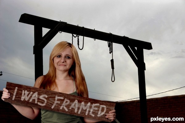
(5 years and 3310 days ago)
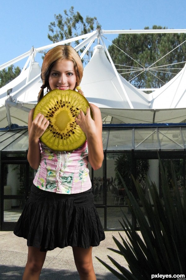
(5 years and 3340 days ago)
LOL! Good piece, funny title! The drop shadow behind her hands in front of the kiwi is out of place, though. Looks like she's not holding it
Thanks MossyB; made some minor changes on that thought, just wish I had more time, but I gots to move on now...
Cool work author...gl
masking needs a lot of work
Howdie stranger!
If you want to rate this picture or participate in this contest, just:
LOGIN HERE or REGISTER FOR FREE
(5 years and 3423 days ago)
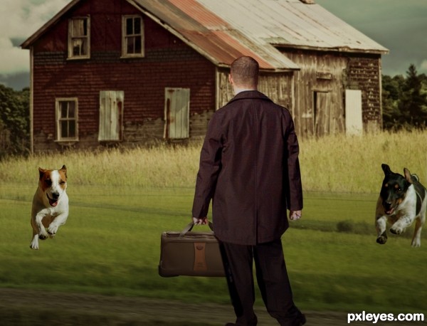
The dogs need some shadows, and i would also shrink them down slightly, they seem a bit too big at the moment. Watch out for opposing light sources too (the man and the dogs) I'd flip the man horizontally to match the lighting on the background.
Good luck 
Or make the man bigger and add some shadows to the dogs.
very cool mood but i agree about the size of the dogs...i know is a bit to lat now, but this image had a lot of perspective....gl author
Howdie stranger!
If you want to rate this picture or participate in this contest, just:
LOGIN HERE or REGISTER FOR FREE
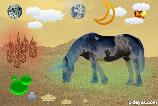
Photoshop first job in which use more than one technique,
all are in the "tutotial" (if you can call it so) my first tutorial. My English is terrible and I'm using the google translator to help me. Sorry friends.
(5 years and 3456 days ago)
I really like the title for its self-deprecation. The whimsical charm of the image is appealing. But the unicorn seems part of the background rather than the focus as indicated by the title. Less is more, which means there are too many extra things when simplicity is most compelling. Having the unicorn cast some sort of shadow would help ground it into the image.
Right. Somehow I get too excited about the drawings of shapes and now I see it differently. And the composition is very important, thanks for the obserbación.
Howdie stranger!
If you want to rate this picture or participate in this contest, just:
LOGIN HERE or REGISTER FOR FREE
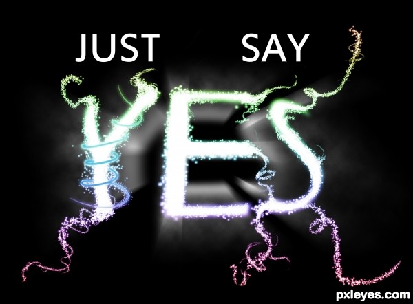
Song by Snow Patrol, tried to make the music into an image. (5 years and 3468 days ago)
Nice glowing, but the sparkles are a brush? You could do them as small letters instead, would really keep the theme right on. Realize it might be a enormus job to change, but I recommend it. Feeling the rythm though 
Nice idea, if I had the time I'd do it right away but... :P
No images, nothing as decoration and no textures; in other words no outside sources are allowed.
You can not use stamps or brushes etc etc, only words are allowed to be used. Please go back and read the contest description 
I read the discription: if you would have looked at my SBS, you would've noticed that I only used some brush options on a brush with 0% hardness, so that they would get spaced out. for the curls I used the pen tool and the simulate pressure option on the stroke pen tool... 
nice light effects
Howdie stranger!
If you want to rate this picture or participate in this contest, just:
LOGIN HERE or REGISTER FOR FREE
LOL SHe's gonna LOVE this!
i am sorry that i don't know who she is
Fantastic Work!! Agree with MnM!!!
Dang author that was quick; and funny, and well done! LOL
it's ok Author. She's a daughter of Sheri RBSGRL
Great,hilarious, neat...gl author
Good
HAHAHAHAHA! Thats so cool! My favorie so far!
Clever, also nicely done.
love the idea
Nice work on her face!!!
the frowning work is flawless.. great job author
Howdie stranger!
If you want to rate this picture or participate in this contest, just:
LOGIN HERE or REGISTER FOR FREE