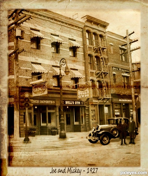
According to wikipedia, the first 4 way, 3 color traffic light was invented by a policeman in Detroit in 1920. I thought this was surprisingly early, so I took some inspiration from it.
Meet Joe & Mickey...proud new owners of Genco Imports and Bull's Gym respectively. Shrewdly located next to one of the few traffic lights in town....location, location, location...
While I didn't follow any specific tutorial from there, I would like to thank psdtuts for their tuts on grunge effects. Also thanks to ValerianaSTOCK, Aconyte-Stock, Fantasy Stock, digital--angel, Falln-Stock, Glo-Stock-Vintage of DA and faceme of Flickr for their source photos. (5 years and 3648 days ago)
- 1: Old Paper 1
- 2: Old Paper 2
- 3: City setting
- 4: Car
- 5: Lamp Post
- 6: Man 1
- 7: Man 2


Nice job! I almost didn't see it
I think it is really nice, but is it suppose to be that you almost don´t notice the trafficlight? If not, you might wanna move a little to the side, if it is...then the location of it is brilliant. GL
GL
Yes, it is intended. I actually struggled with what the heck I could do with a freaking traffic light LOL...then I realized I was over complicating it and decided to simply make it part of the scenery of a larger picture, after all who takes notice of traffic lights unless you are driving? (and sometimes not even then!)...This is what I came up with. Hope you like it
this is a really nice chop, and very good sbs. the only thing I see that could be tweaked are the shadows below the source light and the two men, they seem to be floating slightly. notice how dark the shadow is under the car's wheels, try adding a bit of very dark gray or even soft black right under the base and the mens' shoes. nice history lesson, too.
@pearlie
Agreed...strengthened the shadows just a touch under them...was a tougher adjustment than I had thought it would be, but should look fine now..
Too much dark shadow under the men, otherwise nice job.
Corrected...again...looked darker once I had posted it....thanks for all the great feedback guys!
I love this image...great combination of sources and perfect fitting source image...but i have to agree with Bob,shadows are still to dark and a bit bad shape.Try to correct that author and u will have perfect entry...good luck
Ok, so trying to brush the shadows in just wasnt working for me...I ended up duplicating the men, turning the brightness down to nothing, and then used perspective to make the shadows...much better result I think.
Maybe u can do this:select shape of the male from the image,create new layer,place it below man image and fill it with black.Then,using distort tool position the shadow.After that lower the opacity of the shadow,and then go to gaussian blur,and blur shadow a bit...I hope this could help u...
Author, I think you don't need shadows under the traffic light and lamp posts (notice the posts of the background image); even the men shadows, you can take them off, because it's a cloudy day (there's a girl walking on the original, and there's no shadow for her). Only for car, you can leave a soft shadow under it.
Ok, lightened up the shadows under the car and all but removed them under the men....think that is gonna be about the limit of my abilities for this one....right guy has blurry feet, I know...but we're gonna chalk that up to an outdated photograph ...and the fact that I have now played with the shadows so much he has blobs for feet....
This is a nice enough looking pic but I don't feel there was enough use of the source image.
I put the entire pic in there in its' natural setting and then even chopped the source itself....not sure how you can say there is not enough use of the source
nice work with the source
Good work.
GL on this one
great entry! GL
cool
Congrats for your second place, Irse!
Congratulations for 2nd
Congratulations! You deserved for your effort!
Congrats!
congratulations!!
Congratulations!!!!!
Congrats!!!!
Congrats
Congrats!!
Howdie stranger!
If you want to rate this picture or participate in this contest, just:
LOGIN HERE or REGISTER FOR FREE