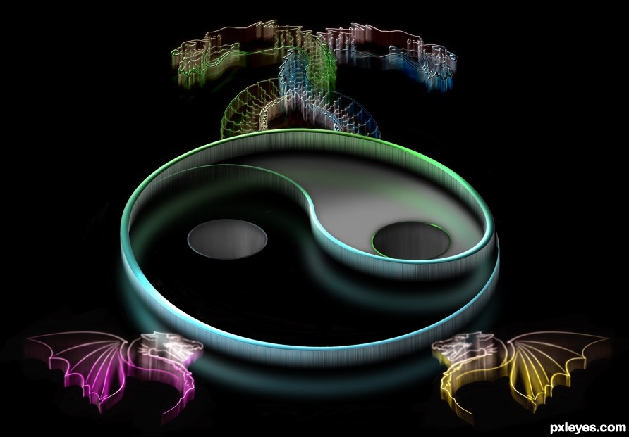
Had fun with Yin & Yang (5 years and 2529 days ago)
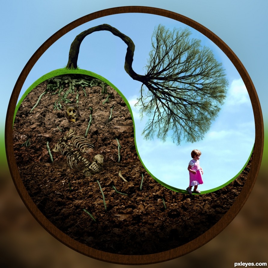
Thanks Ben Earwicker for the skull photo.
Frame and background are in SBS. (5 years and 2530 days ago)
Why has this no commented yet? I think this is very clever. IMO I would have softened the whole thing up with a filter, but I realy like this.
Thanks!
It is quite good 
Howdie stranger!
If you want to rate this picture or participate in this contest, just:
LOGIN HERE or REGISTER FOR FREE
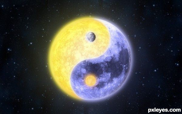
Light - Dark, Night - Day, Sun - Moon. A simple example of balancing opposing forces.
Everything was done within Photoshop from scratch save the stars and moon. (5 years and 2856 days ago)
Quite elegant, Great job 
Thank you
becomes a magical moon, very well done, bravo
Thanks, I appreciate that
Great blending and elegance!
Thank you!
well done ... great moon
Thanks, can't take all the credit for the moon though...
Howdie stranger!
If you want to rate this picture or participate in this contest, just:
LOGIN HERE or REGISTER FOR FREE

Special thanks to the sources photo (5 years and 3431 days ago)
Great creation!
Excellent.
Simple and elegant interpretation of the theme. Bravo, excellent work.
Thanks all....
Nice work..well done.
Great work author...gl
Cool colors, nice theme...Congrats 
Howdie stranger!
If you want to rate this picture or participate in this contest, just:
LOGIN HERE or REGISTER FOR FREE
(5 years and 3681 days ago)
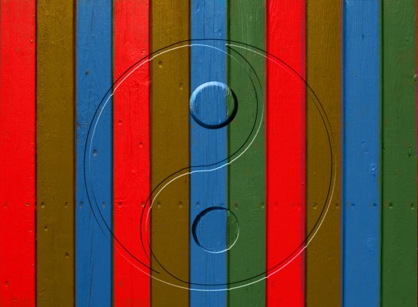
Sorry but...I can't seem to see what is up or down here...
There is nothing more closley realted and uo and down then Yin & Yang. Get your blinkers off and educate yourself before commenting
Dont really like this piece or the attitude.
Well thats just tough Barnacle. I don't like some attitudes either so if you don't like it then don't vote on it.People should think about what they are going to say before they open their mouth and if the MODS think it's off theme they can remove it. I will not loose any sleep over it.
Oh, don't worry, we'll still vote.....
hhmm.. interesting entry.. mysterious.. you'll still get the votes if mods don't pull it out..
Actually after reading the guidelines again, it specifies you have to have two subjects in the shot and one is definitely right side up and one is definitely up side down. The fence wouldn't look different either way so technically, you don't have two subjects.
Yeah I actually agree with Barnacle. Go figure??? 
let the mods do their job, there is no need for micro modding in these contest.
Howdie stranger!
If you want to rate this picture or participate in this contest, just:
LOGIN HERE or REGISTER FOR FREE
Interesting technique! GL author.
THX Bob
This is lovely...
Thank you
so cool i love this
Thanks Karen
Very cool image!
Thanks Randy
Firstly, interesting treatment. I like it. Maybe I'm being picky but shouldn't the dragons reflect on the black surface the same was the symbol does? Also - at least looking at it on my monitors - there are some grey artefacts on the black surface that shouldn't be there.
Thanks for pointing out the grey areas, I had to get a real weird angle on my screen to see them but they are gone now.
Very nice. Looks like a 70's t-shirt.
Thanks Mark! Dunno if a 70's shirt is good or bad LOL
Well... from my point of view - that would be good. Reminds me of high school.
This could be a great wallpaper! Simple and colourfull...
Thank you and thanks for the fav
Interesting image right on theme. Yes, love your technique. GL author.
Thank you and thank you for the fav
Very well done with a strong design sense!!
Thanks Rein
Congrats!
Thanks
Congrats Rob nice work
Thanks Megan
Congrats Rob, fine work!!
Howdie stranger!
If you want to rate this picture or participate in this contest, just:
LOGIN HERE or REGISTER FOR FREE