
If you are not good, I will give you to eat this! (5 years and 3240 days ago)
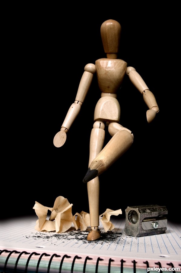
A simple idea but finally I decide to upload it.
Own images used (5 years and 3241 days ago)
Simple maybe, but very cleaver. Great job.
Ha Ha very cool idea author. I think the difference between a good chop and a bad one is not based on how simple the idea is, but how well it is executed. This idea was executed well; good vote from me.
simple chop , but the idea is wonderful lol
Agree wholeheartedly with Tuckinator above! Excellent image...regardless of the simplicity. Nice job, author! 
Lower leg would be thinner, but nice job.
Agree with CMYK46, pencil nub could use work, however, I still like it!
poor woody lmao
SIMPLE!! & EXCELLENT!!! ENTRY .GL 
very creative! good luck!
I agree about the leg but its still a great concept, well done 
Very creative and interesting, and yep, I think it's very funny! :p 
Wow, I do indeed, and this is so great and well done = )
Very nice concept.
Great concept, especially with the grid paper, that's a nice detail.
Such a great idea,simple yet effective..I loved you title too..GL author
Congrats on 3rd, mqtrf. I'm not sure what it says about me, but yes, I do find this funny. 
Congrats for third place "amigo" nice entry!
congratulation...
Nice Congrats
Congratulations!
Congrats on the third place...
Congratulations!!! Have a cookie!
note: cookie is purely hypothetical.
Congrats pal!
Congrats!!
Congrats!!
Congrats!!!  Great concept!!!
Howdie stranger!
If you want to rate this picture or participate in this contest, just:
LOGIN HERE or REGISTER FOR FREE
(5 years and 3246 days ago)
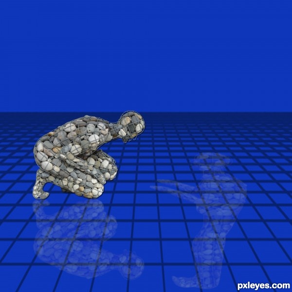
This would be cool if you deformed it so the head is in front of him to the right so that he is looking at himself.
Thanks K5683 I redid is this what you ment ?
I can't talk for k56, but :
You could explore that opposition theme: with the guys looking at each other, only remove the grid and use (maybe) some ice- something like frozen water but which is transparent at some points so that we can recognize his reflection.
You could also use contrasting colors orange/blue and some fog in the horizon.
Damn, I miss photoshop!
that's not really what I meant, well sort of but not really. I'm not really sure what tool it would be in photoshop because I use paint shop pro. In paint shop pro, it is called the deform tool and you can pull one angle. So, his feet would still be reflecting at his feet (feet touching), but his head would be in front of him, not below him.
Transform + rotate ? Ctrl T and mouse. Or distort.. hmm.
ahhh, no sorry author, this isn't what I mean either, but this one looks creative  Okay, so if you duplicate him, flip him underneath and lower the opacity you will have a reflection like you first had. Okay, now what you want to do is click on the deformation tool, and put your cursor over the nodes (the tiny squares on the corners and middle of the lines you see) Now, if you hold the Shift button or Ctrl button when pulling these nodes, you will be able to deform them in different ways than with just pulling the nodes. You may have to play around with it a little to get it the way you want it.
Like I said though, this new reflection is quite creative, I would just move it over so the feet touch still.
Thanks so much k5683 I played with it a while ended going back to original so his reflection would look same shape as him But like tile says I see you putting another reflection would give it another demenion where there is a reflection by its self and while he sees his he sees the other..lol Thanks again
Howdie stranger!
If you want to rate this picture or participate in this contest, just:
LOGIN HERE or REGISTER FOR FREE
(5 years and 3254 days ago)
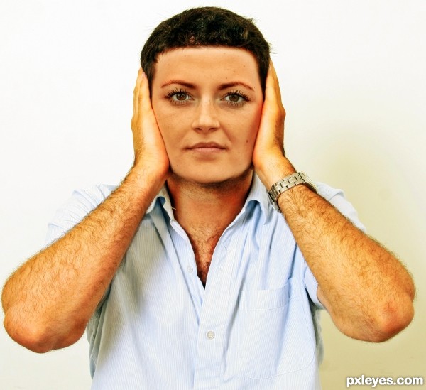
Nice work here too, author. Nice blend, very realistic. I notice some "stubble" on the man's neck - you might consider adding some to her chin area as well?
Great entry, should do well. Perhaps subbing out the background for something a little more "interesting"? Shouting kids, loud music, something.
Nice work.
Great blending, maybe just the smallest of tweaks of saturation or vibrance of the female head to get that blend spot on.......but its very close already , great work author 
cool work author...gl
Howdie stranger!
If you want to rate this picture or participate in this contest, just:
LOGIN HERE or REGISTER FOR FREE
(5 years and 3254 days ago)
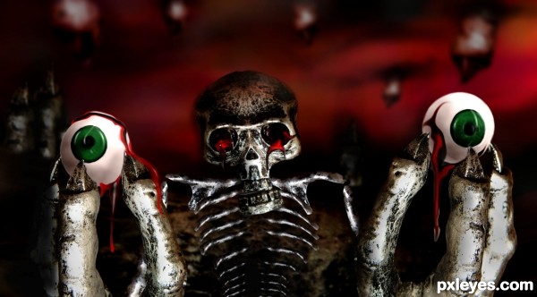
oooooooo, reminds me of that creature from Pan's Labyrinth .. great job!!!
i love the idea! and good finished product
you got the idea.., I like it.., 
ewe and cool!! I like it!
Great job author...love this image so much...IMHO eyeballs are to clean u could apply tome texture on them and maybe add some cracked blood vessels...just an idea...GL
actually erathion i made the eyes realistic at first with more realistic blood but it came out
much too disturbing , so i decided to go with this 'plastic' version .
thanks for the feed back 
Very creepy and gruesome ... great idea and well done.
Love the freestyle on the skull and skeleton! GL Author!
Howdie stranger!
If you want to rate this picture or participate in this contest, just:
LOGIN HERE or REGISTER FOR FREE
LOL
Thanks
Howdie stranger!
If you want to rate this picture or participate in this contest, just:
LOGIN HERE or REGISTER FOR FREE