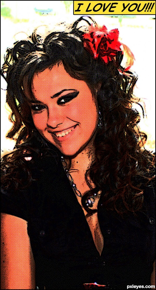
Picture uploaded in SBS. (5 years and 3412 days ago)
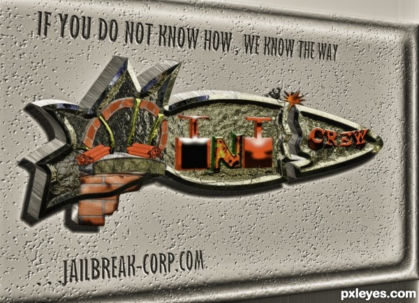
(5 years and 3418 days ago)
Great idea author and cool work...gl
tnx erat 
Howdie stranger!
If you want to rate this picture or participate in this contest, just:
LOGIN HERE or REGISTER FOR FREE
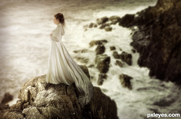
credits to magikstock (5 years and 3425 days ago)
Lovely  Great depth and convincing, soft shading
I like It..nice job
I like It..nice job
Great job. Hard to believe she wasn't always part of the picture.
Nice Job 
Fantastic piece author...great colors,mood and execution...well done
Interesting image, but very derivative.
Really lovely
I have come back to this image a number of times now ... I cannot decide how I feel about it.
I LOVE the mood and expression you have capture but it almost seems surreal. It has something about it that just doesn't quite feel right (not in composition or subject). The more I look the more I think it is that the background is a little too blurry. I looks a little like those photo's you take where you take miniature objects and photograph them as if they are full size or on of those tilt/shift photos. This is not really a critique ... I am fascinated by this picture but still trying to figure it out.
Great image
Congrats!!
congratulations...
Howdie stranger!
If you want to rate this picture or participate in this contest, just:
LOGIN HERE or REGISTER FOR FREE
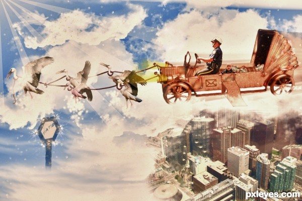
let's go kid , go go go :D
lots of work.. (5 years and 3444 days ago)
Good work. But you need to erase the line, where the rays end up.
Good work !. IMHO rays could be gradient masked. GL 
Tnx , I forgot that thing, I corrected 
Nice imagination!
They can bring my mail like that any time.. Great idea! Love the stretched version of the car..
very cool work author...gl
Postman Pat in Heaven  Beautiful picture
Congrats!
Thank you 
Howdie stranger!
If you want to rate this picture or participate in this contest, just:
LOGIN HERE or REGISTER FOR FREE
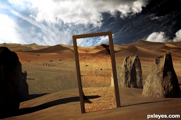
Hi everybody! I hope you like my new entry..
Basic masking and allot of hue and saturation to match the background images together...
Twirl to achieve this twirly look inside the door and yeah before that some noise with a motion blur was added to the door to create that rain effect.. (5 years and 3456 days ago)
There's potential here, but the image looks more like "Go Through Here If You Wish or Else Just Walk Around" since the end result appears to be the same. The arid setting suggests that a lush, green alternative (with water) visible through the doorway would be enticing but yet worrisome if the title were "Enter If You Dare...".
Hot entry, with clearly some awesome stock! ( dude, u gotta teach me how to find good stuff like this).
You should find another nice image with a Winter landscape and place it in the door.
Really, is not that hard, and the effect should be awesome.
Don't "green" it , like Dan said( no offence), but "WINTER" it. The sand vs. snow has more impact than grass vs sand, for obvious reasons. Good luck!
Real nice, awaiting for more of your entries.
Thanks for the feedback guys.. But I'm going to leave it as it is since that is what I saw in my imagination.. I don't want to get judged and voted on ideas which came from other people, only that way I will get a honest result and I'll see how 'I' did.. Thanks anyway
Author, i respect your 'standing ground', and afterall leaving it like that it's cool as well - the door is transparent so you don't know what expects you on the other side.
But there's no such thing as an honest result or objectiveness (LOL), since each person has his own do & don't-s list. Some, as you said, might judge you based on the idea, others based on the stock you used, others on techniques, others cause they always liked interdimensional doors, whatever.. There are so many judges & POVs that you shouldn't even care. So congrats to you for following your guts  .
.
Thanks greyvmal i'm glad you understand.. 
Great 'twirl' effect.. works very nicely. I also agree with you sticking to your original idea, and i completely respect that. Even though the suggestions would add a level of complexity to this image (that might get you higher votes) the images works very well the way it is now. The blend between sources is very convincing and your lighting seems good. Great job 
Thanks allot ponti55 for the great feedback 
very very nice work author...i agree with Matteo about sticking with original idea...Love how u blended all elements and how u handle the shadows...best of luck
Thank you for the compliment erathion 
Thank you all for voting!!!!  Hurray!
Congrats for 2nd
Congrats...
Congrats!
Howdie stranger!
If you want to rate this picture or participate in this contest, just:
LOGIN HERE or REGISTER FOR FREE
very nice work author...gl
Who me?
we love you too

good one
nice gl
very nice
very nice, good luck!
Thank you, guys! I am so happy that you like it.
Howdie stranger!
If you want to rate this picture or participate in this contest, just:
LOGIN HERE or REGISTER FOR FREE