
(5 years and 593 days ago)
- 1: egg shell
- 2: feather
- 3: nest
- 4: nest 2
- 5: autumn leaves
(5 years and 2485 days ago)
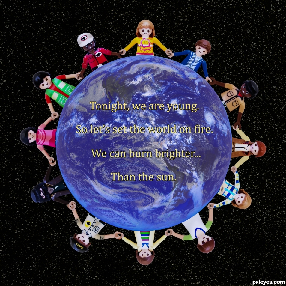
Tedious work on the arms... GREAT JOB!!! really was worth it ... hehehe, Though you quote "Fun." this reminds me of "Teach the world to Sing" commercials from the late 70's (Before Coke got all business oriented and actually cared about people) good luck author 
Thanks Drivenslush
Awsome work
Thanks Anusha1
Your SBS alone deserves high marks. Good work.
thanks Ichappell
Howdie stranger!
If you want to rate this picture or participate in this contest, just:
LOGIN HERE or REGISTER FOR FREE
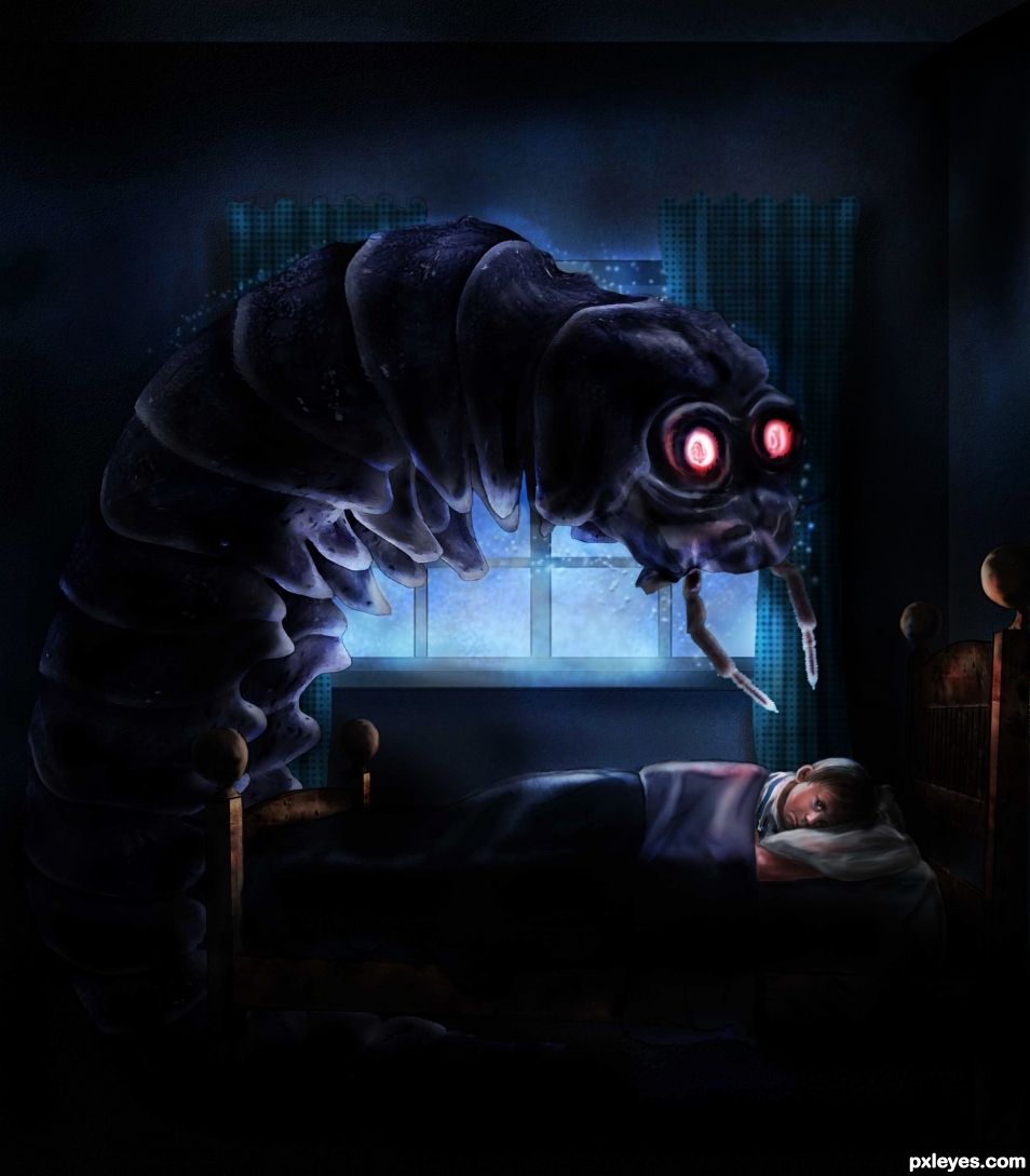
The movie was"The monster that challenged the world" I saw it when I was a 10 year old boy, and it scared the hell out of me for many years to come, not very scary by today's standards, but it was then.
http://en.wikipedia.org/wiki/The_Monster_That_Challenged_the_World (5 years and 2487 days ago)
Much better than the movie! 
Thank you Bob, I watched the movie as an adult later on and said to myself what a silly movie to be afraid of. At least I didn't need therapy.
LOL... I remember that movie. Pretty funny, but a good chop 
Thank you kyricom, I'm trying to forget it, LOL 
Cool chop n lighting friend. Love the atmosphere 
Thank you kushpatel. Love the comment.
fantastic nice done one of my fav
  gl author
Thank you very much red. 
wonderful work -- mood light all are great
Thank you Alan 
oh my i would diffidently wet my bed. LOL very nicely executed
Thank you darkshellie, I tried to make it scarier than the movie.
creepy cool  poor kid i dont wanna be at his place
  fantastic work
Thanks anoosh, I was in his place.

This is very good, the little boy should close his eyes for sure when this critter is in his room 
thank you gibbsld 
perfect
thank you Rick 
You followed the idea real well. Nice concept, and yes, it is really scary. Good luck. It is nice to see this kind of work in these contests for sure.
Thank you George. 
love the feel (The movie that freaked me out as a kid was Phantasm, I still see it in my minds eye) wonderful creation
thank you. We need to take our finger and poke our mind's eye.
In the book "Danse Macabre" (Dance of Death) by Stephen King (non fiction) he describes the gorilla in the chained box we keep in our heads. Our fear is constantly boxed up and kept in secret until it escapes and all hell breaks loose. hehehe
Never watch scary movies before going to bed. Give the gorilla a banana or two.
The only thing I can complain is the length of the boy's body should be only 4/5 of the current one, which can be guessed on the form of the blanket. Considering his head, you can estimate his body.
Also I wish that I can see more details and sharpness in your image. But it's just the minor thing.
Congrats! 
congrats 
Thank you 
congrats.
Congratulations.....
Congrats on making it to the final round!
congrats 
Thanks all
Congrats!
Congrats!
Congrats sir....Next round is your winning round. Hope I will give proper competition to you...


Howdie stranger!
If you want to rate this picture or participate in this contest, just:
LOGIN HERE or REGISTER FOR FREE
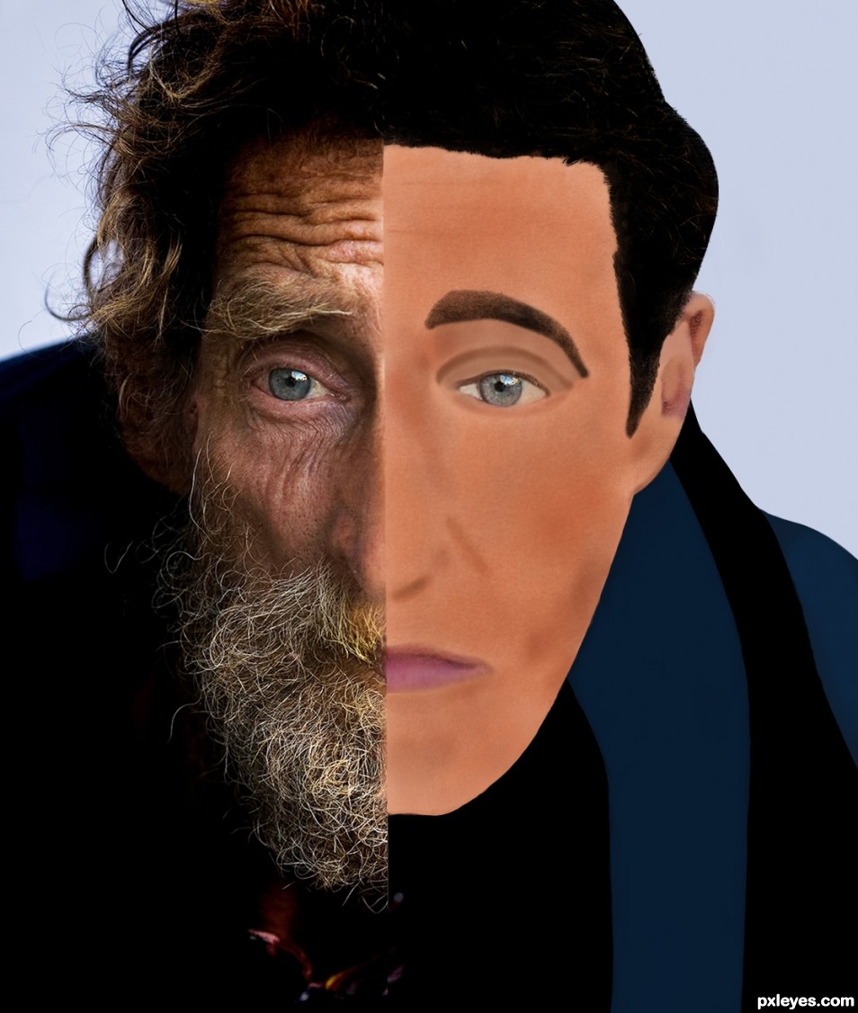
I thought it would be interesting to show this gentleman before and after in the same picture. The after is my interpretation of what he would look like 25 years earlier. (5 years and 2537 days ago)
Bob - Please consider: Comments have consequences. Positive comments encourage people. Negative comments with solutions help people grow. Negative comments discourage people and can cause someone to give up Pxleyes after 111 days of excellent entries. Making a joke at
the authors expense also discourages the author and gives others the impression that the entry is substandard. Rules 3.4 and 3.8 deal with theses issues. I'm pretty sure you meant your comment as a joke. However it was a joke at my expense. I am not ready to pack up and
leave Pxleyes yet, but if I do, you will be one of the main reasons.
My comment was indeed meant as a joke. Sorry if you were offended.
Author, although challenging and certainly old, perhaps your chosen source is too lined and too gritty-looking to effectively convert the face to a younger age without over-processing it beyond human appearance. The overly-illustrative quality of your work is too jarring to be against the real photo, split-screen style. In addition to benefiting from skin textures with shadows and light, the drawn character should (but does not even) retain the original eye color, and the entire drawing raised up a few pixels to provide more symmetry with the physical features on the photo side. Although I say basically the same thing as CMYK46, hope you are not as sensitive to this comment.
Elemare, Thanks for your response. Your points are well taken and I mostly agree with them. CMYK46 stated he was sorry if I was offended and I accept that. I am glad you were able to give me your analysis-Something that us contest entrants rarely get. I did learn something from it that I can use in the future - Whenever making adjustment layers such as levels, curves, etc. I must remember to mask out the eyes of a human subject or they will be affected by the adjustment layers. To be fair CMYK46 has given me some helpfull advice on a number of occasions and he is one of the few "oldtimers" that regularly gives pointers in comments.
Elemare - took some of your suggestions and improved the picture a little. Thanks
One day at a time and we all start somewhere, good luck author  Using the Dodge and Burn tools are very hard, and have a bazillion settings, but it's very nice to see the effort
Thanks Drivenslush, appreciate the encouragement. Just finshed uploading my third version.
Howdie stranger!
If you want to rate this picture or participate in this contest, just:
LOGIN HERE or REGISTER FOR FREE
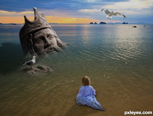
Thanks to jurvetson for the pic of the young girl, to fwooper7 for the pic of the seagull, and to foxypar4 for the other pic of the seagull, all of them artists from flickr. (5 years and 2648 days ago)
Nice idea, well done!
This almost works, except that the kid doesn't look wet, and the light on the girl is opposite that on the king. (Oh, and the king has no shadow or reflection.).
Thanks Bob...made some small changes.... thanks for suggestions.
Neat idea.
Thanks photogirl723....!
Everything is good except for the shadows as bob said. still a nice work.
Howdie stranger!
If you want to rate this picture or participate in this contest, just:
LOGIN HERE or REGISTER FOR FREE
Thank you CMYK.
Congrats !
Thank you Lolu.
Congrats Skyangel
Thank you Sylvie.
Congratulations....
Thanks George.
Congratulations and great work
Thank you Wyndham. When are we going to see more of yours?
I'm a little bit stuck right now, but working on it
Howdie stranger!
If you want to rate this picture or participate in this contest, just:
LOGIN HERE or REGISTER FOR FREE