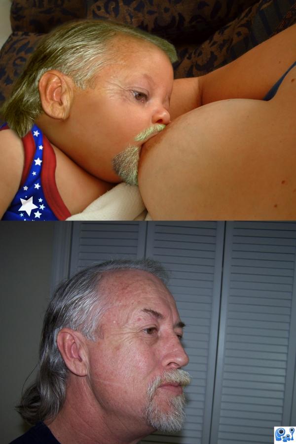
this is from the early life of lchappell :)
(5 years and 3789 days ago)
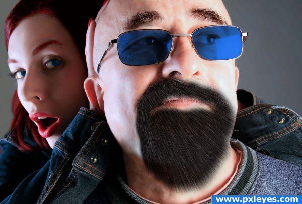
Taking the years away...
sbs up later... (5 years and 3808 days ago)
i liked her before but i like that you changed the color of his glasses
Nice thinking...try using a fine, thin brush with nearly no roundness and scatter closely to give the look of a hair edge where the skin meets the goatee. Just a thought.
Pixelkid, thanks for the sugestion, i´ve been trying but my photoshop skills are not quite there yet. i´ll keep having a go at it.
Howdie stranger!
If you want to rate this picture or participate in this contest, just:
LOGIN HERE or REGISTER FOR FREE
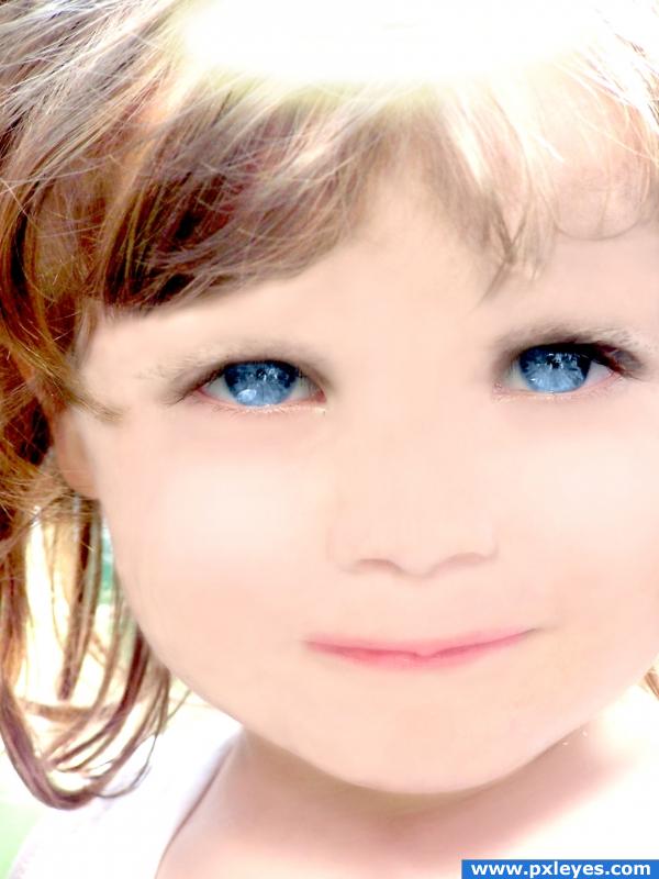
Sorry to bring yet another cleaned-up entry to this contest but this is what I enjoy doing and well, since I made it I might aswell upload it. ;) (5 years and 3854 days ago)
I like the idea, but you made her skin tone too even in my opinion. Good luck!
nice effort ..but the originality of the picture is lost.. levels 2 high n smudging also
Very clean work. A little too bright.
Howdie stranger!
If you want to rate this picture or participate in this contest, just:
LOGIN HERE or REGISTER FOR FREE
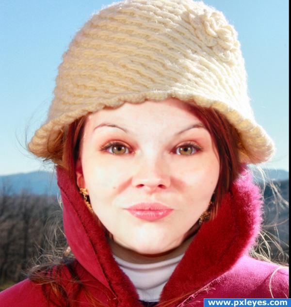
Thanks to Siege N. Gin at flicker.com (5 years and 3875 days ago)
step 3 looked the best in my opinion. good job!
This child looks a bit weird to me o.0
Hmm, i'd remove the make up by selecting a skin colour with the eye dropper tool and then paint over it in a new layer set to 'luminosity' Good luck.
Pretty good for the most part, but, the chin area could have been blended a bit more.
Nose should be smaller...
I like this better- good job!~
awesome!
needs more work below the chin 
Howdie stranger!
If you want to rate this picture or participate in this contest, just:
LOGIN HERE or REGISTER FOR FREE
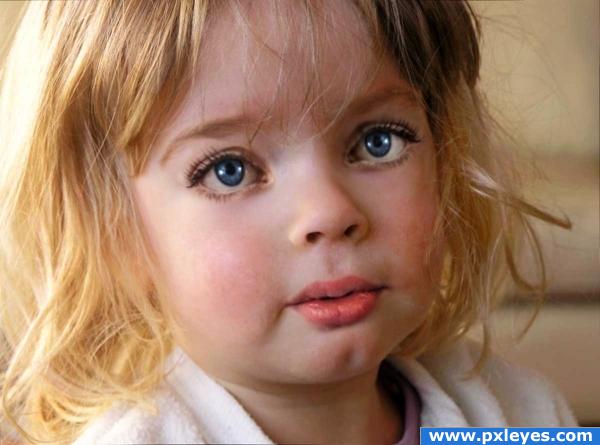
Credits and thanks to:
- faestock (http://faestock.deviantart.com).
- Zela (5 years and 3879 days ago)
great blending!  i don't know why, but she looks kinda weird.. maybe it's the eyes.. but nevermind, great image!!
Thanks... she looks a bit strange because of the eyelashes i guess, they're not really of a child's. I already removed most of the make up and arranjed up, dunno if i can do more >.
all you have to do is lighten the base lashes... children's bottom eyelashes are usually not dark in slovak/caucasions (I have over 20 nephews and nieces) the darkness of the bottom lashes causes the ADULT eye effect (sorta like how they dress all the teen age girls on the Disney Channel to look like sluts.. they just darken the base eyelashes and put them in tight crappy clothes) lighten ONLY the lashes, or she may end up with eye bags (you could also remove them completely, like the original photo, keep the top ones so it still looks like a transformed adult.. beautiful image 
EDIT: MUCH BETTER.. the lighter lashes make her more sweet.. good luck and very good work author
My understanding is thast you ars supposed to use an image of an adult and make them young again. What you have here is a image of a child already.
i agree with JustinCase in contest goal says "grab any image of an adult"...but this image is quiet nice but out of theme, good luck
This is cute though--it reminds me of one of those porcelain dolls that look so real. I did this project before I realized it was for a higher level---I put the results in my album (or in ART)
how is this off theme? "revert them back to early childhood, in other words, turn them into babies!" i think the author did a pretty good job doing that!
excellent blending, her bottom lip could do with a bit of adjustment, it looks lik she's pulling it to the righ (screen right)
Well this is supposed to be the model's from faestock, baby's version for that i needed a child's stock ~~
Edit: Made the eye lashes lighter; fixed the lips; added more shadows/lights to the eyes.
Woah.. quick change.. looks a lot better in my opinion now, good luck!
personaly i think the child you submitted looks older than the original ( more defined ) i thought you were suppost to take an older person and make them young, not take a young person, and make them look like a different young person ?
very good blending on this image, good job!
I think the problem i sthe left eye, it's a little bit to big,needs to be rotated a bit and maybe add some perspective to it. All just some minor adjustments 
Great work BTW and on-theme if you ask me 
The two images are too similar in age to make this much of a transformation....
Well i'm sorry if this is not really in theme i guess i didn't understand well what's the goal of this contest o.o
to take a old person and show what they looked like young. don't get me wrong this is a very nice image, just a tad off theme.
awwwww! so cute
How is this off theme? Other people are doing the same, working on a child's stock using adult's parts on it T.T
I would like to see the "older" version in your SBS. The mouth needs to be shifted screen right a bit and if you use the transform feature I'm sure you could get it more into perspective. All in all I like it...off theme or not!!!
The older version is the girl in source 2 by faestock.
Congrats for your second place, Akassa!
Congrats!
congrats
Congratulations for 2nd
Congrats!
Howdie stranger!
If you want to rate this picture or participate in this contest, just:
LOGIN HERE or REGISTER FOR FREE
haha cute
gl.
Cool manipulation author... GL author! X-rated LOL : D got high marks from me author!
wow!
LOL Chappy. Fine job Author
Your task is to take any image depicting and elderly man or woman and make them look younger. Show before and after images. I don't see before and after here...
maybe you should lose the shades (h)
I think youre being too picky there CMYK. That hair, goatee and crowsfeet are hardly things you'd see on a newborn! But the forehead, nose and cheeks are young... To be pedantic you are probably correct but I think its within the 'spirit' of the contest - and I like it!
I hear you CMYK46, the rules state to make an old man/women look younger not the opposite, though it is really a great entry, it is a shame not to have it both ways. Any way, good luck author, wonderful work of Art!
I think it's a little off theme.
OHHHH! This is just WRONG! And ouch......that mustache has GOT to hurt!!! But a very funny image!
thanks for all the comments i guess a few do not get the "youth fountain" i have tried to make with this image
Hahah!Great idea!
author, if what you are saying is that what you have done is taken this gross ghastly old man, and made him look young, then essentially you are depicting that he is still 60 or 70 something, therefore this image is pornographic, and is uncalled for on this site. if this was really just a baby, it would be ok. but if you ask me, i dont think any of us want to see this old man suck on someones boob, no matter how young they look. on the other hand, if this is a baby you took and make look older, that wouldnt be so pornographic, but it would still not follow the guidelines, as we need (cont...)
as we need to take the image of an young person and make them look old. so this would actually be inappropriate either way. doesn't fit the guidelines, and if it did, would be inappropriate for this site. anyway, if what im trying to say is that if this WAS following the guidelines, then what you have here is a 60 or 70 something OLD man sucking on a woman's breast. i think that would be inappropriate for something on here, unless its like distasteful video®, or some wrong episode of penthouse.
thanks bddesign glad you like it
OK I have to agree with Ray on this one. Bd if you think this is porn and belongs in Penthouse rag you have lead a very protected life. Although your novel is nice, I see a young and old, also find it humorous. good luck Author
Ok... this is not porn! Even with the sparkle in the eye! lol... I looked at high res... banish my soul! This is what Ichappell looked like as a baby... Hope this is a top entry and posted on website homepage... lol!?
lol
I don't really think this is pornographic either but the theme was to take someone old and make them look like what they might have looked like when they were young. So....... I guess I agree with CMYK.
people, people, people...............this is a fun site too, and this image is great............lighten up a little, and enjoy it!
i happen to think is wrong in so many levels an off theme. so many good entries have been removed before on other contests by being a bit off theme...i am on the fence on this one
ok,

in an effort to help some people understand what is plain to see in this entry, i will try to say why this entry is ON theme, as i cannot see any reason that it is off theme.
Goal:
In their later years, people often look back and think about how they looked years before.
Your task is to take any image depicting and elderly man or woman and make them look younger.
Show before and after images.
( suggested by: ponti55 )
ok, lets look at the goal, line by line
1: In their later years, people often look back and think about how they looked years before.
i have added a twinkle to his eye to help with the fact that this is a thought process
2: Your task is to take any image depicting and elderly man or woman
i have used the elderly pic of lchappell
3: and make them look younger
i have made this old guy look younger, very young in fact
4: Show before and after images.
i have a before and after image there
now, for little added flavor, i have also used the contest name in my design, if you think about it this image does follow the "youth fountain" name very well.
so, maybe one of you would care to show me your reasons this entry is off theme so i can fix it
thx
well, i'll give it a go... i don't think the object was to make a play of words and image. it is a very straightforward goal to pretty much give an older person a "photoshop cosmetic surgery", to recreate how the person would have looked younger, not as a baby. i believe that was another contest. besides that, i don't think the person on your original image had a beard and grey hair as a baby, maybe if the baby looked like the man as an infant people would not have a problem with the entry. hope this clarifies it, at least from my perspective.
well, lchappell is an American legend, and everyone knows he was born with his beard

bleah XD
I really like this design, and dont think its off the theme. I beieve the author shows an old man getting younger by drinking from a fountain which happens to be breast milk. The author took to the theme and added a sense of humor spin.
hahahhahhahhahahhah
funny
either way, 31 comments. Life is tough as an artist ... creative works are open to interp. a side note: from a movie can not remember the name. An artist painted a picture. the picture was of a Woman half naked in her bedroom, man looks on . A viewer of the painting scorned the work. stated it was PORN. A young woman in a state of undress in front of an old man.. she was just horrified by the work. She was then approached by the artist. She put forward her opinion of the works. The artist then said. MADAM, this is a picture of a married couple. ( see next posting for continued story)
it is their wedding Anvers.. and they are getting ready to go out for dinner. The man is waiting for his wife . In the end the artist asked the woman to leave after the artist stated in a very good way his opinion. Art can be strange ,different and open to so many opinions. GOOD LUCK AUTHOR>
very nice
CMYK is often jelous when he see some good and original art... Don't mind him he sometimes gives good advice (but only sometimes)... Lots of images that are winning, have nothing to do with theme, thats why i dont do contests anymore Ur idea is original and i like it, blend little more old skin on baby's face and it will be perfect
  l
l
Howdie stranger!
If you want to rate this picture or participate in this contest, just:
LOGIN HERE or REGISTER FOR FREE