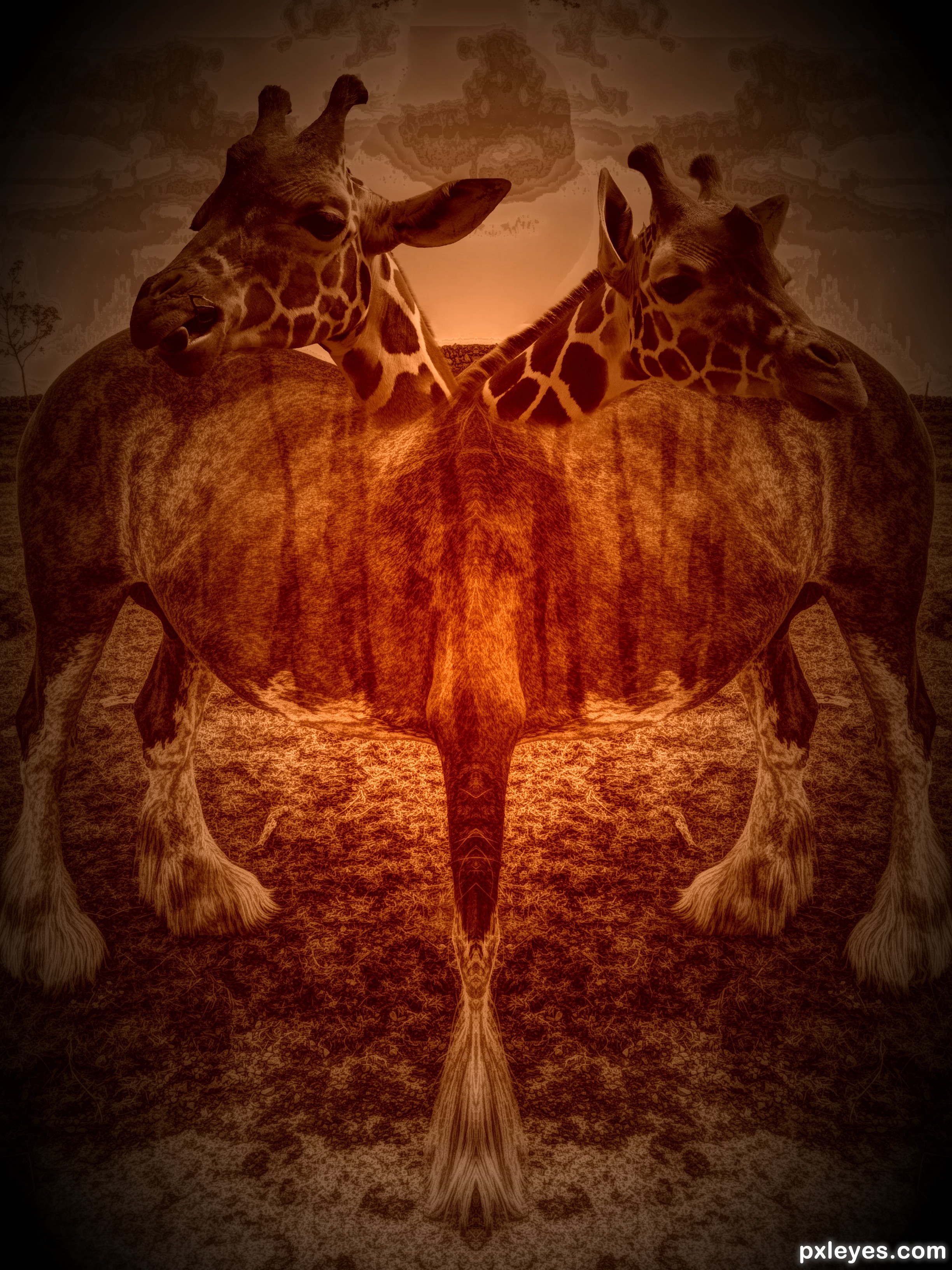
(5 years and 2324 days ago)
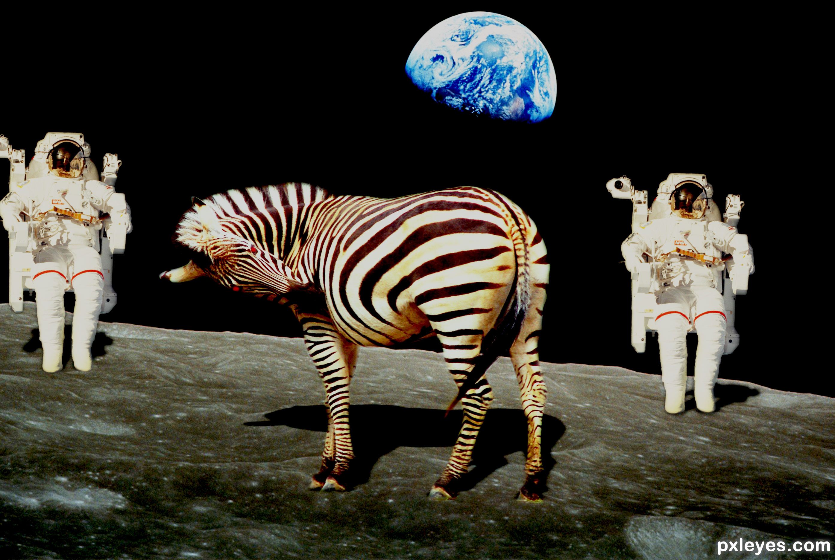
Five legged Zebra Horse with two heads! (5 years and 2460 days ago)
Other sources?
The other source is my own picture of a horse taken by myself but how do I show it?
5.3. Use of Personal Images as Source: If you use your own personal images, the uncut source must be placed in the step by step with an explanation that it is your image.
The heads don't seem to blend well with the bodies... Good attempt, but some improvement is needed
Howdie stranger!
If you want to rate this picture or participate in this contest, just:
LOGIN HERE or REGISTER FOR FREE
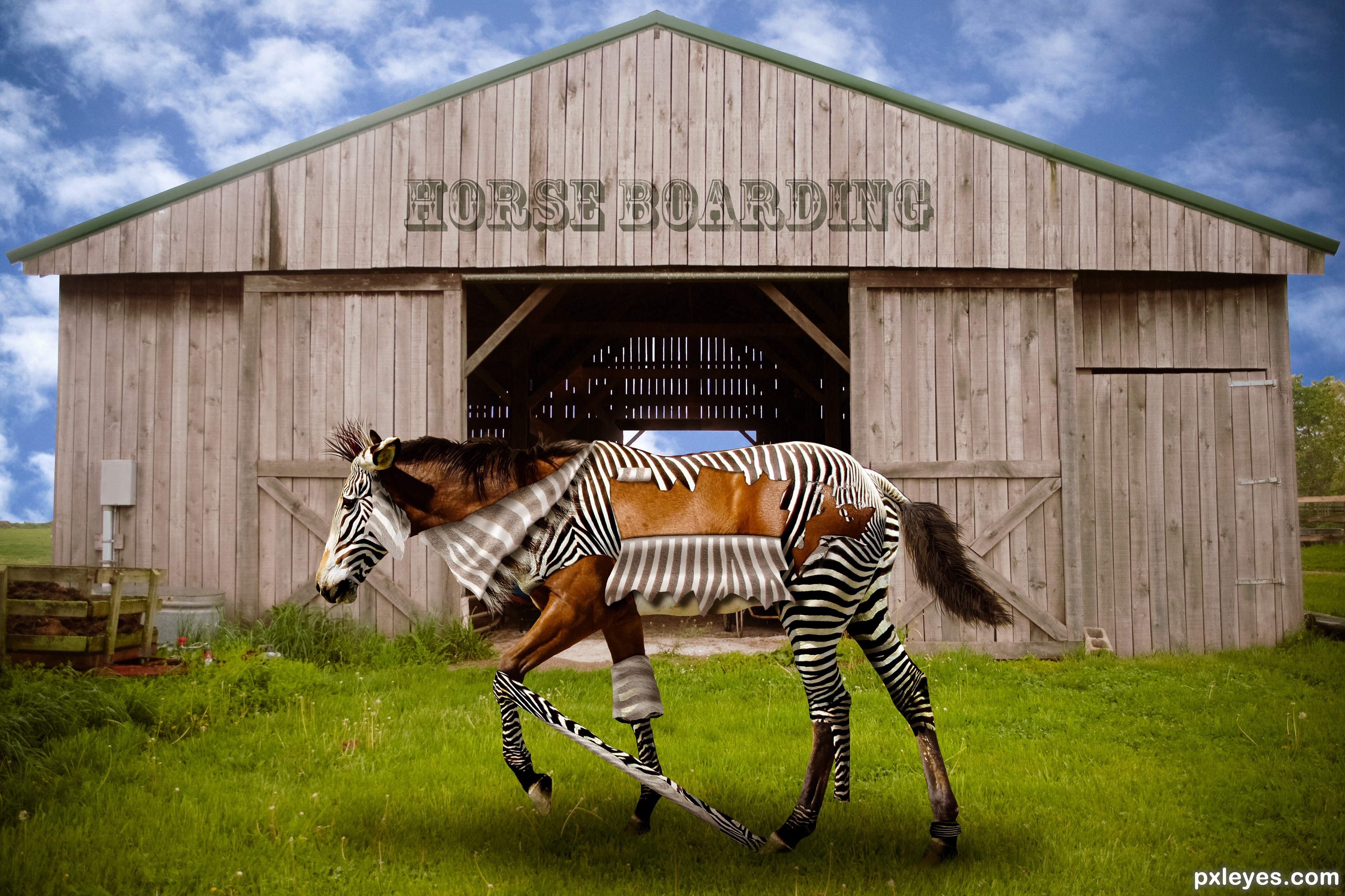
(5 years and 2486 days ago)
Gr8 job. My only concern at first was front left leg's peeling zebra skin felt either too straight or long. Then i realized it is being stretched by the hind leg... great detailing.. 
Yep exactly, and thanks. I tried to vary the skin in different stages of removal and the leg position was perfect for a skin stretch using the hind foot.
That is so cool lol... man im loving this contest, the images are wicked!!!
Thanks, appreciated!
LOL... Very clever work 
Thanks so much!
Clever idea, and very good work!
The only nitpick I have is the shadow from the horse/zebra, it should be stronger, based on the shadow from barn overhang, and shadow from horse's ear, it will help to ground the horse more. See the shadow on source pix.
Agree, fixed. Thanks!
Congrats.
Thanks!
Congrats again Randy!!
Thanks!
Howdie stranger!
If you want to rate this picture or participate in this contest, just:
LOGIN HERE or REGISTER FOR FREE
(5 years and 3022 days ago)
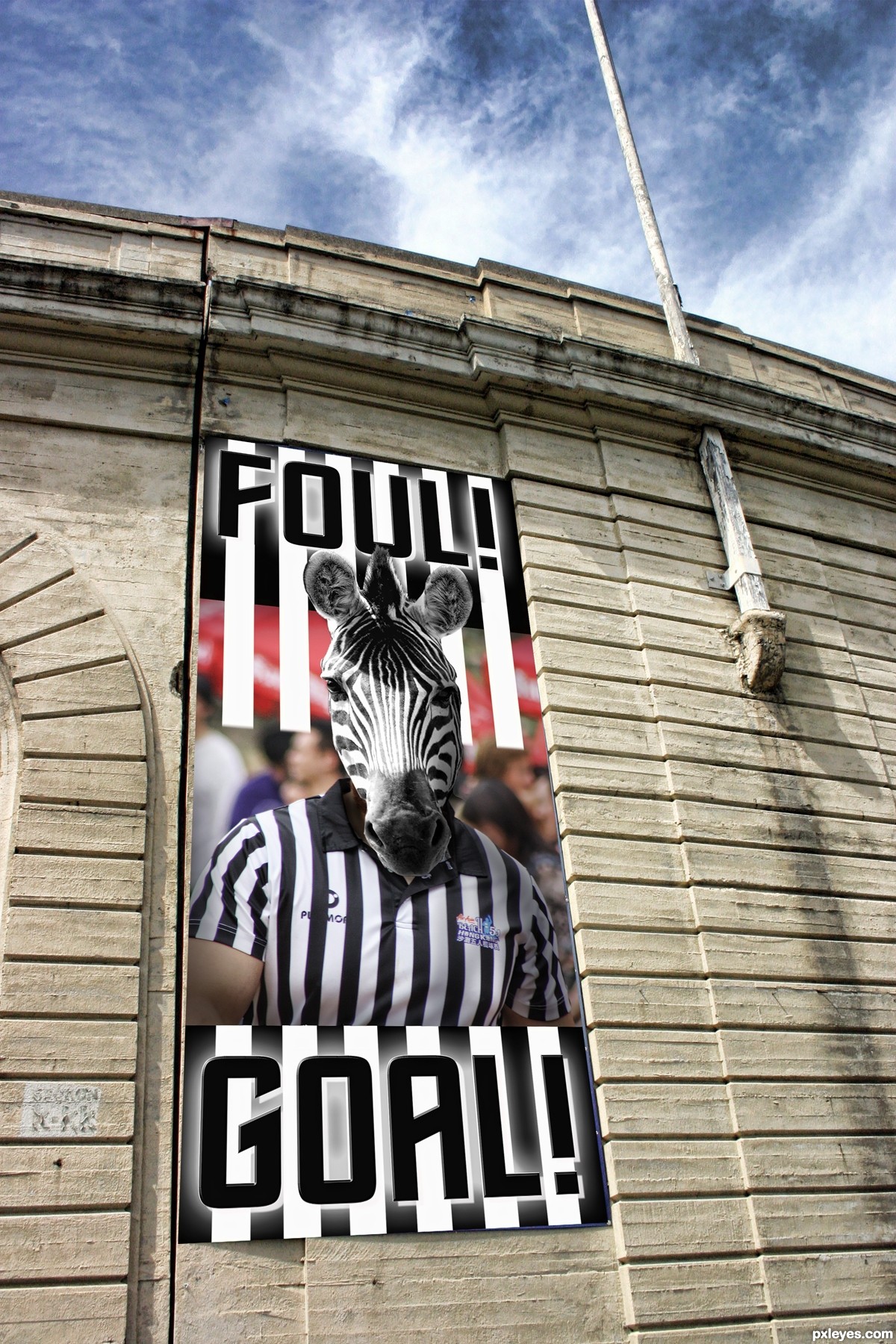
its a good idea but you really need to work on the execution, the zebra head looks pasted on because you can still see part of the neck and chin of the person behind it also his arms are stillnormal skin. If you would make the edge of the poster less sharp like the one behind it then that will add a lot to the result as well. I really like how you draw the white lines on top longer till behind the zebra. The zebra lines below the image i think are hurting the image because the lines on the shirt arent really straight and much brighter white then on the shirt. So the image loses power where the textfield gets the attention maybe you can make the white less bright and the black lines less black below the picture, that might help. If you dont wanna do his arms then you could crop the picture off higher to not lose effec there.
oh lord 
Personally, it think the image is cute and works (that's a lot of words on how worthless this entry is LOL)
Good thinking, you really maade me laugh !!
Great type treatment, especially at the top (see thru to back), and bottom glow. They remind me of piano keys.
Howdie stranger!
If you want to rate this picture or participate in this contest, just:
LOGIN HERE or REGISTER FOR FREE
(5 years and 3072 days ago)
i like the idea funny
hehehe
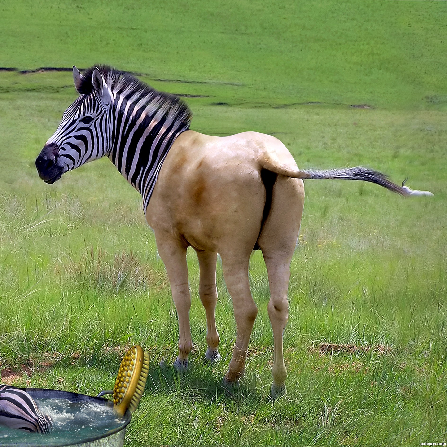
Maybe that's what it feels to be "butt-naked". Lol 
This is cool...and has great potential. See if you can blend where the zebra fur is gradually into the naked part. Perhaps use a brush with various opacities with the 'scatter' function. Nice job!
lol...hilarious
between the back feet there are some strange marks(check the hi-res).
Congrats!!
Congrats, terrific work
Congrats !!!
Nice Job Congrats on First Place Win
hahaha this is nice
Howdie stranger!
If you want to rate this picture or participate in this contest, just:
LOGIN HERE or REGISTER FOR FREE
Photography and photoshop contests
We are a community of people with
a passion for photography, graphics and art in general.
Every day new photoshop
and photography contests are posted to compete in. We also have one weekly drawing contest
and one weekly 3D contest!
Participation is 100% free!
Just
register and get
started!
Good luck!
© 2015 Pxleyes.com. All rights reserved.


its look really cool
thnx
Howdie stranger!
If you want to rate this picture or participate in this contest, just:
LOGIN HERE or REGISTER FOR FREE