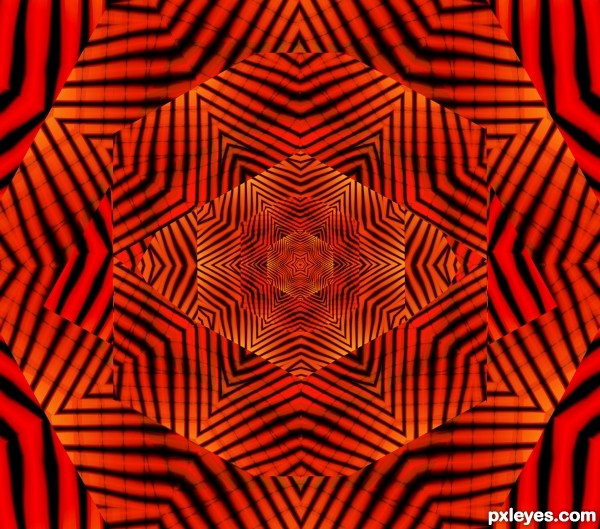
simple but I'm still finding my way around...kinda lost at the moment.. (5 years and 3118 days ago)
- 1: source1
(5 years and 3133 days ago)
Howdie stranger!
If you want to rate this picture or participate in this contest, just:
LOGIN HERE or REGISTER FOR FREE
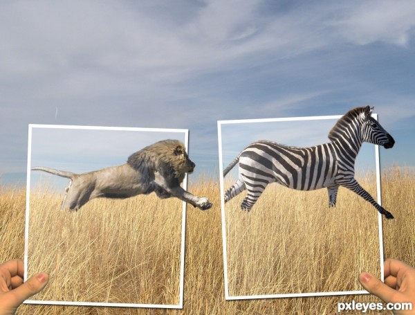
I wanted to do a picture with a lion and at first I wanted the zebra to be a person instead. But I couldn't find a good stock image of a person running away so the zebra is going to get eaten. (5 years and 3182 days ago)
This is a pretty good piece. I really like it. I do have a couple of suggestions though and will wait to vote. First, do a little research of the size of a lion relative to a zebra. Your picture seems like the lion is a bit large. If both are in the original then I will just accept that I know very little about lions and zebras  Second, putting one of the frames in front of the lion might add a little more dimension. Finally, the exposure on the hands doesn't really match. Not sure how to fix it, just seems not quite right. Just some food for thought.
thanks for your suggestions. Instead of making the lion smaller I made the zebra a bit bigger. I moved both animals to the left and put the frames in front of their tails to make it seem more like they are in the pictures. And lightened up the hands to make them a bit more pale because the whole picture kind of just has a pale look to it. 
i like the concept. maybe darken the background a bit, to draw attention to the photograph frames?
also, there are some sort of mask on top of the animals, is a little distracting.
I lowered the brightness of the background and it does help the foreground pop out a bit, thanks. and the mask that is over the photographs is suppose to be some gloss how pictures have, but I lowered the opacity of it over the animals. 
Very cool image author...one of the best ideas for OOB image...u should fix some minor details such making edges of animals bit softer and maybe with smudge tool u could work on hairs and fur....also, this is OOB image but don't forget shadows...GL
Howdie stranger!
If you want to rate this picture or participate in this contest, just:
LOGIN HERE or REGISTER FOR FREE
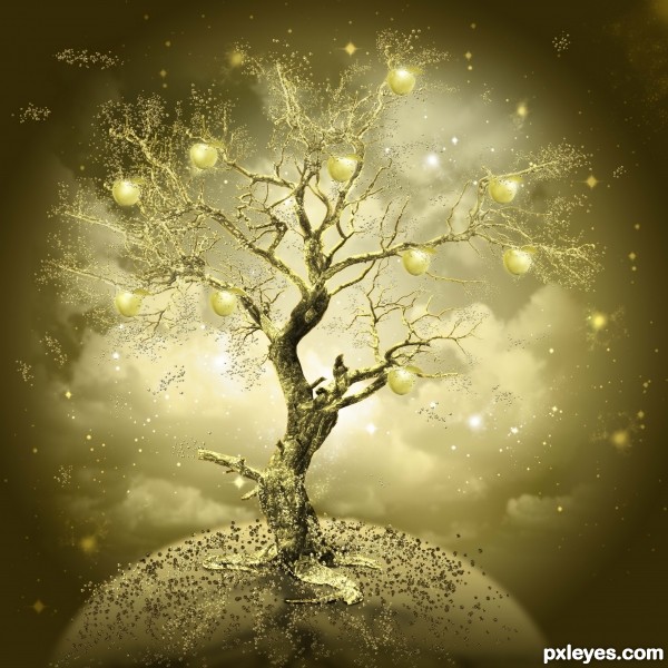
i followed this tutorial http://www.photoshoplady.com/tutorial/create-a-imaginative-golden-apple-tree-in-photoshop/2742 (5 years and 3347 days ago)
loooooool great job
thanks!!!!
I love it, good luck!!
Great idea..needs a background to finish it off.
thanks i fixed everything
Fantastic colors with amazing work........... Good Luck Author.
very good!!
thank you !that's not me, that's a tut! i'm only learning
Fantastic work author...love the colors,mood,execution...everything....best of luck
fab
Fascinating work ... colour is lovely and the concept is very "otherworldly".
thank you!!!
beautiful job 
nice work .......... 
IT IS AMZING ,GOOD LUCK
many many thanks!!!!!!!!!!!!!!!
Lovely golden tree 
Howdie stranger!
If you want to rate this picture or participate in this contest, just:
LOGIN HERE or REGISTER FOR FREE
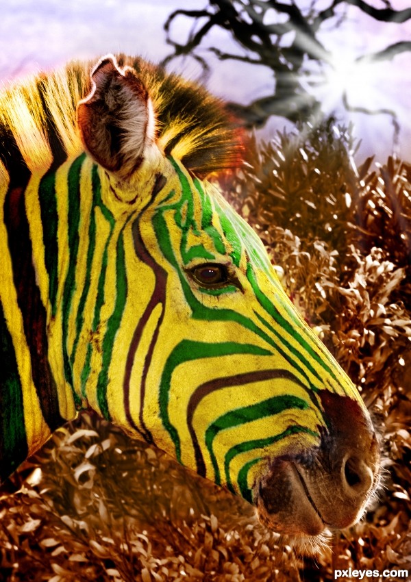
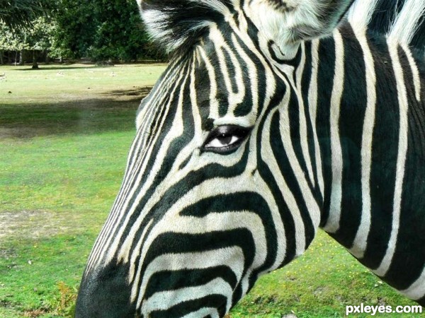
Hey Everyone!
I hope you like my new entry..
This was allot of work, most of it done in quick mask mode and then some blending of colours, hue& saturation, colour balance ect.
The original Image was in colour but I made it B&W and then worked from that.
As always I am open to suggestions on how to improve! :D (5 years and 3371 days ago)
I think you did a nice job. It looks well blended.
Nice image author, if I may give you some little critique, you should try to get rid of the white borders/lines around the stripes and work some more on the ear. And I would give the bushes in the background a different color than the zebra, but that is my opinion 
I saw quite a few of these back in the 60s & 70s. 
Good work, author.
Super cool idea and fantastic execution...well done author...gl
Cool job. Like the color choice. It is different. And the zebra is smiling. 
well now..isn't this a little warhol.  Nicely done. i love the choice of picture, and your thoughts in color.
  its fun.
Reminds me of the zebra from the old chewing gum commercials... "Yikes, Stripes! Fruit Stripes Gum!"
:lol:
Thank you all for the comments and support! 
The Zebra is cool but the background could have been replaced.
Jaws I'm not sure if we were allowed to change the background.. I think we were only allowed to work with one image if that was what you meant  Thanks
Howdie stranger!
If you want to rate this picture or participate in this contest, just:
LOGIN HERE or REGISTER FOR FREE
The white of the eye is too bright for the rest of the image. It is whiter than the stripes which are being directly lit by the sun. Nice blending, though.
Nice blending author! Best of luck!
Howdie stranger!
If you want to rate this picture or participate in this contest, just:
LOGIN HERE or REGISTER FOR FREE