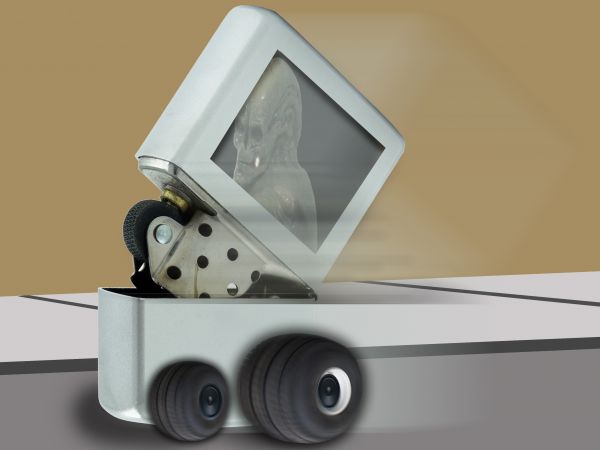
Using different techniques, i have created this wacky racing car.... A zippy zippo :-) Enjoy (5 years and 3713 days ago)

(5 years and 3836 days ago)
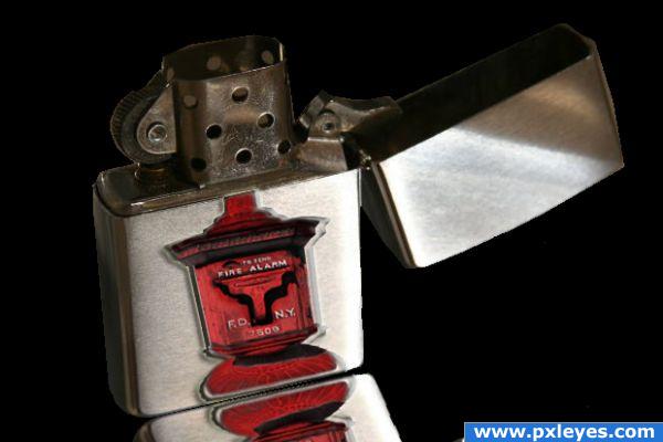
Reflection needs to start underneath the lighter, fire alarm isn't straight...
Let me see you put something together. This is time consuming. Beside, it's the idea that counts.
I would have to agree with CMYK46. The drop shadow is a bit much to the left and the refection is crooked. Plus the top of the source image is a bit tall. Do you see how the top stick out above the lighter outer casing? The lighter is also at a different angle than the source. Don't get mad, just try and fix it, mmkay? I'll come back and vote later.
Author, without wanting to sound harsh, if you have no interest in improving your skills or receiving constructive feedback, then this is not the place to submit your work! Take on board the feedback these people give you - I'll hold off my vote for now to see if you do 
ironic idea, nice
Author: well, yes, the idea does count but it's the execution of the idea and how well you carry it through that will earn you the votes. Please try to be open minded about the criticism........it is meant only to help you. CMYK usually gives rather terse comments but they, as well as all the others, are meant only in a helpful way.
I understand where you guys are coming from. I just found myself getting discouraged, because I entered too many contests at once, and I am suppose to be focusing on my college assignments. Here, I fell behind in my schooling and became frustrated. Sorry. Oh! And I do appreciate the feedback. It has really helped me enhance my skills in other areas of photoshop. Thank you.
Howdie stranger!
If you want to rate this picture or participate in this contest, just:
LOGIN HERE or REGISTER FOR FREE
nice idea but demands more work...some parts are to blur-y...what are that black stripes...tire's have wrong perspective
For so thick tires, the forward one of the opposite side would be appearing a little; and the angle doesn't match the lighter one.
Thanx guys, but i will leave it as is... Youre right though Erathion, but erikuri- what if there arent tires on the opposite side? maybe its just one in the middle, i mean, its an alien riding in a zippo... you might as well tell me, you cant put anything in a zippo let alone letting it be a race car... i appreciate the criticism, but i dont think its needed for such an entry, but thanx guys! gold medals for you both!
Very good idea !! but the tires are a bit too blurred and the downside of the zippo also is a bit too blurred, though it's a very nice idea and Good luck author !!!
!!!
Neat idea but could use some more details. ; )
Howdie stranger!
If you want to rate this picture or participate in this contest, just:
LOGIN HERE or REGISTER FOR FREE