- photo contests ▼
- photoshop contests ▼
- Tutorials ▼
- Social ▼Contact options
- Stats ▼Results and stats
- More ▼
- Help ▼Help and rules
- Login
Pxleyes
Photography and photoshop contests
We are a community of people with
a passion for photography, graphics and art in general.
Every day new photoshop
and photography contests are posted to compete in. We also have one weekly drawing contest
and one weekly 3D contest!
Participation is 100% free!
Just
register and get
started!
Good luck!
© 2015 Pxleyes.com. All rights reserved.




The brightness of the right front of the tree seems inconsistent with a light source coming from behind the tree. There's an inexplicable notch in the right railing near the top. (Using the Clouds filter to create a mask for the tree shadow might help 'wispify' it.)
(5 years and 3690 days ago)Nice illustration, although a bigger skull (even going beyond the borders of the image) might be more dramatic. The text has too many different fonts which confuses the message. I would put "Lung Cancer" all on the same line. A punchier message might be: "Stinking is cool. Lung cancer is cooler. Dying is coolest."
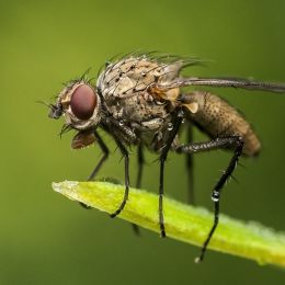
(5 years and 3692 days ago)Creative concept (although the perfectly horizontal shoe may be too extreme). The dark-blue background made me first think this was a lobster under the sea! I think sky blue would be a better choice. Also, the blurry ground needs to be in focus like the ant's feet and the plants in the back.
(5 years and 3692 days ago)Would be good if the red paint looked realistic.
(5 years and 3692 days ago)To me, "dancing on" needs to show feet in contact.
(5 years and 3692 days ago)I'm unfamiliar with the idiom, so I appreciated the explanation. The wooden landscape is lovely, but I don't get why the figure is also made of wood.
(5 years and 3692 days ago)Cool concept, but for it to truly work for me, the figures need to look more like origami (flat planes, crisp edges) than guys in origami-like costumes.
(5 years and 3692 days ago)Great creepiness factor! The feet positions are odd when divorced from their source -- why not display the Barefoots on pedestals with a blurry sand background? I really like the concept of adding a level of content by making your entry an advertisement plus I think "Leave Your Mark" is a great slogan for these unconventional shoes. BUT The two pics on the bottom should have identical heights. The headline calls the product "Bare foots" (two words, initial cap only on the first word [I think]) while the text at the bottom refers to "Barefoots" (one word). Both lines of text at the top should be stretched so the left and right margins match the left and right edges of the double-pic montage underneath.
(5 years and 3692 days ago)Very creative. I think there should be some shadow where stem meets house, and the center house might also cast some shadow on its leaves. The three-house thing seems odd. If it's three blooms, then having the front bloom cast a shadow on the back blooms would make it seem less flat (although the stems kind of seem like they're all on the same plane). [I'd go back to your flower-pot source for inspiration and make it two blooms: big house in back, smaller (still growing) house in front on right.]
(5 years and 3693 days ago)That face adds a lot of personality! I like that you colored the tattoo. I think the bird could stand out a bit more, however -- maybe move it in front of the white portion of the barn roof or make it bluer.
(5 years and 3693 days ago)Very appealing and quite realistic, although the source of the front light is mysterious.
(5 years and 3694 days ago)Cool.
(5 years and 3695 days ago)Like the color palette and the dramatic silhouettes. Nevertheless, to me, the casual poses of the people still seem at odds with the chaos around them. But then again I do tend to prefer the literal depictions of idioms over the figurative depictions such as this.
(5 years and 3695 days ago)Chosen idiom is dramatic, but the image -- not so much. Making the bat three-times bigger so it's clearly the focus would help a lot. If that yields more contrast between foreground and background for a greater feeling of depth, then you will have created something more compelling.
(5 years and 3695 days ago)I think you've illustrated a proverb/adage/saying rather than an American-English idom. That said, if there's tape over his mouth, then we shouldn't be able to see lips, but rather just a straight up-and-down edge.
(5 years and 3695 days ago)The cancel marks on the stamp should continue onto the envelope. That's also an odd place for a stamp. You could turn the Air Mail logo upside down and then place the stamp upside down in the lower corner to make it seem like the entire envelope is upside down.
(5 years and 3695 days ago)Fun, although it does look more like "When Pigs Taxi."
(5 years and 3695 days ago)Creepy. I'm not familiar with this idiom, however, although I have heard people criticized for having a 'foul' mouth.
(5 years and 3695 days ago)Very interesting because you illustrated a literal idiom by incorporating a different figurative idiom, specifically, illustrating the abstract notion of thought as a 'light bulb moment.' I personally think a lit bulb would be a better depiction of a 'light bulb moment,' plus more than one bulb would better conform to the plural thoughts.
(5 years and 3695 days ago)Good one! It is indeed a dilemma to figure out what kind of animal that is.
(5 years and 3695 days ago)Pretty compelling. I confess I don't understand what the mask adds. Also, I think there's maybe too much uniformity. If the wing were darker and if the upper-left hair were more distinct against the blurry firestorm in the background, there would be more of a feeling of depth which would be more dramatic IMO.
(5 years and 3696 days ago)This strikes me as Crack AND Dawn (or maybe Dawn and Crack given the arrangement of the composition). I would expect the dawn to be coming out of the crack in order to be Crack OF Dawn.
(5 years and 3696 days ago)The contest description seems to imply that literal, not figurative, meanings are to be visualized, but since there's no explicit limitation, this figurative representation is technically on theme but maybe not as interesting. What is the light source for the bright spot on the boy?
(5 years and 3698 days ago)Cool, but I think super-fly needs to cast more shadow.
(5 years and 3699 days ago)Good concept, but the skeleton seems like a cartoon whereas the closet seems real.
(5 years and 3699 days ago)Really like the idea of re-imagining rust as caramel dripping over chocolate cake, but I don't think the caramel is quite realistic enough for such a close-up viewpoint. Also, I feel the whipped cream is weak and possibly unnecessary.
(5 years and 3699 days ago)Cute. However, on the car's bottom third, the wheel cut-outs are appropriate for a standard, straight-up-and-down car side, but they don't reflect the curvature of an egg. And then when the car body curves under, I would expect it to be in shadow.
(5 years and 3699 days ago)The 'hat' is a Möbius strip and while it has unique topological properties (http://en.wikipedia.org/wiki/M%C3%B6bius_strip), it's not clear that it's an optical illusion as it is exactly what you see and you can even make one at home.
(5 years and 3699 days ago)An SBS displaying the two birds on a white background might help dispel the confusion.
(5 years and 3699 days ago)Very creative! Maybe if the title referenced the bench instead of the man, initial confusion would be reduced. BTW I would expect his feet to touch the ground closer to the bench.
(5 years and 3700 days ago)Very creative integration of multiple optical illusions!
(5 years and 3701 days ago)I agree: weird but nice.
(5 years and 3701 days ago)It is a nice effect. I would observe that the pic's drop shadow implies a flat surface, but the bike's shadow apparently exists in a floor/wall environment.
(5 years and 3701 days ago)The orange background makes the orange flowers hard to see. The floral arrangement seems a bit undersized for such a large vase.
(5 years and 3701 days ago)k5683: If there were no guy, there would be no (really significant) illusion. The guy transforms the final ramp plane from a top to a bottom. My suggestion merely proposed that having the ladder connect to the front of that bottom (the direction the guy is facing) might be better than connecting to the back of that bottom -- plus (I would note) connecting to the front would create an illusion even without the guy (i.e., an alternative way to convert the final ramp plane from a top to a bottom).
(5 years and 3702 days ago)Love the spoof of the non-level horizon! The overflow source's top and bottom don't quite match the upper and lower edges of the framed pic's water, however. Aso, I would move the bird in front of the frame a bit more to the left to make it even clearer that it is both in and out of the framed pic.
(5 years and 3702 days ago)A level horizon would be less distracting.
(5 years and 3702 days ago)Nice, but I'd still like to see a level horizon.
(5 years and 3702 days ago)Very creative to turn the metal heart into orthodontia. But the flyer/ad is kind of blah. The drop shadows only make the text harder to read, especially in the inset (where it should be "orthodontists" BTW). Maybe more image (with more contrast and bigger inset as that's the point) and less green would be more compelling.
(5 years and 3702 days ago)A lot to like. The illusion might be more compelling, however, if the right-side figure were on the same step level as the left-side figure. Additionally, the I think background is distracting because its dark shadows dominate the center (initial focal point of viewer) but then has no optical-illusion component. A simple stone wall (with maybe a window) with vertical mortar lines consistent with those of the left- and right-side walls might be better as a background. [BTW in background, top figure's left hand should be casting a shadow.]
(5 years and 3702 days ago)I love the minimalist simplicity. Somehow I think that this might be more compelling, however, if the top of the ladder ended in front of the guy. And I would ditch the question mark; you've already captured that confusion with your title. Fine tuning: Instead of flaring ladder-base shadow, have shadow match ramp lines. Going up ramp from bottom, top of left-side edge should meet the top edge of the right-turn ramp, and then the corner at the next turn should be straight up and down, not curved. Right-side edge of long center ramp should be straight up and down at the bottom, and at the top it should match the top of the left-turn ramp.
(5 years and 3702 days ago)Well done!
(5 years and 3702 days ago)Using the beetles [not to be confused with The Beatles ] really makes this cool. Cropping the image so it's wall-to-wall beetles possibly out to infinity might make this even more disturbing.
(5 years and 3702 days ago)Fun idea. I wish you had followed the horizontal flip with a vertical flip, however, so the final result wouldn't have quite such a mirrored-halves feel. (BTW there's a white-line edge issue where the top two cogs intersect.)
(5 years and 3702 days ago)Nice. The pearls do have a rather dull finish, however, not the shiny transluscence of real pearls. Experimenting with bevel on the string might add some three-dimensionality. The necklace reflection should be moved down slightly so the relationship between the ground-touching pearl and its reflection is the same as you show for the loose pearls to the right.
(5 years and 3702 days ago)Fun and colorful. The background is maybe a bit too intense, distracting some from the butterflies. I wish the butterflies had differing expressions and leg positions to give them more individuality beyond just hue.
(5 years and 3702 days ago)I agree with Alan that it looks more like melted cheese, and fairly convincingly so. I would confine the color balancing in SBS Step 4 to the car body to avoid the chocolate-looking wheels, windshield, and interior -- and greater color contrast between the cheese and the hood/bonnet would be more effective (red maybe?).
(5 years and 3702 days ago)Very creative. I wish the floor-tile pattern were also an optical illusion. I also think the walkway illusion would be even more effective if the walkway's beginning and end looked like they were tied into the pool's rim, not sitting on top of the rim.
(5 years and 3703 days ago)Pretty. I like that it's not a mirror image although the repeating shapes at the same horizontal level give it a mirror-image-like feel in spots.
(5 years and 3703 days ago)Looks chocolatey, but I usually think of fast cars and sensuous chocolate as silky smooth. The white 'glare' on the near hood edge presumes a smooth surface but in any event looks like a gash here.
(5 years and 3704 days ago)