- photo contests ▼
- photoshop contests ▼
- Tutorials ▼
- Social ▼Contact options
- Stats ▼Results and stats
- More ▼
- Help ▼Help and rules
- Login
Pxleyes
Photography and photoshop contests
We are a community of people with
a passion for photography, graphics and art in general.
Every day new photoshop
and photography contests are posted to compete in. We also have one weekly drawing contest
and one weekly 3D contest!
Participation is 100% free!
Just
register and get
started!
Good luck!
© 2015 Pxleyes.com. All rights reserved.




Very cool. An SBS would be informative/instructive. I think having all of her hair splattering would be even more compelling.
(5 years and 3385 days ago)Creative concept and you certainly committed yourself to a lot of work. The hair/veil notion is very cool. I found the medium hi-res version [the one shrunk to fit on my screen] the most compelling. The small one here doesn't have quite enough detail to appreciate what you've done while the full hi-res reveals the misalignments, etc. that are understandable when you're doing something so intricate for negligible remuneration at best. The assymentric hole arrangement on the symmetrical face is a perfectly valid artistic choice. I do feel, however, that the holes on the far side of her nose should not be particularly visible.
(5 years and 3385 days ago)Creative idea with a clever title compellingly executed in a dramatic palette. An SBS would be nice, though. Opportunities for fine-tuning: Have the cross-hatched sections look like they follow the contours of the face they're in front of to make them seem on the face instead. Have the grass cast subtle shadows on the building where it touches the ground to firmly ground the structure. Have the far right columns of the building cast a shadow consistent with that cast by the mound to their immediate right.
(5 years and 3385 days ago)I think there is creativity in treating the eyes differently and in making the great color choices, not to mention the overall concept. However, having all the images facing the same way would be more Warholian and compelling IMO. (BTW is the title an allusion to Warhol's 'Mao'?)
(5 years and 3441 days ago)Fun idea, but I don't get the star shines (or lens flare) on the near sides of the bowling pins. Step 4 of the SBS seems more realistic and compelling to me.
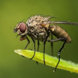
(5 years and 3451 days ago)I'm not a fan of super symmetry either: would a bug really have its antennae and legs perfectly mirror their opposite sides? I also think the background is too blurred because any clue as to what it is has been eliminated. Coupling those corrections with a Rule of Thirds composition could be more dramatic.
(5 years and 3451 days ago)The hair color is unique, but the face with the radiant highlights is lovely.
(5 years and 3451 days ago)I think the detailing and cropping added more punch to the source. I like the vignetting on the bottom but not on the top where it obscures ears, especially his. Could those portions of the vignetting be masked out?
(5 years and 3454 days ago)Mildly interesting. Googling the title didn't give me an immediate explanation as to what this might represent. What am I missing?
(5 years and 3456 days ago)I kind of have to agree with Keiley22. Plus I think the title is a bit uninspired (or in idiomatic American English, 'lame'). The bug wings are too similar to/repetitive of the flower petals IMO. (BTW I don't get the asymmetric bug in the lower right.) The big disks don't strike me as being attached to the stem.
(5 years and 3457 days ago)Very cool, although I think the colored areas on the back wall are distracting while the coloring of the figure in Step 30 (and earlier) is more eye-catching.
(5 years and 3465 days ago)There's potential here, but the image looks more like "Go Through Here If You Wish or Else Just Walk Around" since the end result appears to be the same. The arid setting suggests that a lush, green alternative (with water) visible through the doorway would be enticing but yet worrisome if the title were "Enter If You Dare...".
(5 years and 3465 days ago)A lot of surrealistic appeal. Stronger shadows might be more dramatic plus I think a stairway wider than the doorway would be more appropriate. And perhaps a title of "Secret of Lemon" would be more accurate.
(5 years and 3465 days ago)Like the concept, but I don't get why I need this tutorial. A title along the lines of "How to [do something]" might help explain why I would want to achieve the (uninspiring IMO) Final Result.
(5 years and 3465 days ago)Very nice, but the lack of resolution in the source pic diminishes the impact of your work by diminishing the contrast between the in-focus and out-of-focus portions.
(5 years and 3465 days ago)Good source-pic choice (critical in this contest) and the enhanced color saturation is appropriate. However, the blurring is too extreme as well as too pervasive, especially on the rear end of the right-edge bus and the far edge of the left-side building which seem to be the same focal distance from the camera as the very-in-focus elements.
(5 years and 3465 days ago)I think the box should be brighter as it gets lost among the brightness of the girl and the hand. Overall, to be blunt, I wish there were something to keep this from being kind of trite and boring. Some sort of magical swirl coming out of her hands (or a much bigger plant?) might be more interesting, for example.
(5 years and 3470 days ago)Love the illustration look. I personally don't get the title.
(5 years and 3470 days ago)Shadows continue to be a problem. The figure's shadow seems to be cast in a different direction than the UFO's. A line drawn from the center of the UFO's shadow through the center of the UFO itself doesn't continue on through the center of the light source. The tentacle shadows don't blend that smoothly into the UFO body's shadow.
With the strong back-light source, the front lighting of the UFO (and especially its underside and the tentacle connections) and the side/slightly-front lighting of the figure seem unnatural.
Perhaps changing the title to "Hugh Hefner Wannabe" would assuage CMYK46's concerns. It would certainly be more disturbingly amusing for me (and more on theme, one might argue). Regardless, I can't stop smiling.
(5 years and 3470 days ago)Cool concept. The 3 o'clock earth starfish is maybe a bit too close; a little more distance might be more dramatic/threatening/tell more of a story. The outer edges of the 12 o'clock starfish's arms seem weak because (as revealed in hi-res) the water line bulges instead of remaining flat to the earth's surface.
(5 years and 3471 days ago)The moon is hard to discern plus the closer starfish isn't casting any shadow. I think just deleting that closer starfish would be a simplifying improvement.
I have to admit that it would never have occurred to me that someone who was shrunk would go dig out the center of a water lily in order to stand in it. I do wish she were brighter and stood out against a darker lily instead of the vice versa we have here which emphasizes the lily. Some sort of shadow line (possibly very light) at the skirt/flower edge might be appropriate.
(5 years and 3471 days ago)Interesting. I think your title may be missing a word, i.e., you meant 'Looks LIKE a tough guy' in recognition of the fact that attacking a snail is never a sign of toughness even if you are small. The snail does seem lit from the upper right while the guy is lit from the upper left, however.
(5 years and 3471 days ago)The fashion accessories need to cast some shadow (maybe only one or two pixels) onto his skin. But even then, I don't get why he's looking at the ceiling in any compelling way. (Here in Maimi, that's a sign that another lizard has gotten into the house—yawn.)
(5 years and 3496 days ago)Superficially extemely appealing BUT: The two-element water reflection doesn't have either of its elements match up with the single light source in the background. And the lopped-off top of that light source (apparently in the heavens) is kind of weird. In any event, the background light doesn't explain why the the foreground elements are lit from the front upper left (without any water reflection let alone creating any shadows BTW). The minimal use of the contest source strikes me as an inconvenient afterthought at best.
(5 years and 3496 days ago)Fabulous coloring! A stronger/thicker and straighter edge where the two birds meet might be appropriate. I'm not a big fan of (often boring) symmetry (of shape here, not coloring). Rotating the image 60 degrees and recropping might be more interesting and better convey a kaleidoscopic feel (even though the two sides aren't mirror images).
(5 years and 3496 days ago)Very cool, but seeing an SBS would make it more compelling.
(5 years and 3496 days ago)Foreground is great, but (as CMYK46 has noted) the background doesn't connect. If the foreground is supposed to frame an opening looking out into space, then the planets and the stars behind them should look three-dimensional, not flat. Although it's not clear how any of that relates to your title.
(5 years and 3499 days ago)Nice. The crescent moon is an interesting element, but a different color such as pale yellow would give it a greater impact. The crisp, uniform borders of the dove's glass pieces should follow through to all the pieces.
(5 years and 3499 days ago)Cute and convincing, at least as far as appearing to be inside the car is concerned. But I don't really have the feeling that all of the giraffe has been crammed into the car. And I'm not sure I get the 'hidden' aspect as required by the contest description.
(5 years and 3506 days ago)Quite fun. There are some lighting/shadow inconsistencies, however. The archway's shadow isn't as strong as that of the feisty rabbit. The shadows indicate that the light is coming from the back, yet the front of the archway and wall seems lit. I also think the moon thing should be brighter.
(5 years and 3510 days ago)Nice result, but without an SBS, it's hard to judge how much effort it took to achieve it.
(5 years and 3521 days ago)Neither the edges of the dog nor its (missing) shadows on the house are realistic. Showing the dog urinating on something more interesting (perhaps Wall Street bankers -- but I still wouldn't know what the dog represents) might be more compelling.
(5 years and 3521 days ago)Interesting concept. I think some black space above the 'head' would better define the jellyfish. Plus the near-perfect left and right halves (especially for the background) is boring. Also, it all seems rather flat to me.
(5 years and 3521 days ago)I would avoid text on the image unless it's integral to the message/meaning/point of the image beyond title of the entry (which does not seem to be the case here). Also, why is the banana smaller than the apple which is smaller than the lemons contrary to one's usual expectations?
(5 years and 3521 days ago)Cute with more three-dimensional personality than your model/inspiration. However, the skin splotches on the face are too symmetrical [apparently a simple mirror image] for me, plus the background is kind of boring.
(5 years and 3521 days ago)A longer tail would reduce the udder feel -- and substantially longer would be Nessier IMO (but maybe I'm just thinking brontosaurus).
(5 years and 3521 days ago)Interesting idea. The contributions of sources 3 and 4 are hard to discern without a hi-res version. I think the leg/foot/shoe should be parallel to the back wall like everything else in this retail display.
(5 years and 3521 days ago)Very cool. Centering the central figures is kind of boring, however. (Move family to right [perhaps slightly overlapping big clown] and far mushrooms to center.)
(5 years and 3524 days ago)Distorted reality is part of the charm of this image. Nevertheless, I think having the boat end of the rope realistically thin would be a good thing along with showing some signs of life on the boat. I would also eliminate the 'oil slick' thingies in the center of the image as that should just be the unencumbered transition area between the surface and the under-sea portion. The water line of the boat could be a tad more curved following the shape of the hull and the reflection of the prow should extend as far out as the actual prow does. The turtle really distracts IMO.
(5 years and 3524 days ago)Maybe if the center of the legs lined up with the line going down the center of her torso and if the legs were horizontally flipped or else rotated clockwise so her near-side legs are lower than her far-side legs (i.e., have legs conform more to the diagonal angle of her gaze). More feeling of front-to-back depth would also add interest; everything seems to be mid-ground with no truly foreground or background elements. For example, fish brushes creating a small school of fish at 11 o'clock plus a bigger jelly fish at 4 o'clock would enhance the diagonality. I also think a tad (1 or 2 pixels, I imagine) more shadow beneath the starfish pasties is needed to make it clear that they are on top of her breasts.
(5 years and 3524 days ago)I like the muted tones and the contrast of the brightness of her skin. The overhead light would yield a lot more shadows beneath the tub which would ground the tub to the floor more while adding drama. I like the blood-red towel but wonder if it would work better shifted closer to the foot of the tub for a more-diagonal compositional flow.
(5 years and 3527 days ago)Grabbed my attention and encouraged extended examination. Disturbing and menacing feel is right on theme even though one wouldn't expect a sunny desert to be 'dark.' Creative and well done.
(5 years and 3527 days ago)My nontechnical reaction is "blah." In your source pic, the cabin and its immediate environment are brighter/more-attention-grabbing (have a higher dynamic range) than anything in this image. Everything here is uniformly dark with no brighter portion to capture the viewer's attention.
(5 years and 3529 days ago)Dramatic. Moving the figure to the left a tad in conformance with the Rule of Thirds might oomph the impact. I confess I personally don't get a 'spooky' aspect as required by the contest description. (The title is awkward. Something a bit more abstract like "The End of Music" might work better.)
(5 years and 3529 days ago)No SBS and I'm too lazy to look at the undescribed sources to try to figure out what you did. I really like the colors, but I think moving the moon more to the right might yield a more interesting diagonal composition, plus more and longer shadows would seem to be in order. The distorted, giant horse head with the unusual human-skull snout strikes me as being too small a portion of the otherwise-essentially-realistic image to convey surrealism (beyond the admittedly strking impact of the strong contrast in the foreground/background coloring) besides being more odd than spooky as required by the contest description IMO. As for the 'deadly fog' in the title, the horizon is crisp and the purple clouds look like dust from the apparently crumbling towers, so I don't see any fog. (BTW what's with the white edge on the top of the towers in hi-res?)
(5 years and 3529 days ago)Batter is cool but the bat is wimpy.
(5 years and 3536 days ago)Lovely mood. I'm not sure about the teensy leaves -- or are those just giant mushrooms with a near-human-size fairy? The single-wing-fairy source is kind of weird. (The dorsal fin of a shark comes to mind.) Butterflies certainly rest with their two wings together, but those wings aren't lacy as here so we can't know if they perfectly align as they apparently do here. In any event, it is customary to expect a fairy to have a pair of wings. One option would be to make a copy of the wing and position it behind and to the right of and slightly lower than the current wing as if it were attached to her far shoulder blade. Some brightness or hue adjustments might be necessary to make the two wings distinct from each other. Another option would be to replace the wing with a set of wings from a new source.
(5 years and 3536 days ago)Creative surrealism. I do kind of wish the hole in the grass lined up with the hooves rather than being off to the side of the horse, however. (It seems to me that a horse sticking its head through a hole off to the side would likely be in more of a 3/4 pose exposing the top of the head and the far ear -- but maybe that's too realistic for surrealism.)
(5 years and 3536 days ago)I really like the title for its self-deprecation. The whimsical charm of the image is appealing. But the unicorn seems part of the background rather than the focus as indicated by the title. Less is more, which means there are too many extra things when simplicity is most compelling. Having the unicorn cast some sort of shadow would help ground it into the image.
(5 years and 3537 days ago)Very creative and fun concept, but the chopsticks are too small (and need a shadow as CMYK46 noted). [I'm afraid my português is very weak so I can't provide a translation like CMYK46 did. .]
.]
(5 years and 3537 days ago)