- photo contests ▼
- photoshop contests ▼
- Tutorials ▼
- Social ▼Contact options
- Stats ▼Results and stats
- More ▼
- Help ▼Help and rules
- Login
Pxleyes
Photography and photoshop contests
We are a community of people with
a passion for photography, graphics and art in general.
Every day new photoshop
and photography contests are posted to compete in. We also have one weekly drawing contest
and one weekly 3D contest!
Participation is 100% free!
Just
register and get
started!
Good luck!
© 2015 Pxleyes.com. All rights reserved.




It's a nice idea you have there. I would try to work on the motorbike parts, gears and rearview mirrors mostly, to match the visual style of the mantis parts (kinda sketchy). Also try to improve the shadow and reflection on the floor, i'll hold on my vote to see if you can work a bit on those extra points.
(5 years and 1707 days ago)BTW signature is not that hidden... i seriously suggest to remove it for contest purposes, since precisely viewing the details is an important matter to vote...
(5 years and 3265 days ago)wonderful piece of art! Raw illustration as its best. However agree with langstrum, the only weakness is the flatten look of the image, it just makes it look more cartoonish, but that's just our opinion that we think a lil' depth would make it even better, maybe this is just the way you intended...
(5 years and 3265 days ago)Even thought the outcome is pretty nice, maybe you could've added some other effects like dried blood over her cheeks, to add some more dramatic look to the picture and to manipulate the source a bit more it's a great idea you have there
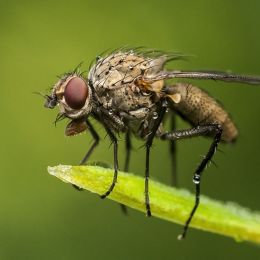
(5 years and 3281 days ago)actually that was a very objective comment, glows, gradients, and such a detailed fly are not precisely minimalistic, plus, if you just stick to the rule of thirds you'll see that the image it's actually unbalanced
(5 years and 3283 days ago)sorry i couldn't comment on this one sooner to achieve minimalism you need to get rid of all unnecessary elements of your artwork, less is more. Use 2 colors in your palette, and only the face with the elements around it that are inside the first circle. There you achieve minimalism...
(5 years and 3283 days ago)Great idea! don't love the font choice but still works... try to center the elements vertically, there's a lot of blank space below "the hangover 2" and so lil' above "the wolfpac is back!". Also think it should look better using a solid color rather than a gradient. =)
(5 years and 3284 days ago)i'd prefer to see a vector rose, but nice one still
(5 years and 3288 days ago)very good!
(5 years and 3288 days ago)I'd get rid of the ring, less is more, you have a great concept, the ring doesn't have anything to do with it, and catches up the eye too much...
(5 years and 3288 days ago)get rid of the gradients and reflections, those effects totally blew up the minimalism you want to achieve
(5 years and 3288 days ago)i think it's a nice concept, maybe the hand is a bit dark, and for the mood you've created maybe the shadow of the hand is also a bit dark good luck
(5 years and 3742 days ago)i think it's a nice concept, maybe the hand is a bit dark, and for the mood you've created maybe the shadow of the hand is also a bit dark good luck
(5 years and 3742 days ago)great work annie! awesome work
(5 years and 3790 days ago)it's more a digital illustration that a pencil drawing (color, watercolor, etc)
(5 years and 3938 days ago)simple and superb result
(5 years and 3982 days ago)congrats in advance
(5 years and 3993 days ago)really think it's great... being nit picky, i think it'd "clean" the composition if you get rid of the ball coming out of the left front leg
(5 years and 3995 days ago)great author... nice to see you again maybe lean the nose a bit to the right (screen right)
(5 years and 3996 days ago)the idea is great, the packaging not so much... you did a great job on 3Ds Max to create the toothbrush, but such a nice work deserves a better packaging... the type is not the best, as well as the color combination, and the size is deeply wrong... you should work on the package because you have a nice idea in here
(5 years and 4002 days ago)gratz dude!
(5 years and 4003 days ago)it's like sexy annabat :-P
(5 years and 4006 days ago)nice pic of Angel' Falls... that's in my country i actually have been there... it's the tallest waterfall in the world :-P
(5 years and 4019 days ago)hope i made myself clear, if there's anything you'd like to ask , don't doubt to contact me...
(5 years and 4019 days ago)excelent idea!! i really like it, just two nit picks, everything has great lighting except the sunflowers and seagull, which lighting doesn't match the rest. The other suggestion i have, is that the visual zone that atracts more in an image is the upper right quadrant, and right now it's totally empty, that somehow gives the feeling like something is missing, and that's accented by the fact that the four finger tips and the right side of the tree completes a rectangle, i suggest you to place the seagull in the mid space between the 2 middle finger tips and the top of image
(5 years and 4019 days ago)something told me this was yours
(5 years and 4021 days ago)gre8 image, very well made
(5 years and 4021 days ago)nice
(5 years and 4021 days ago)remove the truck on the left behind the horse and the blurry one behind the guys heads, nice composition good luck
(5 years and 4024 days ago)elephant it's not a reference, it's actually a source... but anyway, it's not copyrighted or anything so there shouldn't be any probs... it's a nice texture modeling, and you created a nice mood, but it'd be greater if you "build" the elephant with source plates (like an automaton or something) instead of overlapping both the source texture and the elephant texture... still a very nice chop

(5 years and 4024 days ago)for a better composition try to place the avocado a lil more behind the fruits in front of him, right now there's too much tension because only an small part of the fruits are overlapping
(5 years and 4025 days ago)nice idea, try to blur the background a lil because it looks more sharp than the eggs, and try to find soe craquelure texture, right now it looks like it was drawed with a marker... nice idea anyway GL
(5 years and 4025 days ago)nice photoshop art... good luck
(5 years and 4030 days ago)agree with pingenvy, besides that, nice image, try to darken up the house on the right and bottom
(5 years and 4030 days ago)great idea... change the gradint colors in the back... use oranges, yellows and reds
(5 years and 4036 days ago)hey i knew it was you love the characters :-P totally different approach
  although i bend over a more "serious" design for a logo identity...
  but it's a subjective matter... GL
(5 years and 4039 days ago)i really like the font you used, try to reduce the size of the emblem though, it's quite big compared to the logotype... nice idea good luck
(5 years and 4040 days ago)the pixels of mordor are calling us... one pixel to find them, one pixel to rule them all and in the darkness bind them... lol nice effect GL
GL 
(5 years and 4040 days ago)it's very cool! i don't think for a logo though... but it's a very nice idea the thing is that when you shrink it, the letters won't be visible at all... so we'd probably be looking a bitten eye with dust :-P but it's a great graphical idea!!
(5 years and 4040 days ago)cool... i'm not thrilled by the oblique position, it's a nice type face and well worked, but for a logo purpose, i'd prefer to see it front also with the 3d effect of course One thing i've just seen, look the bottom of the "P" it looks like it were closer that the other letters... fix that
(5 years and 4040 days ago)we all force the eye to read the first "P" because we all know this is for PXL Eyes, but ask other people who doesn't know the site what does they see, i really like the cutout style... use it a lot for my own job, but readability always has to come at first good luck... if you fid out there're readability issues, try to put a blue bar on the left and that's it
(5 years and 4041 days ago)Great Image being nit pick, it's easy to follow patterns in flames, because the image of flames in our mind is always random, so if you could randomize the flames that look repetitive it'll be top notch
(5 years and 4043 days ago)nice good luck
(5 years and 4046 days ago)it's your work, what i'm about to say it's a suggestion but i think it will make your image muuuch better... first get rid of the girl copied on the back, add a wooden background using the nut case, finally add some shadows to make it more eye popping... it'd look kinda scary :-P good luck
(5 years and 4046 days ago)the cut is pretty hard.. try to make it a lil bit softer, or maybe add some brown border (with the nut texture) around the slice good luck
(5 years and 4046 days ago)great image but you could've done more with the source... good luck
(5 years and 4046 days ago)either darken up the baloon a bit or lighten up the background good luck
(5 years and 4046 days ago)image is a bit flat... add some shadows and darker/brighter areas to make it more catching
(5 years and 4046 days ago)make it darker and blurry as the image fades out to the end... that will give you depth of field
(5 years and 4046 days ago)add some contrast on the face, and if you can, make the edges sharper... see that the bottom part edges are very sharpy compared with the ones on the face
(5 years and 4046 days ago)