- photo contests ▼
- photoshop contests ▼
- Tutorials ▼
- Social ▼Contact options
- Stats ▼Results and stats
- More ▼
- Help ▼Help and rules
- Login
Pxleyes
Photography and photoshop contests
We are a community of people with
a passion for photography, graphics and art in general.
Every day new photoshop
and photography contests are posted to compete in. We also have one weekly drawing contest
and one weekly 3D contest!
Participation is 100% free!
Just
register and get
started!
Good luck!
© 2015 Pxleyes.com. All rights reserved.

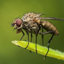



The light reflection in the eyes is a bit distracting, and is inconsistent with the back lighting of the background.
(5 years and 3227 days ago)Great capture of the flames!
(5 years and 3227 days ago)Yum! Not the prettiest, but certainly one of the tastiest!
(5 years and 3227 days ago)The blurry strawberry is a distraction, but the grated chocolate is in nice focus.
Very pretty girl!
(5 years and 3227 days ago)Long may it wave...er, swirl...Nice work!
(5 years and 3227 days ago)What is it? It's a bit too close up, the syrup swirls at the bottom are a bit hard to make out clearly.
(5 years and 3227 days ago)They don't look like they have backs. The green and pink ones look flat, while the blue one looks to be only 2 sided...
(5 years and 3227 days ago)Since the "black" triangles are holes, they should be showing the other sides of the pyramids.
Love the cookie cup, this looks very tasty!
(5 years and 3227 days ago)Add the shading on the opposite side of the light source as it is reflected in the eyes (pretend you are shining a flashlight on the eyes - the shading will go on the other side of where the flashlight lands on your subject.
(5 years and 3227 days ago)You can also add some gradual shading to the legs to make them look more rounded. This might help some: http://artswork.asu.edu/arts/students/line/line4.htm
This would have been even better if the pen had been turned a bit more sideways to show the writing tip in profile, or even from the top. The black underside is a bit bland.
(5 years and 3227 days ago)There's a bit too much of the dark tree on the left, it is dominating the picture, but the lighting on the building is very rich and enjoyable!
(5 years and 3227 days ago)Subtle coloring of the water, but believable. Very nice shot!
(5 years and 3227 days ago)The upside down tree in the corner really sets this off!
(5 years and 3228 days ago)Looks more like a parachute than a balloon...
(5 years and 3228 days ago)Clean job separating the leaves in the front.
(5 years and 3228 days ago)This is cute, but would have been better if the newspaper ads were about pets, rather than real estate...
(5 years and 3228 days ago)Really nice color of the water at the bottom.
(5 years and 3228 days ago)When separated from all the other colors in a landscape, this color of water looks more like sewage than water...Funny how the eye absorbs all the colors combined. Beautiful clarity of the falls!
(5 years and 3228 days ago)Nice subtle coloring of the water! One of the best entries so far.
(5 years and 3228 days ago)Great color and movement.
(5 years and 3228 days ago)Exquisite effort!
(5 years and 3228 days ago)This is a very interesting render. The concept has a few questionable directions, mainly regarding heat and humidity. Even with some panels opening, it would seem the heat and humidity build up would be comparable to a gigantic greenhouse - especially sitting on all that water. Also, if there is no breeze, the heat build up would be even worse. Spraying non-potable water (also used for toilets and showers) into the air as mist would create potential health hazards, and would increase the humidity problems on hot days...
(5 years and 3228 days ago)It is still a very interesting idea, and a good 3d render!
That's a great distraction photo! Well done!
(5 years and 3228 days ago)It's a little to monochromatic, and the square window at the bottom is placed strangely on the building, although the values are excellent, with the fine details in the shadows still visible.
(5 years and 3228 days ago)I agree with Vexycon, the rope looks like a flat cardboard cutout stuck on, with that dark edge on the bottom, and no curvature shading and highlights.
Excellent photo and angle of the shot. I thought it a Photoshop manipulation, and thought, "What the ???" and then saw it was for the Photography contest...Very well done!
(5 years and 3228 days ago)Very imaginative! Nice composition.
(5 years and 3228 days ago)Amazing looking building, great lighting and contrast!
(5 years and 3229 days ago)How beautiful and dense the greens!
(5 years and 3229 days ago)This has improved wonderfully from your first upload. Before it was very cut and paste and odd. Now it is almost a "painterly" illustration. Really good job!
(5 years and 3229 days ago)Terrific humor!
(5 years and 3229 days ago)I've never seen a yellow ink pen before...Can you even read what you write with it? Nice photo!
(5 years and 3229 days ago)Beautiful and very creative, nice work!
(5 years and 3229 days ago)Great imagination! Nice work!
(5 years and 3229 days ago)Very nice selective color in this image, especially the pool at the bottom.
(5 years and 3229 days ago)This is definitely a stronger entry, author. It is an odd building that warrants a second (or third) look!
(5 years and 3229 days ago)Excellent photo, I agree with friiskiwi, I thought it a Photoshop contest entry at first!
(5 years and 3229 days ago)The water in the middle has no color at all, green, blue, or otherwise. Since you choose the photo you take, you need to keep the background in consideration, since this looks half-baked at best, with a bit of blue at the top, nothing in the middle, and a lot of blue at the bottom. If the way it looked on the ground is what "talked " to you, then crop off the distracting and desaturated top and focus on the water on the ground.
(5 years and 3229 days ago)The weird thing coming out of her eye is distracting, but the eyes themselves are very well done!
(5 years and 3229 days ago)Great job of "thinking out of the box." An expensive way to write, but definitely noteworthy!
(5 years and 3229 days ago)This photo leaves something to be desired in presentation, both the photo and the gelatine...It just kind of "sits there..."
(5 years and 3229 days ago)This looks like something you'd see at an amusement park...Where is it?
(5 years and 3229 days ago)The composition of this is very boring. The building is "target center," with all the tents on the sides distracting from the building because there is more going on with all the stuff for the eye to look at. A "Rule of Thirds" positioning, cropping off a majority of the right side of bushes and tents would help this immensely.
(5 years and 3229 days ago)It looks like half a dozen different houses glued together from all different styles...I wonder if it was designed that way, or evolved as it grew...Great find!
(5 years and 3229 days ago)Love the presentation, it looks like something David Copperfield would do...It's MAGIC!!!
(5 years and 3229 days ago)I hope you submit this as a contest source suggestion. A lot of interesting shapes and lines in this could make for some great entries!
(5 years and 3229 days ago)Really nice effect - The water looks like water, not mist, or gauze, or gelatine...Good job!
(5 years and 3229 days ago)The top fin is too sharp for the rest of the image - it looks "cut and paste," and the bottom is a bit too dark, going to almost pure black, but this is a creative idea, and the fish looks pretty real!
(5 years and 3229 days ago)The water lost color behind and to the left of the rock,but it's an interesting composition!
(5 years and 3229 days ago)It looks delicious! Nice, clear photo! Good job!
(5 years and 3229 days ago)I thought you might have been deliberately inconsistent, so as to reflect all levels of talent here on the site, since inconsistent lighting and shadows are some of the biggest and most common mistakes people make, but thought I'd mention it just in case you were striving for a higher quality entry. Glad to know my initial feeling was the right one.
(5 years and 3230 days ago)