- photo contests ▼
- photoshop contests ▼
- Tutorials ▼
- Social ▼Contact options
- Stats ▼Results and stats
- More ▼
- Help ▼Help and rules
- Login
Pxleyes
Photography and photoshop contests
We are a community of people with
a passion for photography, graphics and art in general.
Every day new photoshop
and photography contests are posted to compete in. We also have one weekly drawing contest
and one weekly 3D contest!
Participation is 100% free!
Just
register and get
started!
Good luck!
© 2015 Pxleyes.com. All rights reserved.





Very dynamic, good visual movement.
(5 years and 3282 days ago)Very well done, good color choice!
(5 years and 3282 days ago)With the cage door closed, it's hard to see how the bird "got away..." Cute entry, nonetheless!
(5 years and 3283 days ago)Almost a cartoon effect, well done!
(5 years and 3283 days ago)The contest is to "decrease the color depth anywhere from 2 to 16 colors (1-4 bit)." You're not supposed to additionally play with the image by then changing and merging colors. That is unfair to the other entries.
(5 years and 3283 days ago)This is a very interesting concept, but the composition really leaves something to be desired...
(5 years and 3283 days ago)The oversized lumpy thing in the upper LH corner is dominating the image, with the fire and the wagon wheel helping to almost totally visually negate the gypsy, who is lost in darkness with the glowing orb casting almost no light on her.
You need to better establish your light source(s), and make them more consistent, especially the wagon wheel area, and the too dark area between it and the fire. The wagon simply should not be that bright, nor that unevenly illuminated...
The star "sparkle" brushes add nothing but additional confusion to this scene, as they do not emphasize your focal point, and just seem to be randomly tacked on.
In my opinion, it would be better composed if you just chopped off about 1/3 from the top and the LH side, and then adjusted your lighting.
It looks MUCH more realistic. Nice changes!
(5 years and 3283 days ago)Looks better.
(5 years and 3283 days ago)I really like what you did to the bicycle girl's face, but it's a bit too small for the rest of the body.
Nice work.
This came out pretty well, except for the dice. The colors have blurred and now over dominate the shape, so that the pips are hard to make out.
(5 years and 3283 days ago)Perhaps make a selection of just the dice, and then "fade" the color depth effect of the section (Edit>Fade effect IMMEDIATELY after making the change), to better allow the dice to look more natural.
The neck looks much better, but now you've increased the overall contrast too much, making the brights look "blown out" to almost pure white, which really makes the ground look bad, almost like a poor infra-red effect...
(5 years and 3283 days ago)Also, although you've now softened the basket, it shows NO highlights to correspond to the rest of the statue. You may have to hand paint those in with either the Paintbrush, or the Dodge tool.
Perhaps you should add a bit of the green color of the foliage back into the image?
It's so dark, it's very hard to tell what parts, or how much of the contest source you've used.
(5 years and 3283 days ago)You may want to consider some judicious cropping, to make your use of the contest source more of the focal point in this image. Right now there is too much background, and too little contest source...
Also think about straightening out your horizon line. It's presently tilting down to the RH side...
Interesting idea, but the inconsistent lighting and side shadows are hurting it, visually.
(5 years and 3283 days ago)You have a "glow" around the moon, yet it can't seem to even reach the top or sides of the chamber encasing it...Perhaps if you feathered it out further, it would help appear more as part of its surroundings.
The side vignette shadows from top to bottom just looks like an uneven attempt to shine a dim spotlight down on the scene. If you try toning those down, especially as you descend down the image, you will achieve a much more effective visual movement to your main focal point, the moon.
The moon also looks a bit too black and white for its brick surroundings. Color refraction would impart at least a very slight warm tint (3-5%) to it.
Author, if you apply about 5% of Cooling Filter 82 (Image>Adjustments>Color Filter), you will help get the adjustment for the skin tones and clothing that you need - The baby is too warm toned for the image.
(5 years and 3283 days ago)The baby is also too large for its position within the picture. The head is almost as large as the head of the soldier, but he is much closer to the viewer than the baby. If you scale the baby down by about 10% (Edit>Transform>Scale, type in 90% for height and width), you will bring it into better proportion for the image.
You may also want to sparingly use the Dodge tool on the top back of the baby's head to reflect the strong sunlight.
Hope this helps, it's a good concept!
You might want to reposition the broom so that it is supporting the witch. She looks too obviously in front of, rather than on top of it.
(5 years and 3283 days ago)The basket is too sharp edged in comparison to the rounded edges of the rest of the sculpture.
(5 years and 3283 days ago)By comparison, the "neck" of the sculpture where the head was removed is too soft and rounded, making it look lumpy and somewhat "melted." A bit sharper "break" edge would better convey the headlessness. You may also want to clone in some of the leaf pattern behind the neck to better blend the space with the background.
The jumping salmon is very crudely extracted, with very sharp edges and a noticeable outline from the original background.
(5 years and 3283 days ago)The contest source cloning you did for the bear is likewise quite crude and repetitive in patterning for the chest and stomach. The direction of the "fur" looks sideways, rather than vertical, which makes the cloning job look even worse.
The "pendulous breast" highlights between the chest and belly are non-existent in real bears. They don't have two breasts that weight would emphasize like that.
This is a good concept, but you need to be better aware of what you are attempting to render. Perhaps looking at some grizzly bear images would help. You also need to put a bit more effort into "seamless" cloning that is not so obvious, as well as taking more time to extract images with a bit more care so they do not look so harshly "cut and paste."
You might also consider cropping at least 1/3 of the empty blue sky off the top. It adds nothing to you image except too much dead space which detracts from your focal point, the bear.
Great zombie effect, but his left leg is on backwards - the little toe is the biggest, while the big toe is the smallest...
(5 years and 3284 days ago)Love the "see through" clothes!
I find it hilarious that someone whose greatness you "bow to," agrees with a "unexperienced" observation, but you still consider the original observation (mine) somehow incorrect...lolol!
(5 years and 3284 days ago)I don't need any input in a 3d medium to point out visual inconsistencies. That's like saying someone needs photographic experience to point out that a picture has cut the top of someone's head off due to poor focal length.
(5 years and 3284 days ago)When anyone with eyes can see that a wingtip is facing the wrong direction in comparison to the rest of the plane, no 3d app experience is necessary.
If that is the criteria you use when deciding if an observation is correct, no wonder you can't place a wing-tip properly...
I find it hilarious that someone whose greatness you "bow to," agrees with a "unexperienced" obser
Great mugs, but what is the appliance on the RH side that the light is shining from? It kind of looks like a front load washing machine, but that makes no sense...
(5 years and 3285 days ago)The alligator is so close to the edge of the water, that his left legs must be embedded deep into the mud...You need to give him a little more maneuvering room on that side, or else he'll never be able to haul himself out of the water to snack.
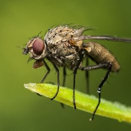
(5 years and 3286 days ago)The image is very blurry, and the insect is too sharp.
(5 years and 3286 days ago)Nice work!
(5 years and 3286 days ago)I can't wrap my head around the gray wing edge on the LH side above the jet. It looks like it is at an angle, pointing towards the front of the plane, rather than to the side...
(5 years and 3287 days ago)Great take on Blue!
(5 years and 3287 days ago)The edge of the lily is too sharp, a wee bit of blur along the edge would help it blend better with the image.
(5 years and 3287 days ago)A very low opacity warming filter would also help with the tones, which are a bit cool for the background.
This is very lovely, but the dream catcher is too close to the woman, it looks like the feathers are balancing the entire thing on the top of her head...
(5 years and 3287 days ago)Great work on the subtle background image.
Interesting, but too visually busy. All the ephemera seems added just for volume, rather than artistic enhancement...
(5 years and 3287 days ago)The elephant is reflected in the mirror...The frog needs a reflection as well for consistency.
(5 years and 3287 days ago)The perspective of the stone lion heads is off, since the image is from above, to see the lion heads in profile means they are all tilted at an angle, on both sides of the pool...Looks strange.
(5 years and 3287 days ago)The candles are also way too large for the image, unless the pool is only a couple of feet in width.
The anatomy is somewhat wonky. Her left leg is noticeably thicker than the right, as if she has a swelling problem. The left knee joint is also lower (which may be causing the swelling...)
(5 years and 3288 days ago)There is not enough shading on the text to make this a successful adaptation of the tutorial. It looks very flat, and done with Photoshop, rather than a 3d application.
(5 years and 3288 days ago)The text does not "bend" in the middle, adding to the 3d effect. It merely looks like "extruded," or "embossed" text raised slightly from the picture plane.
This is lovely. The only distracting part is the white in the eyes. Being of stone, the white is too bright and distracting from an otherwise truly enchanting image.
(5 years and 3288 days ago)I agree with you about the Hi-Res version not always being necessary in order to preserve the visual illusion created. Best of success to you!
The counters seem a bit short, since counter height is usually very close to stovetop height.
(5 years and 3289 days ago)The top of the stove also looks a bit odd, as the contrast is so dim that it is hard to make out whether those are burners (which are WAY too thick if they are) or very thick pans on top of the stove.
Otherwise, this is very nicely rendered, I like the texture used for the cabinet doors and the floor.
The background lighting is inconsistent with the contest source.
(5 years and 3289 days ago)Notice how the wheels of the vehicle are fully lit? Yet you have both versions riding over rocks that are in the shade. Just doesn't work, visually...
Consistency of lighting and shadows is hard, but is one of the most important things in almost any entry in these competitions. You can try lightening the rocks with the Dodge Tool, or find another beach background image to use that does not have such obvious shadows beneath the riders.
The round shape on the LH side looks tilted downwards to the right. Is it a stationary building (with people on the edges), or is it a flying saucer?

(5 years and 3289 days ago)You also have very inconsistent light sources all over the place, with the sky and flying machines illuminated from the opposite side of the saucer, the background city, the ships (which are lit from above), and the skyscraper, which is lit from the RH middle.
The ant-type creatures on the water, as well as the bridge, show no shading at all on the water, and the reds are too warm in tone for the overall blue cast you have given this image.
It's a very interesting concept, but it is very inconsistent in execution and needs a lot of adjustments to be visually believable.
It's too dark, with too much background. Your focal point is lost as just a small shadow on the horizon line. There is no way to visually determine if it is wrath or just aggravation at not being able to find his car keys that he's dropped in the dark...
(5 years and 3289 days ago)I would suggest a heavy crop, making your subject much more dominant in the image, and accenting whatever it is you feel is conveying wrath, which is a strong and vengeful anger, like rage.
The too-bright lights on the flag are very distracting and inconsistent with the rest of the image.
(5 years and 3292 days ago)You additionally have the flag lit too strongly from the top, while the rest of your scene is being lit with a far softer light source from the RH side...The spyglass is placed within a shadow, and should not be showing any real highlights at all...
The edges where you've extracted the elephant from the background are very rough. You may want to try using the pen tool for more control.
(5 years and 3292 days ago)You also need to adjust the edges which are shadowed and highlighted, as your background has the light source from behind the elephant, which would provide a back lit "halo" effect, rather than a strong highlight on top and a shadow beneath.
The face still is noticeably lighter, with the sun shining DOWN from behind her.

(5 years and 3292 days ago)Her hair and shoulders show NO lighting on them at all, while you have a VERY strong shadow coming off of the bottom of her dress, although the dress shows no corresponding shading away from the sun light source.
I'm sorry, but whatever corrections you've made have not helped the inconsistencies between the contest source, the woman's body and dress, and the background you've selected...In competitions like this, such inconsistencies will probably have a negative effect on your score.
The lighting on the face is inconsistent with the background you are using. You might try selecting the face, and going to Image>Adjustments>Selective Color>Whites, and try bringing down the white tones in the face to better match the rest of the head and neck...
(5 years and 3292 days ago)Well done. Clean chop, good use of the tutorial.
(5 years and 3292 days ago)The filter used on the columns is very fake looking, because it is too flat and does not change in perspective as it recedes into the horizon line.
(5 years and 3293 days ago)Also, the pool you used is at a different angle than the contest source, which makes the lines look extremely crooked, and the pool then appears to be tilting.
The statue is too large in proportion to the pool, and the lighting is not consistent with the rest of the image.
This is a really good concept, but it looks very rushed, without enough attention to detail...
The angle of the shoulder is wonky in relation to her head, and her face is too bright for the light source behind her (notice the shadow is in front of her face...)
(5 years and 3293 days ago)Your source link does not work.
Beautiful blend. Looks quite realistic.
(5 years and 3294 days ago)It would have looked better if the doorways were open or had handles. This way just looks like the staircases all run up to solid walls...
(5 years and 3294 days ago)I think your texture scaling combined with the odd shape may be why it looks so fake... I have an entire fireplace wall done with that type of brick, so I am familiar with the texture.
(5 years and 3294 days ago)It's called "rake brick" because of the texture pattern.
Here are a couple of photoa of how the real thing looks:
http://hostedmedia.reimanpub.com/TFH/Step-By-Step/FH04FEB_POINTB_09.jpg
http://www.arch.mcgill.ca/prof/friedman/arch240/winter1998/lecture6/Mason23.jpg
It's so dark, it's hard to make out much of anything...
(5 years and 3294 days ago)The moon is on the opposite side of your light source...
(5 years and 3294 days ago)The texture on the brick is a bit too varigated in color. Combined with the indented face, it looks more like a brick shaped sponge than a heavy object.
(5 years and 3294 days ago)Other than that, the image is quite nice. Good background, perspective, and lighting.