- photo contests ▼
- photoshop contests ▼
- Tutorials ▼
- Social ▼Contact options
- Stats ▼Results and stats
- More ▼
- Help ▼Help and rules
- Login
Pxleyes
Photography and photoshop contests
We are a community of people with
a passion for photography, graphics and art in general.
Every day new photoshop
and photography contests are posted to compete in. We also have one weekly drawing contest
and one weekly 3D contest!
Participation is 100% free!
Just
register and get
started!
Good luck!
© 2015 Pxleyes.com. All rights reserved.

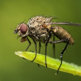




Don't change a thing! The fly is perfect, in that it DOESN'T jump out at the eye. Flies are like that when they are "normal" sized.
(5 years and 3510 days ago)The fly has a shadow on the statue. Possibly a bit more for the bottom of the wing on the right, but otherwise the perspective is spot on.
I especially appreciate the translucence of the wing on the left, showing the road behind it.
This is delightfully "icky!" The only way it could have been better would have been if the statue was a stone hamburger or something. Very nice work!
Some nice things going on here, I like the nails and lipstick, and the snowflake "tattoo" on the arm. But the giant snowflakes on the left are distracting, and the overlay on her hair just brings the illusion down and looks too contrived.
(5 years and 3510 days ago)The filter effect needs to be adjusted around the edges of the body, She looks like she has corrosion holes along the edges, especially where her body meets the water.
(5 years and 3510 days ago)The trick with filters is to make them not look like filters. Tricky, to be sure, but half the fun is experimenting!
Well done! Filters are not a sin, I think you used them judiciously.
(5 years and 3511 days ago)I do think the hands are a bit too big and too bright, though. The right hand looks like it comes from a man...
Better with the lemon...
(5 years and 3511 days ago)Those aren't water drops, that's flammable oil that hasn't ignited yet...
Really nice ice effect on the figure. Well done!
(5 years and 3511 days ago)Great rework! Don't worry, it gets easier with every contest you enter!
(5 years and 3511 days ago)The woman is too blurry for the rest of your image, which is in sharp focus.
(5 years and 3511 days ago)The jagged edges along the side of the face are distracting.
(5 years and 3511 days ago)Love the flames, but the "outline effect" on the lemon and the bottom of the pitcher hurt the overall image. Bring back a little more of the lemon and work on the very bottom area a bit, bringing the flames down into the solid black, so it looks like the lemon is plunging into a pitcher of fire more.
(5 years and 3511 days ago)A bit too warped and blurry along the bottom, but a beautiful chop, nevertheless.
(5 years and 3511 days ago)The background is too close to the hair color. Needs more contrast.
(5 years and 3511 days ago)Looks like she's trying to pass that lemon or give birth to it...
(5 years and 3511 days ago)Creative, but weird.
The drop shadow on the text makes it too hard to read. It would look better with an outline on the lettering or a translucent box behind it.
(5 years and 3511 days ago)The fish should have some color since so much of the image is desaturated...
(5 years and 3511 days ago)I really like the tail, well done!
(5 years and 3511 days ago)I really like this piece. Don't care if you did it in 30 seconds or 3 hours, the final result is visually pleasing to my eye, no matter how much effort it did or did not take to achieve. Very skillful and well done.
(5 years and 3512 days ago)Nice improvement. Now you can see the expression much better!
(5 years and 3512 days ago)The spaces between the wheel spokes need better extraction, there's opaque gray patches.
(5 years and 3512 days ago)Comedy has nothing to do with it. It's called a modicum of respect. The Statue of Liberty does not deserve such poor taste, and it has NOTHING to do with "humor."
(5 years and 3512 days ago)And YES, a good 'chopper SHOULD be able to censor themselves when they are participating in a contest based on popular votes. It doesn't take THAT much effort to be respectful of something that is very symbolic to millions of people.
Thank you, author for changing the image. As a proud American, I appreciate it.
Really good work!
(5 years and 3512 days ago)That is bizarre! Very creative and very well drawn. Nice work!
(5 years and 3512 days ago)You might want to consider a different swing source. Here are a few:
(5 years and 3513 days ago)http://www.everystockphoto.com/photo.php?imageId=60368
http://www.everystockphoto.com/photo.php?imageId=3910555
http://www.everystockphoto.com/photo.php?imageId=3910505
http://www.everystockphoto.com/photo.php?imageId=4775508
http://www.everystockphoto.com/photo.php?imageId=4226660
http://www.everystockphoto.com/photo.php?imageId=4852980
(You'll have do do a little chain work, 'tho...)
Great job! She definitely gives off a "frozen" vibe.
(5 years and 3513 days ago)Great concept, but the perspective angle of the swing is too skewed for the angle of the arch. Either the kid needs to be more face forward, or the arch needs to be angled.
(5 years and 3513 days ago)The weird shapes around the fruits in the water don't make sense, and the color reflections at the top of the water in the pitcher needs to be slightly adjusted.
(5 years and 3513 days ago)It's a bit too dark.
(5 years and 3513 days ago)I guess I'm too much of a patriotic prude...The Statue of Liberty??? Couldn't you have just used a skyscraper, or a mountain, or something not quite so symbolic?
(5 years and 3513 days ago)Would look nicer if the sky and moon had color. Great blend, though!
(5 years and 3515 days ago)Thank you for lightening it. Now it's too brown in comparison to the cow. As a sepia effect, like an old photograph, the cow should be slightly tinted, too. This way, is just looks like monochrome with a desaturated white cow image pasted on top.
(5 years and 3515 days ago)I really like this piece, but the water splash coming off both sides of her hips ruins the "icy" aspect for me. The icicles are a great touch, but you need to better blend them where they join the "Ice Princess." The top edges are too hard, and make them look pasted on. Great piece, though!
(5 years and 3515 days ago)Perhaps a bit of free transform skewing on the body to "angle" her back a bit would help the perspective. I like the concept, but agree about the jellyfish, more because as compared to morey (morels are mushrooms) eels, a jellyfish has no real brain or personality, and those tendrils sting, no matter who they touch, friend or foe...
(5 years and 3515 days ago)@DollMommy ~ While comments can be kudos and back pats, here they also serve the purpose of pointing out visual inconsistencies and technical flaws and errors to *theoretically* help the artist become better at chopping an image. Hence, what you term "nit picks" are quite often merely observations of flaws that prevent the image from visually communicating the artist's vision. Not every creation is a "masterpiece," and just because it was made does not excuse it from critical commentary.
Perspective, Lighting, and Edges are the three most important compositional parts of a good Chop. When they are flawed, it brings the entire image down, regardless the author's subjective intent.
The light reflection on the iris is too blurry. Being a "wet surface" light reticulars are sharp edged on eyes.
(5 years and 3515 days ago)Nice work for your first attempt, though! Yeah, grayscale and then painting will work out better many times.
Nice render, but it's too blurry. I think you over used the smudge tool.
(5 years and 3515 days ago)The drop shadow under the shed, combined with the cast shadow makes it float...Also, the front of the building needs to be darker, and not show a light source shining on the side of the door.
(5 years and 3515 days ago)The brace on the bottom in the back has a gap where it's not connected to the wheel, and there looks to me too angled a fusilage, especially the "point" behind the cockpit.
(5 years and 3515 days ago)Great concept, VERY well done and humorous! Good work.
(5 years and 3515 days ago)Stunning work. All that time with the pen tool paid off, this is awesome!
(5 years and 3516 days ago)Very interesting interpretation, but of course, the clothing does not fit the poetry of a tale of ancient Rome...
(5 years and 3516 days ago)Beautiful image, but it's too dark.
(5 years and 3516 days ago)It's too dark, can't see what is shifting...
(5 years and 3516 days ago)Too dark around the edges. The lightest portion of your image is where there is nothing going on but a wide expanse of blank ground.
(5 years and 3517 days ago)I don't get it. Did she fall over after sprouting because she's top heavy?
(5 years and 3517 days ago)Is she trying to scoop more mulch over her roots for nutrients? Even under the canopy of "surreal," this is more confusing than thought provoking...
Personally, I don't care for the background. It's too flat with the "photoshop vignette" look to it. When I think "surreal," I think of Dali, with his dreamlike vistas filled with odd and distorted objects.
It's too dark. Mood lighting is one thing, but when it's like a bad case of glaucoma, you need to lighten the image. It's almost impossible to see your figures, they basically look like shadows.
(5 years and 3517 days ago)EDIT: Much better. Your focal point is easier to appreciate now. Good work.
Interesting CBR. Nice colors.
(5 years and 3518 days ago)The light delineation on the table and the helicopter aren't quite right. If the light is that strong coming through the window, the shadows need to be deeper. Mainly it's the front edge of the table that visually bothers me the most, it looks brown rather than shadow gray...Being white, it shouldn't have any tint in shadow.
(5 years and 3519 days ago)Example photos :
http://everystockphoto.s3.amazonaws.com/globes_light_shows_326304_o.jpg
http://www.everystockphoto.com/photo.php?imageId=2102479
http://www.everystockphoto.com/photo.php?imageId=226347
http://www.everystockphoto.com/photo.php?imageId=4598972
Very disturbing and beautiful...
(5 years and 3519 days ago)The most realistic of all the entries. Exceptionally well done, congratulations!
(5 years and 3519 days ago)This is wonderful. Great lighting, great texturing, really sets a mood. Niiicce!
(5 years and 3519 days ago)Quote:
(5 years and 3519 days ago)"...this piece wasnt the best in the contest, but deserved a better score than that."
By what standards? Every piece ranking better than yours showed much more effort, transforming the source image, while your entry basically just masked off portions and added a face and some lights. Technically it was sound work, but aesthetically you didn't alter the image all that spectacularly to rank much more than "average," which at 50%, is pretty much where you landed after 841 votes.
Perhaps if you had put your "scientist" in more of an environment, say of a laboratory, or a hidden workshop, your concept would have read better and you would have gotten a better score. But for what you did, compared to all the other entries, I think you ranked correctly in this contest.
Don't let your hubris control you. It won't help here. To rank high, you have to show more than just good chop skills, you need your concepts to show good imagination as well.