- photo contests ▼
- photoshop contests ▼
- Tutorials ▼
- Social ▼Contact options
- Stats ▼Results and stats
- More ▼
- Help ▼Help and rules
- Login
Pxleyes
Photography and photoshop contests
We are a community of people with
a passion for photography, graphics and art in general.
Every day new photoshop
and photography contests are posted to compete in. We also have one weekly drawing contest
and one weekly 3D contest!
Participation is 100% free!
Just
register and get
started!
Good luck!
© 2015 Pxleyes.com. All rights reserved.





Very cute concept. Nice work.
(5 years and 3528 days ago)The face growing out of her shoulder blade throws this piece off. I think she looks good without it.
(5 years and 3528 days ago)There's a cut out edge around the guy, which makes him look too flat, but I really like the concept and the execution on the sand.
(5 years and 3528 days ago)Too dark, you can barely see the monochrome background at all, although it does provide a good contrast for the cow.
(5 years and 3528 days ago)The pseudo-ink well/candlestick is interesting, but the quill should be placed to show that the tip really is a pen. This looks like it could just be a feather...
(5 years and 3529 days ago)Love the placement, the colors are great, but the water droplets really set off the image. Nice work!
(5 years and 3529 days ago)It looks like a pencil with an interesting end, rather than a pen...
(5 years and 3529 days ago)Congrats on the win, well earned!
(5 years and 3529 days ago)This is a really cute effect, and you've done a great job with the lighting!
(5 years and 3529 days ago)The figure is a bit too sharp in focus. A little Depth of Field blurring would help the visual believability.
(5 years and 3529 days ago)The left leg is problematic to this piece. Looking at the DOF blur of the floor and the angle of the camera, that left foot should be slightly larger at the heel, and toe needs to be angled upwards a bit, not "flat" on the bottom edge of the image. Also, the pant leg on the left leg is doing a weird "pinched in" mirror effect at the ankle, and shows an odd gray fade mark running about 10 inches up the back of the leg and stopping.
The light source on the man's face is very strong, striking his chin and lower cheek from the top. This would make the shadows of the legs stronger on the left.
I cannot visually "read" the forearm with the watch on it. It looks like a brushed metal pipe, not a hairy forearm...
Personally, I'd suggest darkening those eyelashes. The light reflection on them is too distracting to your overall image.
The fish half is side profile (the top fin away from the viewer), while the woman half is facing upwards to the viewer...The angle just doesn't work, and the blending is very rough, looking like an uneven blur erase. The woman half's skin will need to start turning the color of the fish half (Gradient) before you erase blend it into the fish, and the fish needs to either be a bit more "belly up," or the woman needs to be facing downwards more.
(5 years and 3529 days ago)Great concept! The dome has a bit of an outline, and is a little too hard-edged where it is "broken," but overall, this is really well done!
(5 years and 3529 days ago)This reminds me of an apartment complex I once lived in...lol!
(5 years and 3529 days ago)This is lovely, but all the light reflection "lines" in addition to the light reflections make it look like she has scratched corneas. Also, the white spots in the shadowed area beneath the upper lid shouldn't be there, it's shadowed.
(5 years and 3529 days ago)Love the bit of red on the side of Death's cape peeking out. Nice emphasis.
(5 years and 3529 days ago)I wouldn't color that left statue, it would look too monochromatic. This way, it helps balance that right side.
(5 years and 3529 days ago)But I agree that it is a visually lovely entry.
Just the words "Egyptian Nights" doesn't really give this much of a night feel or appearance. Perhaps a darker colored background would help.
(5 years and 3531 days ago)Love the textures! Really well done!
(5 years and 3532 days ago)Interesting, but it's too dark to easily make out what's going on.
(5 years and 3532 days ago)The base plate of this is too small, and doesn't show any form of mounting. It looks like the gun should fall over.
(5 years and 3533 days ago)Really nice rendering of the wire and nuts!
Good effort, but you have too many gray tones in the "sketch," which is what is causing the visual confusion. Try adjusting Brightness and Contrast to make it more of a Line Art paper sketch, and adjust your burnt edges a bit, making them larger. They are too "lacy" at present.
(5 years and 3533 days ago)You've gotten pretty close with the effect, though!
Interesting, but it doesn't look very realistic. The iris coloring is somewhat blotchy, and the light reflections are somewhat blurry, which wouldn't happen with a wet surface like an eyeball, they would be in sharper focus.
(5 years and 3534 days ago)Very cute, but the mushroom house is too angled on the hill.
(5 years and 3534 days ago)The light coming from underneath and behind her doesn't correspond with any other light sources or the shadow of her sleeve on her chest. Consistency is "key" to a good image
(5 years and 3534 days ago)The trees looks terribly cut and paste, since the dark in between the trees does not match the clear sunny sky around them, and the shape is too smooth and does not look like real trees, which are very irregular in profile...
(5 years and 3534 days ago)Really interesting mountain texture! I wish your SBS had shown that technique in more detail.
(5 years and 3534 days ago)The table and floor are at a really weird perspective. He is sliding down the floor, and the table is more floating, with the back legs higher than the front, but at a lesser angle than the floor...
(5 years and 3534 days ago)Until I read the source thanks, I thought it a dreamy picture of a pair of hands holding the 'shrooms...lol! Very nice effect.
(5 years and 3534 days ago)The nose horn gets lost in the dark background. Perhaps lightening the barn just a bit to better emphasize the contrast?
(5 years and 3534 days ago)The woman's skin tone is too cool and blue looking, while the pasta is too warm toned. I'd suggest warming the skin tones with a warming filter layer.
(5 years and 3535 days ago)You already have a white "light specular" painted onto the lens opening of the iris. The giant white "manga" specular makes it look like the eye is diseased.
(5 years and 3535 days ago)Pasta kitty! Superb!
(5 years and 3535 days ago)You might consider cloning out the big rock at his feet and making it grass. A horse wouldn't stand like that on or that near a rock.
(5 years and 3535 days ago)The selective desaturation doesn't really work well for this image. You've emphasized the grass, rather than your subject.
(5 years and 3535 days ago)Whatever the message is you're trying to visually convey here, I just don't get it...
(5 years and 3535 days ago)The "testimonial" should not cover the body of the horse. You have a lot of "empty space" with the sky.
(5 years and 3535 days ago)I lost 80 pounds, and I
................feel better than
....................ever
...................before!
(the dots are the horse outline)
would be a more "dynamic" text placement.
Also, the "Before" and "After" should be placed better on top of each image, not straddling them and the background
The eyelashes are a bit too thick, almost scary looking, but the eyeball is well rendered, if a bit too pink...
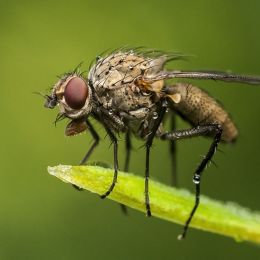
(5 years and 3535 days ago)The fur on the head isn't consistent with the insect body. Perhaps giving the body fur, or making the face smooth textured and reflective like the body would help. Also, the coloring of the head is a bit too "fake." Maybe making the eyes red, or adding some colors to the horns?
(5 years and 3535 days ago)It looks like octopus tentacles. With the title, I thought it was sushi themed...

(5 years and 3535 days ago)Very creative and lovely!
A bit too CBR. It looks like a lot of pretty swirls, but not enough definition of either what it was, nor what it is supposed to be.
(5 years and 3535 days ago)Wow! Beautiful work!
(5 years and 3535 days ago)Good job on the lighting!
(5 years and 3535 days ago)The lighting is a bit too inconsistent, expecially the ground near the girl's feet. With such a bright light shining on her, she would not be standing in a pool of shadow...
(5 years and 3536 days ago)The horizon is very smoothly blended with the sky, although the topmost clouds look a bit "swishy," rather than cloud-like.
The wing on the LH side is too dark. It looks like she is leaning against some sort of "shadow wall," and is visually confusing. The wing on the other side needs a bit of work, it looks like a curtain, rather than a wing.
(5 years and 3536 days ago)Other than the wings, this has beautiful lighting and blending. Really nice work!
True mandalas (of the Buddhist type) are not symmetrical, per se, although they are balanced...
(5 years and 3536 days ago)http://www.exoticindiaart.com/mandala.htm
This is a very thoughtful and creative effort. It shows true consideration of the topic, and is quite lovely.
Great entry, but the statement makes it seem like a joke. "Choose to fight and be a winner..." Against a locomotive? I think not, but perhaps you meant it to be ironic...
(5 years and 3536 days ago)Love the crank to raise the lid! The glowing top knob is a bit distractive, but overall this is a great creation!
(5 years and 3536 days ago)The headlight is too bright, and the star lens flare effect compounds the problem. The light would not be so bright unless it was looked at directly head on, not from an angle like the rendering. You also have a too-bright reflection on the side behind the light, which simply would not exist, unless the light is somehow leaking through the metal.

(5 years and 3536 days ago)The rear wheel is quite interesting, although I bet it doesn't get much traction
The eye is misshapen. It doesn't look like a "ball" in a socket, as much as an almond shape with an iris. There is no tear duct, nor upper and lower eyelids, rather just an opening with lashes applied. You also have no depth to the eye or the socket. It's all quite flat and looks somewhat like a cartoon eye, although the coloring of the iris is quite intense.
(5 years and 3536 days ago)Here are some very good articles you may want to check out to help you achieve a more realistic effect:
http://drawsketch.about.com/od/drawingportraits/ss/draweyes_3.htm
http://www.artyfactory.com/portraits/drawing_techniques/drawing_the_eye.htm
http://www.ehow.com/how_2109633_draw-eye-conte-crayon.html
The strands of hair look a bit odd, with really thin and fine hairs off the forehead, but really thick strands on the rest of the head.
(5 years and 3536 days ago)Also, the philtum (the ridges from the nose to the lips) is a bit too pronounced, and her left shoulder is really short and jammed up to her neck.
Beautiful colors, though!