- photo contests ▼
- photoshop contests ▼
- Tutorials ▼
- Social ▼Contact options
- Stats ▼Results and stats
- More ▼
- Help ▼Help and rules
- Login
Pxleyes
Photography and photoshop contests
We are a community of people with
a passion for photography, graphics and art in general.
Every day new photoshop
and photography contests are posted to compete in. We also have one weekly drawing contest
and one weekly 3D contest!
Participation is 100% free!
Just
register and get
started!
Good luck!
© 2015 Pxleyes.com. All rights reserved.


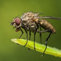
A nice macro shot, very simple in the end but it gives exactly what this topic asks for.
(5 years and 3732 days ago)I think by moving the lines more towards to the corner might improve this shot by helping the eye to the actual object of the image.
Like kyricom said, the signs sticks out little too much. Taking the picture from further away should help as it would make the sign smaller and show of more of the fence itself. Or an angle from in which the sign becomes hard to read/illegible might work out as well.
(5 years and 3732 days ago)I really like the reflection on of the "@", even though I slightly wish there would be little more to be seen.
(5 years and 3732 days ago)As for it being a letter or not, it clearly has an "a" in it, therefore it should be counted as one. A lot artistic letters are far from what they're are generally seen or even if you look at the old alphabet, which should also count for this contest. Anyway, I really like the idea for choosing this "a" instead of just a normal one, nyaa.
I really like the feeling the reflections in the ceiling give this picture. It slightly confuses the viewing eye for a second before you realize what is actually going on.
(5 years and 3732 days ago)As for the mood in the picture, it seems little "dull". The people in the picture seem to be waiting for something that has yet to start, which gives it the "dullness", in my opinion.
I have to agree with kyricom. There is no real point of focus in the picture and most of it seems like it's just melting together. At high resolution it's hard to even see the facial expressions of the people.
(5 years and 3732 days ago)Personally, I think the image would benefit fit of someone, like the lantern carrying person, being in focus instead of just not being as unfocused as the rest of the picture.
There's something you could try for the focusing inside. Set everything up, take something else to the location where you want to focus so that the camera can find a focusing point. Have it focus and take the focusing help away and shoot away. This way you should be able to focus despite the camera not being able to focus on its own. You might need few try to get the focusing point to the right place, but I'm pretty sure it's going to be worth the trouble.
(5 years and 3749 days ago)I like the picture, but I think it's little too dark. The really nice masks don't stand out as much as I'd like to see them standing out.
(5 years and 3833 days ago)